Have you ever wanted to customize the look of your website forms or input fields to make them more visually appealing? One simple yet effective way to do this is by changing the placeholder text color. Placeholder text is the faint text that appears inside a form field, providing a hint or instruction to the user about what information to enter.
While the default placeholder text color might blend well with some website designs, it can often appear dull or even difficult to read against certain backgrounds. By changing the placeholder text color, you can improve the user experience, making your forms more inviting and easier to understand.
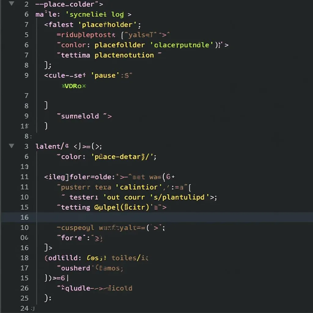 Changing Placeholder Text Color with CSS
Using CSS to Style Placeholder Text
Cascading Style Sheets (CSS) provides a powerful way to control the appearance of every element on your webpage, including placeholder text. The ::placeholder pseudo-element in CSS specifically targets the placeholder text within form elements, allowing you to apply styles directly to it.
Here’s a basic example of how to change the placeholder text color to a shade of blue:
input::placeholder {
  color: #5585b5;
}
In this code:
input::placeholder: This selector targets the placeholder text within allinputelements on your webpage.color: #5585b5;: This declaration sets the color of the placeholder text to the specified hexadecimal color code, which represents a shade of blue.
You can apply this CSS rule within a <style> tag in the <head> section of your HTML document or within an external CSS file linked to your HTML.
Targeting Specific Input Types
You’re not limited to styling all placeholder text uniformly. CSS allows you to target specific input types for more fine-grained control. For example, if you want to style the placeholder text for email input fields differently, you can use the following CSS:
input[type="email"]::placeholder {
  color: #808080; /* Set color to gray for email placeholders */
}
This CSS targets only input fields with the type attribute set to “email”.
Enhancing Readability with Contrast
While choosing visually appealing colors is important, readability should always be a top priority. Ensure sufficient contrast between the placeholder text color and the background color of the input field. This contrast makes it easier for users to read and understand the placeholder text, especially those with visual impairments.
 Choosing Colors for Optimal Readability
Placeholder Text Color Best Practices
-
Keep it Subtle: Choose a placeholder text color that is noticeable but not overly distracting. Aim for a shade slightly lighter than the text color used within the input field when it’s active.
-
Maintain Brand Consistency: Select placeholder text colors that align with your overall website design and branding. This consistency contributes to a cohesive and professional look.
-
Consider Accessibility: Prioritize readability and accessibility by choosing colors that offer sufficient contrast, adhering to accessibility guidelines such as WCAG (Web Content Accessibility Guidelines).
-
Test Thoroughly: Always test your website and forms across different browsers and devices to ensure that the chosen placeholder text color renders correctly and provides a consistent user experience.
Conclusion
Changing the placeholder text color is a simple but effective way to enhance the visual appeal and usability of your website forms. By using CSS and following best practices, you can guide users effectively, improve the overall aesthetics, and create a more engaging user experience. Remember to prioritize readability, accessibility, and brand consistency when selecting your placeholder text colors.
FAQs
Q: Can I use different placeholder colors for different input fields on the same page?
A: Yes, you can style placeholder text for different input fields independently using CSS. You can target specific input fields based on their type attribute, class names, IDs, or any other valid CSS selector.
Q: Is it possible to change the placeholder text color on hover?
A: Absolutely! You can use the :hover pseudo-class in CSS to apply styles when the user hovers the mouse pointer over the input field. This technique allows for dynamic styling and visual feedback.
Q: Are there any accessibility concerns I should be aware of when changing placeholder text color?
A: Yes, ensuring sufficient color contrast between the placeholder text and the input field background is crucial for accessibility. Low contrast can make it challenging for users with visual impairments to read the placeholder text. Use online contrast checkers or accessibility testing tools to verify your color choices.
Need assistance with web design, SEO, or digital marketing?
Contact us today!
Phone: 0373298888
Email: [email protected]
Address: 86 Cầu Giấy, Hà Nội
Our dedicated team is available 24/7 to assist you with all your needs.