Understanding the way colors work is fundamental to appreciating the art of design, especially in fields like painting and interior decoration. At its core, color theory is divided into two primary systems: additive and subtractive color. While additive color deals with light emissions, subtractive color focuses on how pigments absorb and reflect light. Let’s delve deeper into the world of subtractive color and explore its significance in our daily lives.
Subtractive Color: Decoding the Concept
In the realm of subtractive color, we begin with a white surface, like a blank canvas or a pristine wall. When we apply a pigment, be it paint, ink, or dye, it absorbs specific wavelengths of light and reflects others. The colors we perceive are the wavelengths that the pigment hasn’t absorbed. Essentially, the pigment is “subtracting” certain wavelengths from the full spectrum of visible light.
Think of it this way:
- A red apple appears red because its skin absorbs all colors of the light spectrum except red, which it reflects back to our eyes.
- A black object appears black because it absorbs almost all wavelengths of light, reflecting very little back.
The primary colors in the subtractive color model are cyan, magenta, and yellow (CMY). These are considered primary because you can’t create them by mixing other colors. However, by combining these primary colors in various ratios, we can produce a wide spectrum of other colors:
- Cyan and magenta create blue.
- Cyan and yellow create green.
- Yellow and magenta create red.
Black, in theory, should be achievable by mixing all three primary colors. However, in reality, this mixture often results in a muddy brown. Hence, black (K) is often added as a fourth color in the printing process, leading to the commonly used CMYK color model.
Identifying Examples of Subtractive Color
Now, to answer the question, “Which Of The Following Is An Example Of Subtractive Color?”, consider these scenarios:
- A computer monitor displaying a vibrant blue image: This is an example of additive color, where light is emitted directly from the screen.
- A painter mixing blue and yellow paint to create green: This is a classic example of subtractive color, as pigments are combined to absorb specific light wavelengths and reflect green.
- A rainbow appearing after a rainstorm: This is an example of light refraction and reflection, not subtractive color mixing.
Therefore, the correct answer is the scenario involving the painter mixing colors.
Subtractive Color in Everyday Life
The principle of subtractive color is not confined to art studios. It plays a crucial role in various aspects of our lives:
- Printing: The CMYK model is the foundation of color printing, allowing us to reproduce images and text on various surfaces.
- Textile Dyeing: From the clothes we wear to the curtains adorning our homes, subtractive color is the driving force behind the vibrant hues that surround us.
- Painting and Art: Whether it’s a masterpiece on canvas or a child’s colorful drawing, subtractive color is the heart of artistic expression.
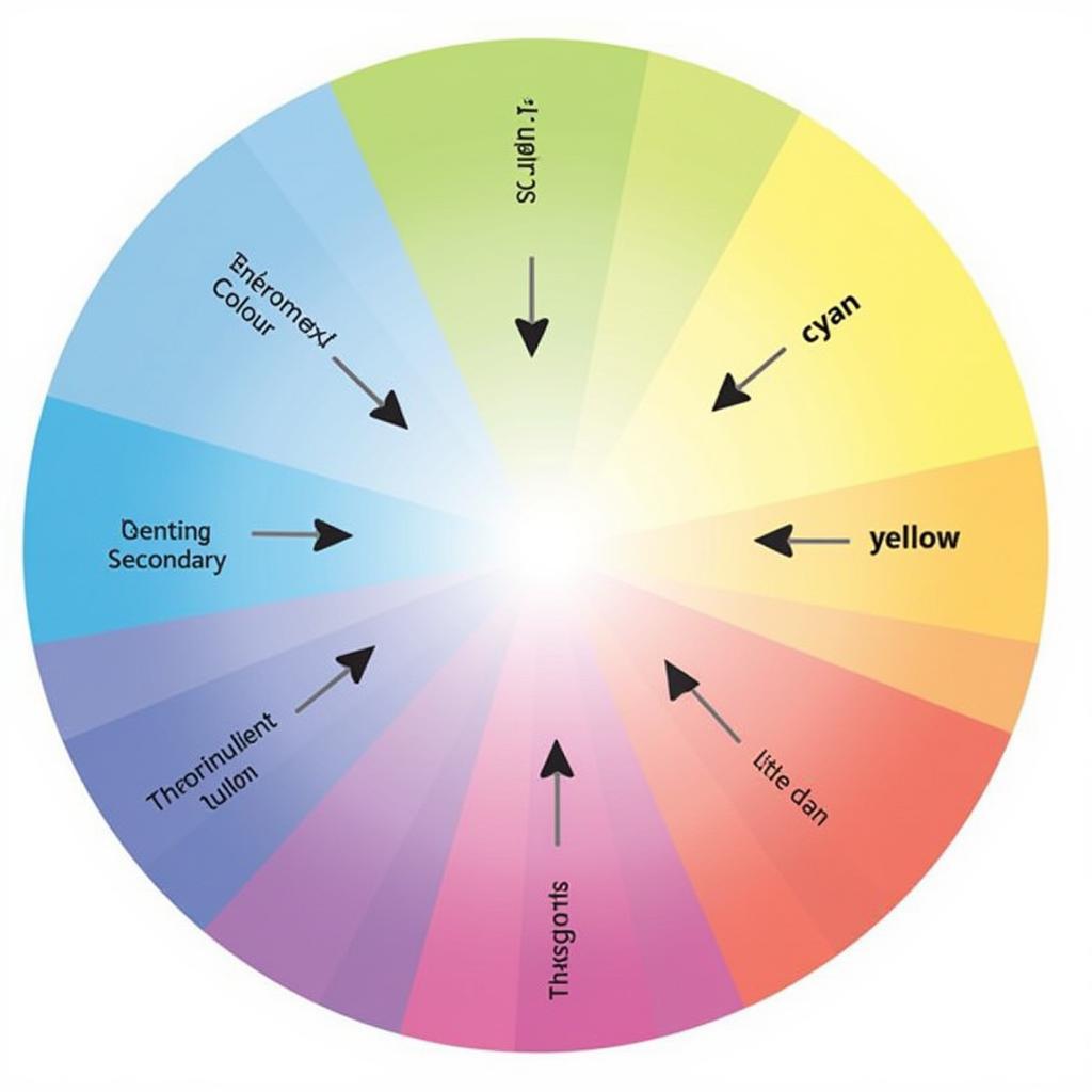 Subtractive Color Mixing Chart
Beyond the Basics: Understanding Color Gamut
While we often talk about colors in absolute terms, the range of colors a particular medium can reproduce is limited. This range is known as the color gamut. For instance, the colors you see on your computer screen, which uses the additive RGB color model, are different from the colors a printer using the CMYK model can produce. Understanding the concept of color gamut is crucial for designers and artists to manage expectations and achieve accurate color representation across different mediums.
Expert Insights:
“Mastering color is like learning a new language,” says renowned artist and color theorist, Emily Carter. “Once you understand the principles of subtractive and additive color, a whole new world of creative possibilities opens up.”
Conclusion
Subtractive color, with its interplay of pigments and light absorption, forms the backbone of how we perceive and reproduce colors in various aspects of our lives. From the vibrant canvases of artists to the printed pages of our favorite books, subtractive color adds depth, vibrancy, and meaning to our world. Understanding its principles empowers us to make informed decisions, whether we’re choosing a paint color for our living room or designing a captivating marketing brochure.
Do you have any other questions about subtractive color or need help selecting the perfect color palette for your next project?
Frequently Asked Questions
1. What is the difference between subtractive and additive color?
Subtractive color involves pigments absorbing light, while additive color involves light sources emitting light. CMYK is a subtractive color model used in printing, while RGB is an additive color model used in screens.
2. Why is black added to the CMYK model?
Theoretically, mixing cyan, magenta, and yellow should produce black. However, in practice, this mix often creates a muddy brown. Black (K) is added to achieve a true black and improve the depth and contrast in printed materials.
3. What is the importance of color gamut?
Color gamut refers to the range of colors a device or medium can reproduce. Understanding color gamut is crucial for achieving consistent and accurate color representation across different mediums, especially in design and photography.
4. How does lighting affect color perception?
The type and intensity of light can significantly impact how we perceive colors. For instance, a color might appear brighter and more vibrant under natural daylight compared to under warm incandescent lighting.
5. Where can I learn more about color theory?
Numerous online resources, books, and courses delve deeper into color theory, exploring topics like color harmony, color psychology, and their applications in various fields.
Need Expert Advice on Color Selection?
Contact us at 0373298888 or email us at [email protected]. Our team at Color Box Hanoi is always happy to assist you in choosing the perfect colors for your project. You can also visit our showroom at 86 Cầu Giấy, Hà Nội, to explore our wide range of color palettes and design solutions. We are available 24/7 to answer your queries and provide personalized guidance.