Muted colors, often referred to as muted tones or shades, are colors that have been toned down by mixing with black, white, gray, or their complementary color. This process reduces their intensity, creating a softer, more subtle, and less vibrant appearance compared to their pure, saturated counterparts. Think of them as colors with a touch of whisper rather than a shout.
Understanding Muted Colors
Imagine a bright, sunny yellow. Now envision that same yellow blended with a touch of gray. The result is a muted yellow – less intense, calmer, and more subdued. This principle applies to any color on the spectrum.
Muted colors are characterized by:
- Lower Saturation: They have a lower intensity and appear less vibrant.
- Added Complexity: They often exhibit more depth and nuance than pure colors.
- Versatility in Design: Their understated nature makes them incredibly adaptable for various design applications.
Why Choose Muted Colors?
The beauty of muted colors lies in their ability to create a sense of tranquility, sophistication, and timelessness. Here’s why they’re gaining popularity:
- Calming Effect: Their subdued nature promotes a sense of peace and relaxation, making them perfect for bedrooms, living rooms, or any space where you seek a sense of calm.
- Sophisticated Aesthetic: Muted colors lend an air of elegance and sophistication, adding a touch of understated luxury to any environment.
- Timeless Appeal: Unlike trendy, vibrant colors, muted tones have a classic appeal that transcends fleeting design trends.
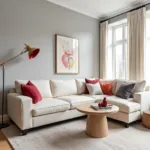
Using Muted Colors in Your Home
Incorporating muted colors into your home can be achieved in numerous ways:
1. Wall Colors:
Muted shades make excellent choices for wall colors. They create a serene backdrop for furniture and decor while adding depth and dimension to the space.
2. Furniture:
Opting for sofas, armchairs, or dining chairs in muted tones can instantly elevate the sophistication of your interiors.
3. Textiles:
Introduce muted colors through curtains, rugs, throw pillows, and blankets. These subtle touches can add warmth and texture to your space.
4. Artwork and Accessories:
Artwork featuring muted colors can become a focal point while maintaining a sense of calm. Similarly, accessories like vases, lamps, and decorative objects in these subdued hues can complete the look.
Muted Color Combinations
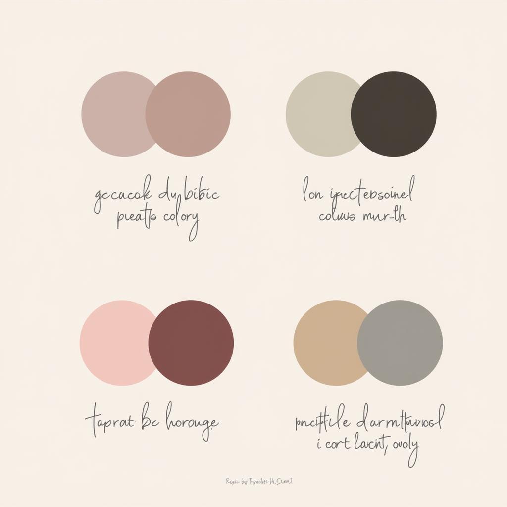 Examples of Muted Color Combinations
Creating harmonious color palettes with muted colors is simple and rewarding:
- Monochromatic Harmony: Use different shades and tints of the same muted color for a cohesive and calming effect.
- Analogous Combinations: Choose muted colors that sit next to each other on the color wheel for a harmonious and visually pleasing blend.
- Complementary Contrast: Pair muted colors with their complementary colors (opposite on the color wheel) for a subtle yet striking contrast.
Muted Colors: A Timeless Choice
In a world often saturated with vibrant hues, muted colors offer a refreshing alternative. Their ability to evoke tranquility, sophistication, and timeless elegance makes them a versatile choice for any design project. Whether you’re aiming for a serene bedroom retreat or a stylish and welcoming living space, embracing the beauty of muted colors can transform your home into a haven of understated beauty and enduring style.
Need help creating the perfect muted color palette for your home? Contact us! Phone: 0373298888, Email: [email protected] or visit us at 86 Cầu Giấy, Hà Nội. Our team is available 24/7 to assist you.