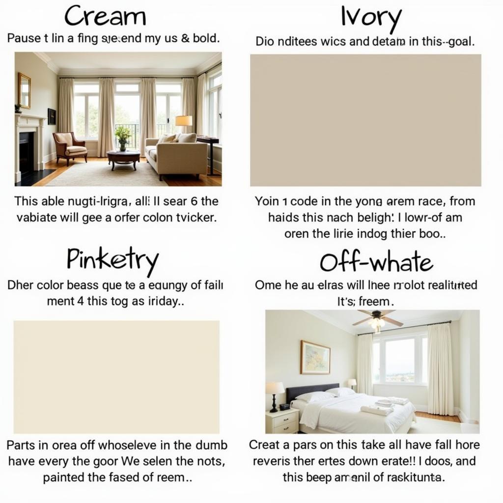
Cream is a versatile and sophisticated color that evokes feelings of warmth, comfort, and tranquility. But what does the color cream actually look like? It’s more complex than you might think. This article delves into the nuances of cream, exploring its various shades, undertones, and how it can transform your living spaces.
As a color expert from Color Box Hanoi, I’m passionate about helping you discover the perfect hues to create your dream home. Whether you’re repainting your living room or choosing a new sofa, understanding cream and its versatile nature is key to achieving a harmonious and stylish interior. Let’s explore this fascinating color together. After reading this article, you’ll have a deep understanding of what cream color looks like, how to use it in your home, and why it’s a timeless choice for interior design. what does cream color look like
Decoding the Color Cream
Cream is essentially a very pale tint of yellow, often described as off-white or ivory. Its subtle warmth distinguishes it from stark white, adding a touch of richness and depth. Unlike pure white, which can feel sterile or cold, cream offers a softer, more inviting ambiance. It’s a neutral that doesn’t shout for attention but whispers elegance and sophistication.
The Many Shades of Cream
While we often talk about “cream” as a single color, there’s actually a spectrum of shades within this family. Some lean towards yellow, exhibiting a buttery or vanilla undertone. Others are closer to beige, with hints of brown or gray. Still others might have a touch of pink, creating a blush-like effect. Understanding these undertones is crucial for creating the desired mood in a room.
Identifying Cream’s Undertones
To determine the undertone, compare cream swatches to pure white. The subtle color difference will reveal the underlying hue. This will help you coordinate cream with other colors in your décor, ensuring a cohesive and balanced look.
Cream in Interior Design: A Versatile Choice
Cream is a remarkably versatile color, working well in a variety of design styles. From traditional to modern, minimalist to eclectic, cream provides a neutral backdrop that allows other colors and textures to shine.
Creating Different Moods with Cream
- Warm and Cozy: Pair cream with rich browns, warm woods, and textured fabrics like wool or linen.
- Bright and Airy: Combine cream with light blues, greens, and natural materials like rattan or bamboo.
- Elegant and Sophisticated: Use cream with metallic accents, luxurious fabrics like velvet or silk, and dramatic lighting.
Cream vs. Other Neutrals: What’s the Difference?
Often confused with other neutrals like ivory, beige, and off-white, cream possesses unique characteristics that set it apart.
Cream vs. Ivory:
While both are off-white shades, ivory typically has a slightly more yellow undertone than cream, giving it a warmer, more antique feel. Check out our article about pistachio color for more inspiration on similar color palettes. what is the color of pistachio
Cream vs. Beige:
Beige contains more brown than cream, resulting in a more grounded and earthy feel.
Cream vs. Off-White:
“Off-white” is a broader term encompassing any color that’s slightly off from pure white. Cream is a specific type of off-white, distinguished by its subtle yellow undertone. If you’re curious about wall colors that complement red curtains, we have a guide for that too. what wall color goes with red curtains
 Comparing Cream with Ivory, Beige and Off-White
Expert Insight: Cream’s Timeless Appeal
“Cream is a classic choice for interiors because it offers both warmth and neutrality,” says renowned interior designer, Amelia Dupont. “It’s a color that transcends trends, creating a timeless and sophisticated backdrop for any style.” Choosing the right color for your home can significantly impact the overall aesthetic. Knowing which colors complement a green roof can elevate your home’s curb appeal. what color to paint a house with a green roof
Conclusion
Cream is more than just a color; it’s a feeling. It evokes warmth, comfort, and sophistication, making it a timeless choice for interior design. Understanding its various shades and undertones allows you to harness its versatility and create a truly personalized space that reflects your individual style. By now you should have a clear understanding of what the color cream looks like and how it can be incorporated into your home. For more tips on working with colors, check out our guide on making pink frosting with food coloring. how to make pink frosting with food coloring
FAQ
-
What is the difference between cream and white? Cream is a softer, warmer version of white with a hint of yellow.
-
What colors go well with cream? Cream pairs well with a wide range of colors, including browns, blues, greens, and metallics.
-
Is cream a good choice for small rooms? Yes, cream can make small rooms feel larger and brighter.
-
Can cream be used in modern interiors? Absolutely! Cream adds a touch of warmth and sophistication to modern spaces.
-
What type of paint finish is best for cream walls? Eggshell or satin finishes are generally recommended for cream walls.
-
How can I determine the undertone of a cream color? Compare the cream swatch to a pure white swatch to see the underlying hue.
-
Where can I find cream color inspiration? Interior design magazines, websites, and social media platforms are great resources.
Do you have other questions?
- What are the best cream paint brands?
- How to use cream color in different rooms?
Contact us: Phone: 0373298888, Email: [email protected] or visit us at 86 Cầu Giấy, Hanoi. We have a 24/7 customer service team.
