Color chroma is a key element of color theory that significantly impacts our visual experience. It refers to the intensity or purity of a color. Understanding chroma is crucial for anyone working with colors, from artists and designers to homeowners choosing paint for their living spaces.
Defining Color Chroma
In simple terms, chroma is the attribute of a color that defines its strength or weakness. High chroma colors appear vibrant and saturated, while low chroma colors seem duller and closer to gray. Imagine a spectrum with a pure hue at one end and a completely desaturated gray at the other. Chroma determines where a particular color falls on this spectrum.
The Role of Chroma in Color Theory
Chroma is one of the three main components of color, along with hue (the actual color family) and value (lightness or darkness). These three elements work together to create the vast range of colors we perceive.
Hue, Value, and Chroma: A Dynamic Trio
Understanding how hue, value, and chroma interact is essential for effective color manipulation:
- Hue: This is the pure state of color, such as red, blue, or green. It’s the most basic characteristic that helps us differentiate one color from another.
- Value: This describes the lightness or darkness of a color. It ranges from pure black to pure white. Adding black to a hue creates a shade, while adding white creates a tint.
- Chroma: This determines the intensity or saturation of a color. High chroma colors are bold and eye-catching, while low chroma colors appear more muted and subdued.
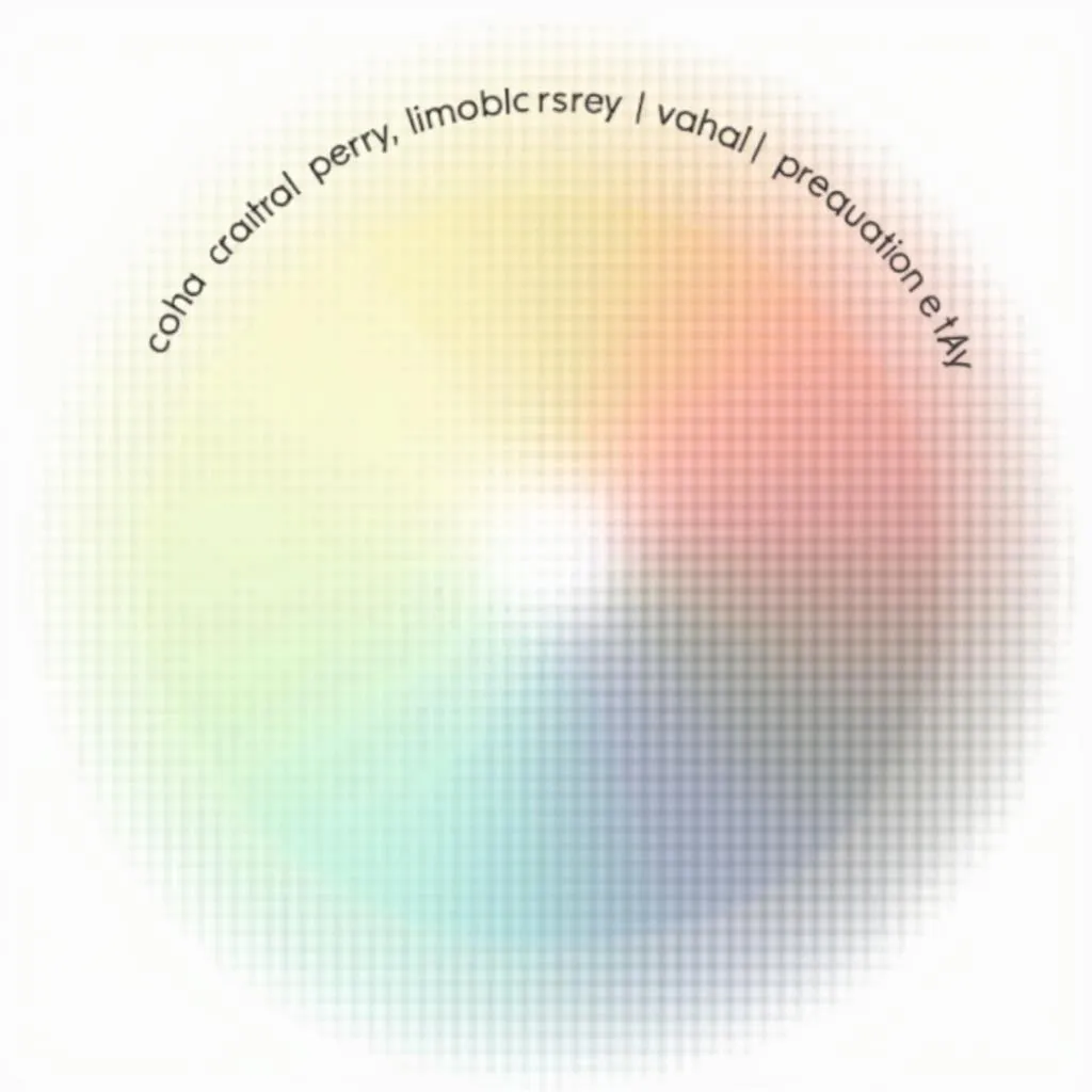 Color Chroma Illustration
The Impact of Chroma on Design and Emotion
Chroma plays a vital role in visual communication and evokes a range of emotional responses:
- High Chroma: Colors with high chroma are energetic, attention-grabbing, and often associated with excitement, passion, and playfulness.
- Low Chroma: Colors with low chroma are more subtle, calming, and often linked to feelings of peace, sophistication, and tranquility.
Designers carefully consider chroma to create specific moods and atmospheres. For instance, a vibrant, high-chroma color palette might be ideal for a children’s playroom, while a more subdued, low-chroma scheme could be suitable for a relaxing bedroom.
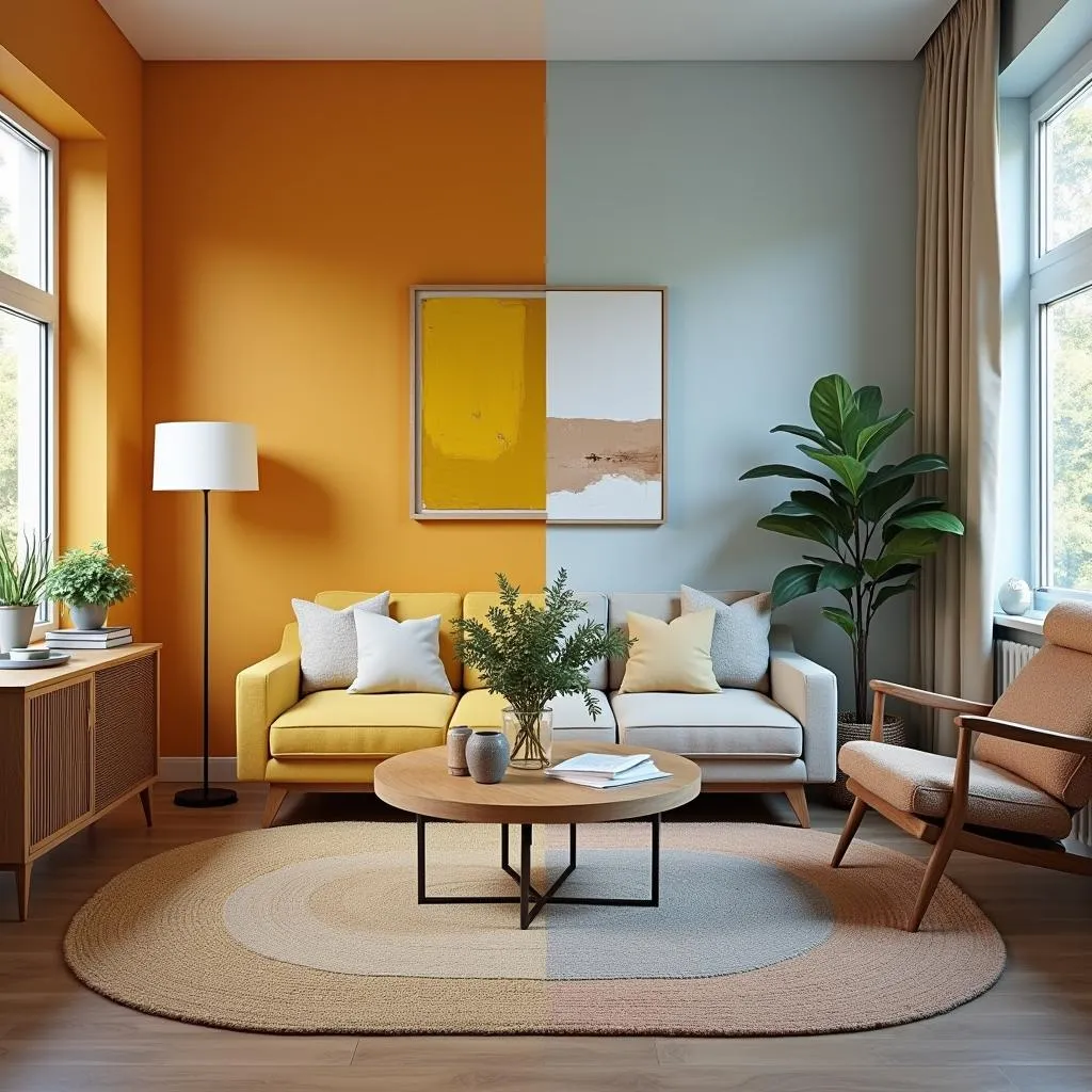 Interior Design with Varying Color Palettes
Practical Applications of Color Chroma
Understanding color chroma has numerous practical applications, especially in fields like design, art, and even fashion:
- Painting and Decorating: Choosing paint colors with the right chroma can dramatically impact the mood and feel of a room.
- Graphic Design: Designers manipulate chroma to create visually appealing logos, marketing materials, and websites that effectively communicate brand messages.
- Fashion: Chroma plays a crucial role in fashion, influencing the overall impact of an outfit. What color top to wear with rust colored pants often depends on understanding how chroma affects the overall look.
- Photography: Photographers use their knowledge of chroma to control the mood and impact of their images during both shooting and editing processes.
Mastering Chroma: Tips for Choosing the Right Colors
Here are some expert tips for effectively utilizing color chroma:
- Consider the Mood: Determine the desired atmosphere of your space or design project and choose colors with a chroma level that aligns with that mood.
- Balance is Key: Don’t be afraid to mix high and low chroma colors to create visual interest and balance.
- Test Before You Commit: Always test paint colors in your space and view fabric swatches in different lighting conditions to see how the chroma appears.
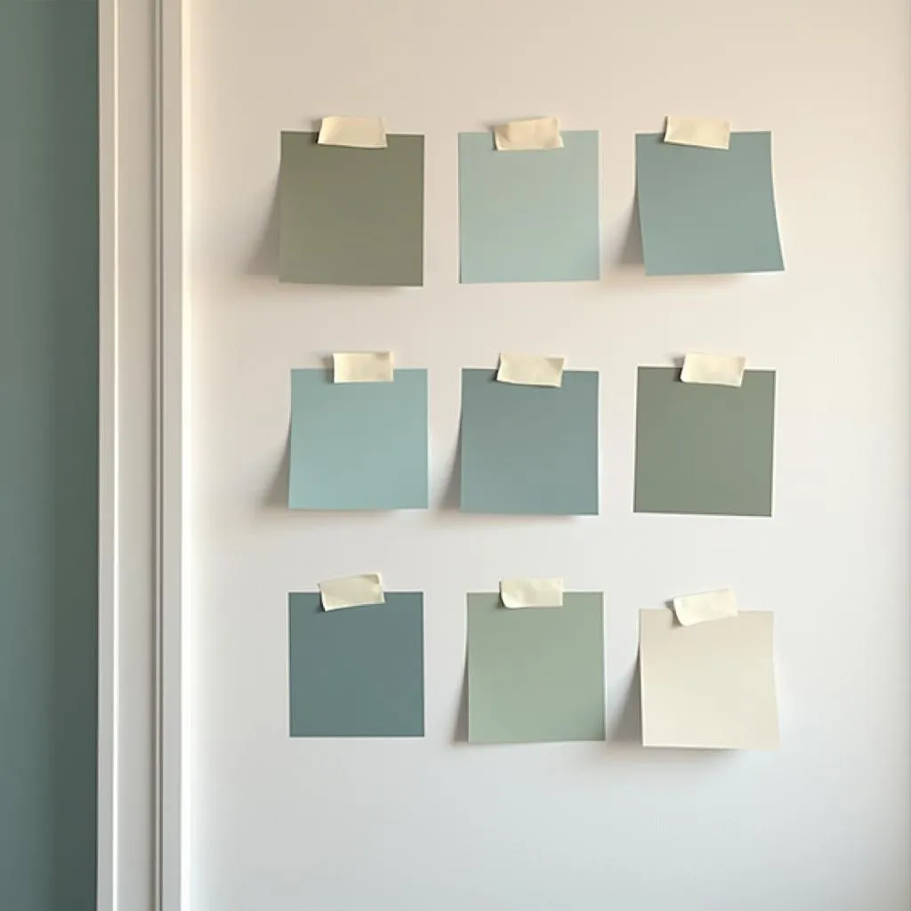 Testing Color Swatches on a Wall
Conclusion
Color chroma is a fundamental element of color theory that significantly impacts our visual experience. Understanding its role in creating mood, conveying messages, and influencing perception is crucial for anyone working with colors. By mastering the art of chroma, you can unlock a world of possibilities and elevate your designs to a new level of sophistication and impact.
FAQs
1. What is the difference between saturation and chroma?
While often used interchangeably, saturation and chroma have subtle differences. Saturation refers to the intensity of a color relative to its own brightness, while chroma measures the purity of a color compared to a pure hue of the same lightness.
2. Can you change the chroma of a color?
Yes, chroma can be altered by adding gray or a complementary color. Adding gray reduces the intensity, while adding a complementary color can either enhance or neutralize the original color’s chroma depending on the proportions used.
3. How can I use chroma to create a harmonious color palette?
Harmonious color palettes often utilize a balance of high and low chroma colors. For instance, you could pair a high chroma accent color with a more muted, low chroma background for a balanced and visually appealing effect.
4. What are some examples of high chroma colors in nature?
Many flowers, such as sunflowers, poppies, and tulips, exhibit high chroma colors. Additionally, certain fruits like strawberries and raspberries display vibrant, high-chroma hues.
5. Can color chroma affect my mood?
Yes, color psychology suggests that high chroma colors can evoke feelings of energy and excitement, while low chroma colors promote calmness and relaxation. Choosing the right chroma for your surroundings can influence your emotional state.
Need Help with Colors?
Finding the perfect color palette can be challenging. If you need assistance with color selection, paint consultations, or have any color-related questions, contact us!
Phone: 0373298888
Email: [email protected]
Address: 86 Cầu Giấy, Hà Nội
Our team of color experts at Color Box Hanoi is available 24/7 to guide you in creating your dream space!