Bold Colors: A Guide to Using Vibrant Hues in Design and Fashion
Bold colors are those that command attention and evoke a sense of energy, confidence, and vibrancy. Unlike muted or pastel shades, bold colors pack a punch, making a statement in any setting. They are not afraid to stand out and can transform a space from ordinary to extraordinary. But what exactly makes a color “bold”? It’s not just about being bright; it’s about the intensity and saturation of the hue. Think rich jewel tones, vibrant primaries, and deep, saturated shades that draw the eye and leave a lasting impression.
Understanding Bold Colors
The impact of bold colors goes beyond mere aesthetics. They have the power to influence our moods, perceptions, and even behaviors. Here’s a closer look at what defines bold colors and how they work their magic:
Characteristics of Bold Colors:
- High Saturation: Bold colors are intensely pigmented, meaning they have a high level of saturation. This saturation gives them their vibrancy and makes them pop against other colors.
- Strong Contrast: Bold colors often stand in stark contrast to their surroundings, whether it’s against a neutral backdrop or paired with a complementary color.
- Emotional Impact: These colors evoke strong emotional responses. They can be energizing, passionate, dramatic, or even calming, depending on the specific hue and how it’s used.
Using Bold Colors in Design
While bold colors can add drama and personality to any space, using them effectively requires a thoughtful approach. Here are some tips to master the art of bold color integration:
1. Start Small
If you’re hesitant to go all-in with bold colors, start by incorporating them in smaller doses. An accent wall, a statement piece of furniture, or even colorful throw pillows can introduce a pop of color without overwhelming the space.
2. Balance is Key
Bold colors work best when balanced with neutral tones. Think of neutrals as the calming counterpoint to the vibrancy of bold hues. White, beige, gray, or even natural wood tones can prevent a space from feeling overly stimulating.
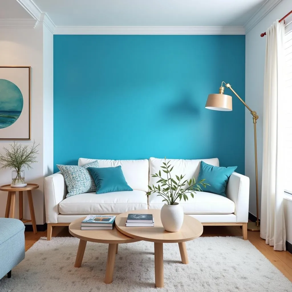 Living room with a bold blue accent wall
3. Consider the Mood
Each bold color has its own unique personality and evokes different emotions. For example:
- Red: Stimulating, passionate, and energetic
- Orange: Enthusiastic, creative, and social
- Yellow: Cheerful, optimistic, and uplifting
- Green: Refreshing, harmonious, and natural
- Blue: Calming, trustworthy, and serene
- Purple: Luxurious, mysterious, and creative
Choose colors that align with the mood you want to create in your space.
4. Experiment with Patterns and Textures
Don’t be afraid to play with patterns and textures when incorporating bold colors. Geometric prints, floral designs, or even textured fabrics can add depth and visual interest.
Expert Insight: “When working with bold colors, remember that a little goes a long way. Don’t be afraid to experiment, but always trust your instincts and choose colors that resonate with you.” – Amelia Grant, Interior Designer and Color Specialist
Bold Colors in Fashion
Just as in interior design, bold colors can make a powerful statement in fashion. Wearing bold colors can boost confidence, express individuality, and turn heads.
Tips for Wearing Bold Colors:
- Identify your “Wow” Colors: What colors make you feel your best? Experiment with different shades to find the ones that flatter your skin tone and make you feel confident.
- Start with Accessories: If you’re new to wearing bold colors, ease in by adding pops of color with accessories like scarves, jewelry, or shoes.
- Create a Focal Point: Use a bold color to highlight a specific part of your outfit, like a statement top or a vibrant pair of pants.
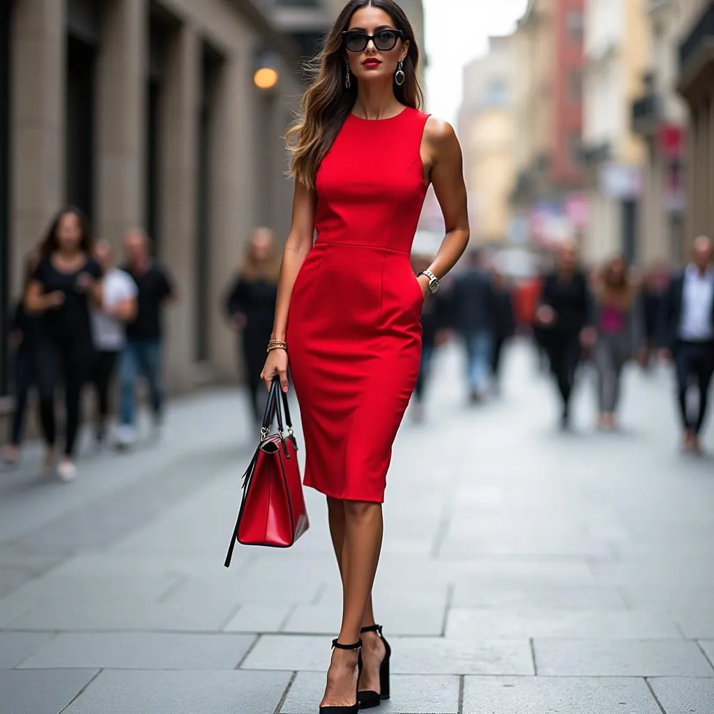 Woman in a red dress
- Mix and Match: Don’t be afraid to combine different bold colors. Look to the color wheel for inspiration. Complementary colors (opposite each other on the wheel) create a dynamic contrast.
Conclusion
Bold colors are a powerful tool for self-expression, whether you’re designing a space or crafting a personal style. By understanding the principles of color theory and using bold hues strategically, you can create impactful and inspiring environments that reflect your unique personality.
Are you ready to embrace the power of bold colors?
FAQs
1. What’s the best way to incorporate bold colors if I’m afraid of overwhelming my space?
Start small! Try a bold accent wall, colorful throw pillows, or a statement piece of furniture. You can gradually add more bold elements as you become more comfortable.
2. What are some good neutral colors to pair with bold hues?
White, beige, gray, and natural wood tones are all excellent choices to balance out the intensity of bold colors.
3. Can I use more than one bold color in a room?
Absolutely! You can create stunning combinations by pairing complementary colors or sticking to a specific color scheme.
4. What if I’m not sure which bold colors suit me best?
Experiment! Try on different colors and pay attention to which ones make you feel confident and radiant. You can also seek advice from a stylist or color consultant.
5. Are bold colors only suitable for modern design styles?
Not at all! Bold colors can work in a variety of design styles, from traditional to eclectic. It’s all about finding the right balance and application.
Need more color inspiration? Check out these articles:
- What color is caramel hair color
- What color is licorice
- What colors compliment yellow
- What is color magic
- What color to wear with purple pants
For personalized color consultations and expert guidance, contact Color Box Hanoi at:
Phone: 0373298888
Email: [email protected]
Address: 86 Cầu Giấy, Hà Nội
Our team is available 24/7 to help you transform your spaces with the power of color!