Matching colors can make or break your Canva designs. Whether you’re creating a social media post, a presentation, or even a logo, the right color combinations can elevate your work from average to amazing. This guide will teach you the secrets of color matching in Canva, empowering you to create visually stunning and impactful designs that capture attention and leave a lasting impression.
Understanding the Canva Color Palette
Before diving into color matching techniques, it’s essential to familiarize yourself with Canva’s color palette and tools. Canva offers a wide array of colors and provides intuitive tools to help you find and apply the perfect hues for your designs.
 Canva Color Palette
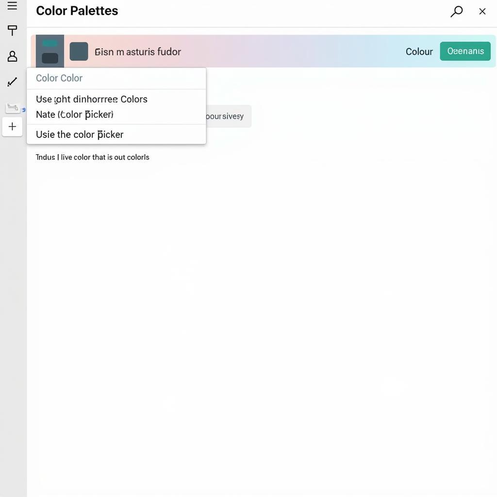
Here’s a breakdown of the key color features:
- Document Colors: Canva automatically generates a set of complementary colors based on the images and elements in your design.
- Color Picker: This tool allows you to select any color from the spectrum, giving you complete control over your palette.
- Hex Codes: For precise color matching, you can input specific hex codes to ensure consistency across your designs.
Color Matching Methods in Canva
Canva offers several methods to help you match colors effectively:
1. Using the Color Wheel
The color wheel is a fundamental tool for understanding color relationships. Canva’s color wheel provides a visual representation of different color harmonies, making it easy to create balanced and appealing palettes.
Here are some popular color harmonies you can explore:
- Complementary: Colors opposite each other on the color wheel, creating a vibrant and energetic contrast.
- Analogous: Colors adjacent to each other on the color wheel, offering a harmonious and soothing effect.
- Triadic: Three colors evenly spaced on the color wheel, forming a balanced and visually engaging combination.
2. Leveraging Canva Templates
Canva offers a vast library of professionally designed templates that already have well-matched color palettes.
By choosing a template that aligns with your design aesthetic, you can effortlessly incorporate a pre-selected set of colors that work well together.
3. Exploring Color Inspiration
If you’re feeling uninspired, Canva provides various avenues to spark your creativity:
- Photo Colors: Upload an image you love, and Canva will extract a color palette based on the dominant colors in the photo.
- Color Palettes: Browse through a curated collection of color palettes created by designers, offering a diverse range of options to suit any style.
Tips for Effective Color Matching
Here are some additional tips to help you master the art of color matching in Canva:
- Limit Your Palette: Stick to 2-3 primary colors and their variations to avoid overwhelming your design.
- Consider Contrast: Ensure sufficient contrast between text and background colors for readability.
- Test Your Designs: View your designs on different devices and adjust colors accordingly to ensure they translate well across platforms.
Conclusion
Mastering color matching in Canva empowers you to create visually stunning and impactful designs. By understanding color relationships, utilizing Canva’s tools, and following these tips, you’ll be well on your way to crafting designs that captivate your audience and effectively communicate your message. So, go ahead and experiment with different color combinations and unleash your creativity!
Remember, at Color Box Hanoi, we’re passionate about helping you unlock the power of color. If you need assistance in selecting the perfect colors for your next project, our team of experts is always ready to help. Contact us at 0373298888, email us at [email protected], or visit our showroom at 86 Cầu Giấy, Hanoi. Let us help you create spaces that inspire!
