As color experts and design enthusiasts at Color Box Hanoi, we often get asked, “What Color Attracts The Human Eye Most?” It’s a fascinating question that delves into the science of color perception and the psychology of visual appeal. While the answer isn’t as simple as naming a single hue, we can explore the captivating world of color and unravel the secrets behind eye-catching shades.
The Science of Color Perception
To understand why certain colors grab our attention, we need to understand how we see color in the first place. The human eye has specialized cells called cones that are responsible for color vision. These cones are most sensitive to three primary colors of light: red, green, and blue.
When light hits an object, some wavelengths are absorbed, while others are reflected. The reflected wavelengths reach our eyes, and our brains interpret these signals as different colors. For example, a red apple absorbs most wavelengths except for red, which is reflected, making us perceive it as red.
So, What Color Stands Out?
While personal preferences play a role, research suggests that high-contrast colors are generally more noticeable. Our brains are wired to quickly identify differences and patterns, and high contrast helps us do just that.
The Power of Yellow
Often cited as the most visible color, yellow has the highest wavelength visibility. This means it’s the easiest color for our eyes to detect, especially in daylight. Think about caution signs, taxis, and even school buses – they all utilize yellow to grab attention.
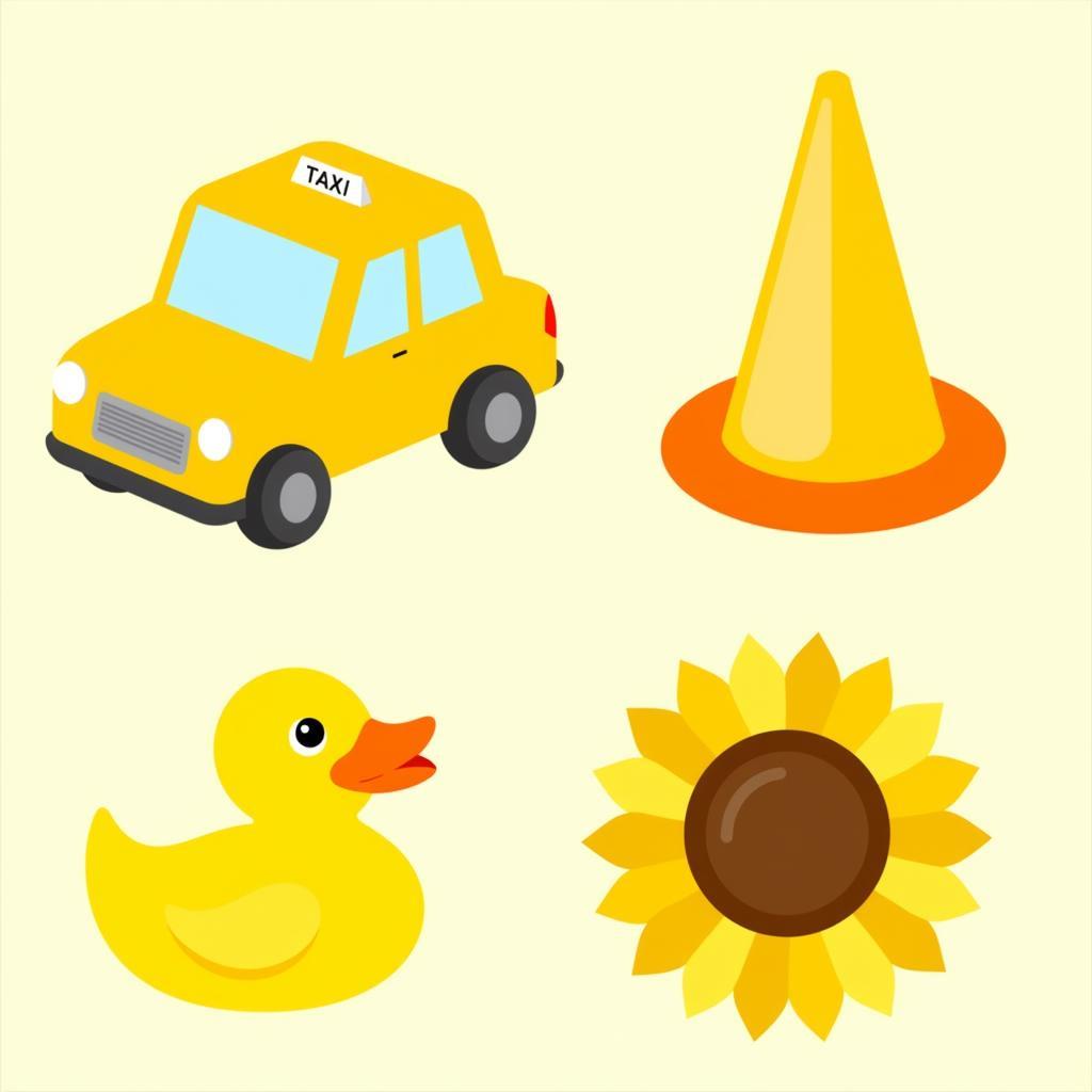 Objects in a vibrant yellow hue.
The Boldness of Red
Red, on the other hand, evokes strong emotions and has a powerful psychological impact. It’s associated with excitement, passion, and even danger. Red tends to advance in our field of vision, making it appear closer and more prominent. That’s why it’s often used for stop signs, fire trucks, and sale banners.
 A red stop sign stands out against a blue sky.
Beyond Individual Colors: Contrast and Context
While individual colors have their unique properties, contrast is key to visual impact. A color that pops against one background might blend in with another. For instance, black text on a yellow background creates a high contrast, making it easy to read. Similarly, a bright green logo will stand out against a purple background but might get lost on a green one.
The Color Box Hanoi Approach
At Color Box Hanoi, we believe in harnessing the power of color to create spaces that inspire and delight. We understand that choosing the right colors goes beyond personal preference—it’s about understanding the science of color perception, the psychology of color association, and the impact of contrast and context.
Our team of color experts will work closely with you to understand your vision, style, and the mood you want to create. We’ll guide you through the world of color, helping you select the perfect palette to transform your space and reflect your unique personality.
Conclusion
While there’s no single “most eye-catching” color, understanding the science of color perception, the power of contrast, and the influence of context can help you make informed decisions about color.
Whether you’re drawn to the vibrancy of yellow, the boldness of red, or the tranquility of blue, we’re here to help you create a space that speaks to you. Contact Color Box Hanoi today at 0373298888 or email us at [email protected]. Let’s embark on a colorful journey together!