Color plays a crucial role in capturing attention, evoking emotions, and influencing perceptions. Whether it’s a vibrant storefront or a captivating website, understanding the psychology of color can be the key to standing out and making a lasting impression. But with a vast spectrum of hues to choose from, what colors truly attract people’s attention? Let’s dive into the science and art of color psychology to unravel the secrets behind attention-grabbing shades.
The Science of Eye-Catching Colors
Our eyes are naturally drawn to bright, high-contrast colors. These hues stimulate our visual cortex more intensely, sending stronger signals to our brain. This primal instinct stems from our evolutionary past, where vibrant colors in nature often signaled food, danger, or potential mates.
The Power of Warm Colors
-
Red: The most emotionally intense color, red evokes feelings of excitement, passion, and urgency. It’s known to increase heart rate and create a sense of alertness, making it ideal for grabbing attention in a crowded space.
-
Orange: A vibrant and energetic hue, orange is associated with enthusiasm, creativity, and warmth. It’s often used to draw attention to call-to-actions and create a sense of friendliness.
-
Yellow: The most visible color to the human eye, yellow is synonymous with optimism, happiness, and energy. It’s attention-grabbing, particularly when paired with black, making it effective for signage and warnings.
The Allure of Cool Colors
While warm colors energize, cool colors soothe and instill a sense of trust and professionalism.
-
Blue: The color of calmness, trust, and reliability. Blue is often favored by brands seeking to convey a sense of security and stability. It’s also known to enhance creativity and focus.
-
Green: Associated with nature, growth, and harmony. Green promotes a sense of peace and tranquility, making it a popular choice for businesses in the health and wellness sectors.
-
Purple: Historically associated with royalty, luxury, and wisdom. Purple can add a touch of sophistication and intrigue to a brand.
The Impact of Contrast and Context
While individual colors hold power, it’s their interplay and context that truly amplify their attention-grabbing potential.
-
High Contrast: Combining light and dark shades, like black and yellow or blue and white, creates a striking visual impact, making designs more readable and memorable.
-
Complementary Colors: Using colors opposite each other on the color wheel, such as red and green or blue and orange, creates a vibrant and dynamic contrast that naturally draws the eye.
-
Cultural Considerations: Color associations can vary across cultures. For instance, while white signifies purity in many Western cultures, it’s associated with mourning in some Eastern cultures. Understanding these nuances is crucial when targeting specific audiences.
Beyond Aesthetics: Functionality and Purpose
When choosing colors to attract attention, it’s essential to consider the intended message and desired action.
-
Call to Action: Bold, high-contrast colors like red or orange are effective for buttons and calls to action, as they create a sense of urgency and encourage immediate interaction.
-
Brand Identity: Colors should align with the brand’s personality and values. For example, a natural skincare brand might opt for calming greens and blues, while a tech company might choose energizing oranges and yellows.
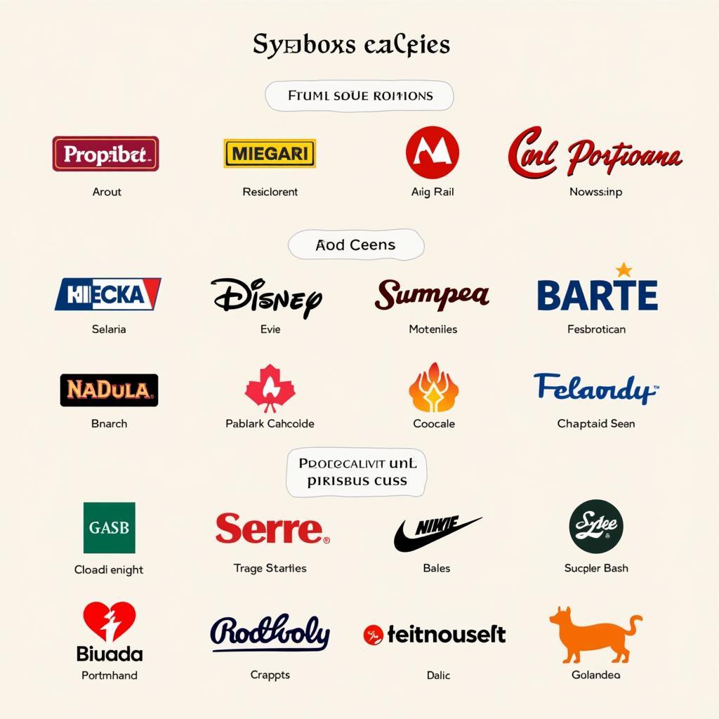 Color Psychology in Branding
Expert Insights
“Color is a powerful tool that can make or break a design,” says renowned graphic designer, Sarah Jones. “Understanding how colors evoke emotions and influence perceptions is crucial for creating impactful visuals that resonate with the target audience.”
Conclusion
The colors that attract people’s attention are those that tap into our primal instincts, cultural associations, and psychological responses. By understanding the science and art of color psychology, you can harness the power of color to create captivating designs that stand out, engage your audience, and leave a lasting impression. Whether you’re designing a website, a logo, or a marketing campaign, choosing the right color palette can be the key to success.
Need help finding the perfect colors to bring your vision to life? Contact Color Box Hanoi today at 0373298888, email us at [email protected], or visit us at 86 Cầu Giấy, Hà Nội. Our team of color experts is available 24/7 to provide personalized guidance and help you create spaces that inspire.