When diving into the world of color, especially in art, design, or even cosmetics, you might come across the term “opaque.” But what exactly does it mean for a color to be opaque, and how does it differ from its counterpart, transparency?
Understanding Opacity in Color
In simple terms, opacity refers to a color’s ability to block light from passing through it. An opaque color is dense and doesn’t allow light to penetrate, meaning you cannot see through it. Imagine a thick coat of paint on a wall – that’s an example of opacity.
 Opaque paint on a wall
On the other hand, transparency is the opposite. A transparent color allows light to pass through, making it possible to see what’s behind it. Think of a clear glass window – that’s transparency in action.
The Spectrum of Opacity
Opacity isn’t a simple on/off switch. It exists on a spectrum, ranging from completely opaque to completely transparent. Between these two extremes, we find varying degrees of translucency. A translucent color allows some light to pass through but not enough to see clearly through it. Think of frosted glass – it’s translucent.
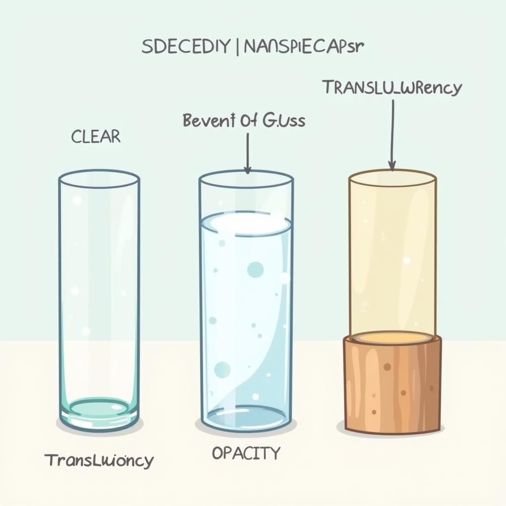 Spectrum of transparency, translucency, and opacity
Factors Affecting Opacity
Several factors influence a color’s opacity:
- Pigment Concentration: The higher the concentration of pigment in a medium (like paint or ink), the more opaque it becomes.
- Medium Thickness: Applying a thicker layer of a color generally increases its opacity.
- Surface Properties: The texture and absorbency of the surface you’re applying the color to can also impact its final opacity.
The Importance of Opacity in Different Fields
Understanding opacity is crucial in various disciplines:
- Art and Painting: Artists manipulate opacity to create depth, layering, and various visual effects. Underpainting, for instance, utilizes the concept of opacity to build layers of color and luminosity in a painting.
- Design: Designers consider opacity when working with digital images, logos, and website layouts. Controlling the opacity of elements allows them to create overlays, subtle effects, or highlight specific areas. You can learn more about choosing the right underpainting color here: how to choose underpainting color.
- Printing: In printing, opacity determines how well a color covers the surface and prevents underlying colors from showing through.
- Cosmetics: Have you ever wondered if you can see through colored contact lenses? The answer lies in their opacity. Can you see through colored contacts? The opacity of the lens pigment determines how much of your natural eye color shows through.
Mastering Opacity for Stunning Results
Whether you’re an artist layering colors on a canvas or a designer playing with digital elements, understanding opacity empowers you to:
- Create Depth and Dimension: Use opaque colors for foreground elements and more transparent colors for background elements to create a sense of depth.
- Control Emphasis and Focus: Layer translucent colors to subtly shift attention or use opaque colors to create bold statements and draw the eye.
- Achieve Visual Harmony: Balance opaque and transparent elements to create a harmonious and visually appealing composition.
“Understanding the interplay of opacity and transparency is like mastering the art of visual storytelling,” says renowned artist and color expert, Emily Carter. “It’s about using these tools to guide the viewer’s eye, evoke emotions, and create a truly captivating experience.”
Conclusion
Opacity is a fundamental concept in the world of color, impacting how we perceive and interact with the visual world. By understanding its nuances and applications, we can unlock a world of creative possibilities, from crafting stunning artwork to designing impactful visuals and even choosing the right contact lenses. So, embrace the power of opacity and let your creativity shine through!