Have you ever wondered, “What Is The Least Favorite Color?” It seems like a simple question, but the answer is surprisingly complex and fascinating. While personal preferences play a huge role in color perception, there’s often a consensus about the least appealing shades. Let’s dive into the intriguing world of color and explore why some hues consistently rank low on the popularity scale.
The Science of Color Aversion
Our responses to color aren’t arbitrary. Scientific studies suggest that our color preferences are influenced by a combination of biological, cultural, and psychological factors:
- Biology: Our eyes perceive color based on the wavelengths of light reflected by objects. Some research suggests that our brains may be hardwired to dislike certain wavelengths associated with unpleasant experiences, such as rotten food or disease.
- Culture: Color symbolism varies widely across cultures. Colors that hold positive connotations in one culture might be associated with negative emotions in another. For example, while white is often associated with purity and peace in Western cultures, it can symbolize mourning in some Eastern cultures.
- Personal Experiences: Our individual experiences shape our emotional responses to different colors. A negative experience associated with a particular color can create a lasting aversion.
Uncovering the Usual Suspects: Colors Often Ranked Low
While individual preferences vary, some colors consistently appear at the bottom of the list when it comes to global favorites. These include:
1. Yellowish-Green
Often described as “puke green,” this hue is widely disliked. Its association with illness and decay likely contributes to its low ranking.
2. Brownish-Orange
This muddy color often evokes feelings of dirtiness and unpleasant textures. Its lack of vibrancy makes it unappealing in many contexts.
3. Gray
While not always actively disliked, gray is rarely anyone’s favorite. Its neutrality can be perceived as dull, boring, and lacking emotion.
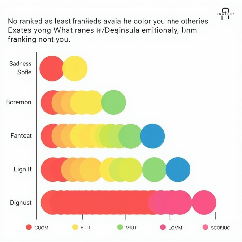 chart of color associations
The Impact of Context
It’s essential to remember that color perception is fluid and context-dependent. A color considered unattractive in one situation might be perfectly suited for another:
- Interior Design: While yellowish-green walls might seem unappealing, accents in this color can add a touch of organic warmth to a space.
- Fashion: While brown-orange might not be a popular choice for clothing, it can work well in accessories or as a statement piece.
Beyond “Least Favorite”: Embracing the Subjectivity of Color
Ultimately, the concept of a universally “least favorite” color is subjective and nuanced. What one person finds repulsive, another might find intriguing. Color preferences are deeply personal and influenced by a complex interplay of factors.
FAQs
Q: Is there a scientific reason why some colors are universally disliked?
A: While there’s no definitive answer, research suggests that biological predispositions, cultural influences, and personal experiences all contribute to our color preferences.
Q: Can color preferences change over time?
A: Yes, our tastes and perceptions can evolve based on exposure to new experiences and cultural shifts.
Q: Are there any industries where typically disliked colors are used effectively?
A: Absolutely! Designers often utilize unexpected color combinations to evoke specific emotions or create visual interest.
Need Help Navigating the World of Color?
At Color Box Hanoi, we understand that choosing the right colors for your space can feel overwhelming. Our team of color experts is here to guide you through the process and help you create a home that reflects your unique style. Contact us at 0373298888, email us at [email protected], or visit our showroom at 86 Cầu Giấy, Hà Nội. We’re here to help you transform your space with the power of color!