Bob Ross, the beloved painter and television personality, captivated audiences with his soothing voice, gentle demeanor, and ability to create stunning landscapes in just 26 minutes. But have you ever wondered, “What colors does Bob Ross use?” While his paintings appear rich and complex, Ross achieved his signature style using a limited palette of just a few key oil paints.
The Magic Behind Bob Ross’s Limited Color Palette
Ross championed a simplified approach to painting, encouraging aspiring artists to overcome their fear of the blank canvas and discover the joy of creativity. His limited color palette, consisting primarily of ten colors, played a crucial role in his teaching method.
By working with a restricted set of paints, Ross demonstrated that beautiful and intricate artwork doesn’t require a vast and overwhelming array of hues. This approach allowed him to break down the complexities of color mixing and blending into manageable steps, making oil painting accessible to everyone.
Deconstructing the Bob Ross Color Palette: The Core Ten
At the heart of Ross’s painting method lies a core set of ten oil colors. These versatile hues, when combined with his signature wet-on-wet technique, formed the foundation of his iconic landscapes. Let’s explore these colors:
- Titanium White: The workhorse of the palette, used for blending, highlighting, and creating those fluffy clouds.
- Phthalo Blue: A vibrant, intense blue perfect for skies and water reflections.
- Prussian Blue: A darker, more subdued blue ideal for adding depth to shadows and foliage.
- Cadmium Yellow: A warm, sunny yellow perfect for depicting sunlight and floral highlights.
- Alizarin Crimson: A deep, cool red used to create rich shadows and vibrant floral accents.
- Sap Green: A natural, earthy green used for foliage, grassy fields, and mossy textures.
- Van Dyke Brown: A dark, warm brown perfect for tree trunks, rocks, and adding depth to shadows.
- Burnt Umber: A reddish-brown hue used for underpainting and creating warm, earthy tones.
- Cadmium Yellow Light: A lighter, brighter yellow often used for highlights and creating vibrant greens.
- Ivory Black: While Ross rarely used pure black, Ivory Black was essential for darkening colors and creating dramatic contrasts.
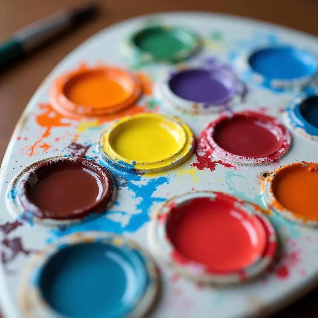 Bob Ross's signature oil painting palette
Beyond the Basics: Expanding the Bob Ross Palette
While Ross primarily relied on his core ten colors, he occasionally introduced additional hues to expand his creative possibilities. These additions, used sparingly, added subtle nuances and variety to his paintings. Some of these supplementary colors included:
- Yellow Ochre: A muted, earthy yellow for creating warm undertones and depicting sand or dirt paths.
- Indian Yellow: A vibrant, transparent yellow often used for depicting sunlight filtering through foliage.
- Sap Green Dark: A deeper, richer green for adding depth and shadow to foliage.
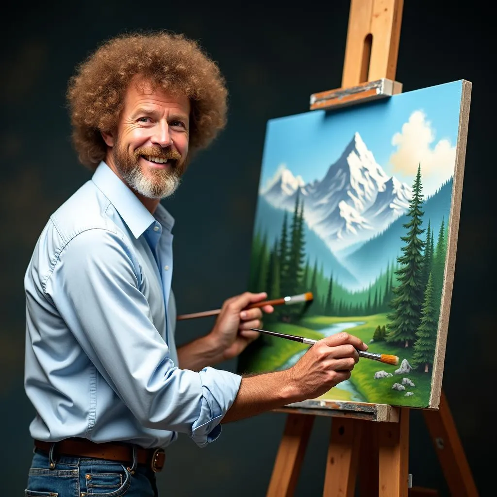 Bob Ross demonstrating his wet-on-wet technique while painting a mountain landscape
The Power of Simplicity: Lessons from Bob Ross’s Color Choices
Bob Ross’s legacy extends far beyond his paintings. His approachable teaching style and emphasis on simplicity continue to inspire aspiring artists of all ages. His limited color palette serves as a powerful reminder that you don’t need expensive tools or complex techniques to create beautiful art.
By focusing on the fundamentals of color mixing and blending, Ross empowered individuals to explore their creativity and discover the joy of painting. So, the next time you find yourself staring at a blank canvas, remember the lessons of Bob Ross. Embrace the power of simplicity, pick up a brush, and let your imagination run wild.