Choosing the right color can significantly impact how comfortable a space feels. Whether you’re painting your living room, designing a website, or picking out an outfit, understanding which colors are easy on the eye is crucial for creating a harmonious and relaxing environment. This article will delve into the science behind color perception, explore various soothing color palettes, and offer practical tips for incorporating these hues into your everyday life.
Soothing Shades: Exploring Eye-Friendly Colors
Our eyes are naturally drawn to certain colors that evoke feelings of calm and tranquility. These hues tend to be found in nature, mimicking the calming effects of the sky, water, and foliage. Cool colors like blues, greens, and certain shades of purple are generally considered easy on the eyes. Warm colors like soft yellows, peaches, and muted pinks can also be visually appealing and create a sense of warmth and comfort.
The Science of Eye-Friendly Colors
The reason why certain colors are easier on the eyes lies in how our eyes process light. Colors with shorter wavelengths, such as blues and greens, require less effort for our eyes to focus on. This is because they scatter less light within the eye, reducing eye strain. Conversely, colors with longer wavelengths, like bright reds and oranges, can cause more visual fatigue.
 Blue and Green Room
Creating a Calming Space with Easy-on-the-Eye Colors
Incorporating eye-friendly colors into your home or workspace can have a profound impact on your mood and productivity. Consider painting your walls in a soft blue or green to create a serene backdrop. Adding accents of complementary colors, such as muted yellows or lavenders, can add visual interest without overwhelming the space.
Choosing the Right Color for Different Rooms
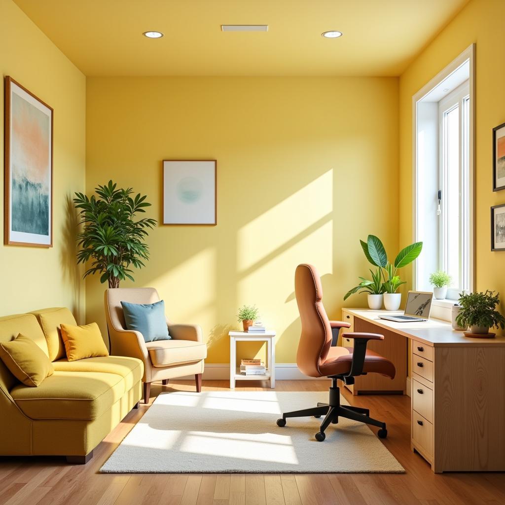
Different rooms may benefit from different color palettes. For example, a bedroom might be best suited for calming blues and greens to promote relaxation and sleep. A living room, on the other hand, might benefit from warmer, more inviting hues like soft yellows and peaches.
 Home Office in Soft Yellow
What colors are soothing for anxiety?
Soft blues, greens, and lavenders are often recommended for spaces where relaxation is key, as they can evoke a sense of calm and tranquility.
What is the most relaxing color for your eyes?
Generally, cooler colors like blues and greens are considered the most relaxing for the eyes due to their shorter wavelengths.
What color is best for eye fatigue?
Soft greens and muted blues are known to reduce eye strain and fatigue.
Using Easy-on-the-Eye Colors in Design
The principles of eye-friendly colors extend beyond interior design. When designing websites, presentations, or other visual materials, choosing a color palette that is easy on the eye is essential for ensuring readability and user engagement. Avoid using highly contrasting colors or overly saturated hues, as these can be visually jarring and difficult to look at for extended periods.
“Choosing the right color palette can make or break a design,” says renowned color consultant, Amelia Hues. “It’s crucial to consider the psychological impact of colors and choose hues that align with the desired mood and message.”
Conclusion
Choosing colors that are easy on the eye is essential for creating a harmonious and visually appealing environment. By understanding the science behind color perception and exploring various soothing color palettes, you can transform your living spaces, workspaces, and digital designs into havens of tranquility and productivity. What color is easy on the eye? Now you know!
FAQ
- What are some examples of eye-friendly colors? Blues, greens, soft yellows, peaches, and muted pinks are generally considered easy on the eyes.
- Why are some colors easier on the eyes than others? Colors with shorter wavelengths, like blues and greens, require less effort for our eyes to focus on.
- How can I incorporate eye-friendly colors into my home? Consider painting your walls in soft blues or greens and adding accents of complementary colors.
- What colors are best for reducing eye strain? Soft greens and muted blues are known to reduce eye strain and fatigue.
- How can I use eye-friendly colors in my digital designs? Avoid highly contrasting colors or overly saturated hues and opt for a calming color palette.
- Are there cultural differences in color perception? Yes, color associations and preferences can vary across different cultures.
- How can I find the perfect eye-friendly color palette for my needs? Experiment with different color combinations and consider consulting a color expert.
“Remember, color is more than just aesthetics,” adds Ms. Hues. “It’s a powerful tool that can influence our mood, productivity, and overall well-being.”
Related Questions:
- What are the best colors for a bedroom?
- How to choose a color palette for your website?
- The psychology of color in interior design.
Need assistance with choosing the perfect color palette? Contact us at Phone Number: 0373298888, Email: [email protected] or visit our office at 86 Cầu Giấy, Hanoi. We have a 24/7 customer service team ready to help.

