Color balance is a fundamental concept in art, design, and especially in our world of paints and home aesthetics. It’s about creating visual harmony by achieving the right mix and proportion of colors within a space or an image. Essentially, it’s about ensuring no single color feels out of place or overpowers the others, creating a balanced and aesthetically pleasing environment.
Understanding the Basics of Color Balance
Imagine walking into a room painted entirely in bright red. You might feel overwhelmed, even anxious. Now, picture that same room with strategically placed white and blue accents. Suddenly, the red feels less intense, more balanced, and the room becomes more inviting. That’s the power of color balance in action!
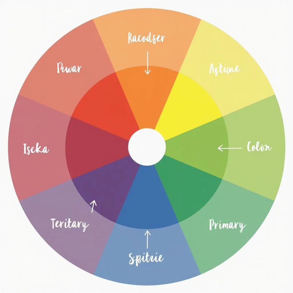
 Color Wheel with Primary, Secondary, and Tertiary Colors
Color balancing doesn’t mean sticking to neutral palettes or avoiding bold hues. It’s about understanding how different colors interact and using this knowledge to create a cohesive and visually appealing look. Whether you’re drawn to vibrant contrasts or soothing monochromes, color balance is the key to making your vision come to life.
Why is Color Balance Important?
Beyond aesthetics, color balance influences our mood, emotions, and even our perception of a space. A well-balanced room can feel more spacious, calming, or energizing, depending on the chosen colors and their proportions.
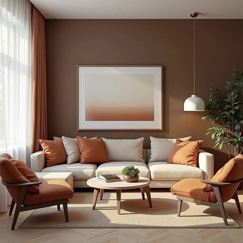
 Living Room Interior with a Balanced Color Palette
Here’s why color balance is crucial:
- Visual Harmony: It creates a sense of order and unity, making a space feel complete and visually appealing.
- Emotional Impact: Colors evoke emotions, and a balanced palette can help create the desired mood and ambiance.
- Enhanced Aesthetics: Color balance can elevate even the simplest design elements, making them stand out.
- Improved Spatial Perception: Light and dark colors can be used strategically to make a room appear larger, cozier, or highlight architectural details.
Achieving Color Balance: Key Concepts
Several techniques and principles can help you master the art of color balance:
1. The 60-30-10 Rule
This classic design rule provides a simple framework for color distribution:
- 60% Dominant Color: This is your background color, often used for walls, large furniture pieces, and sets the overall tone of the space.
- 30% Secondary Color: Used for smaller furniture, curtains, rugs, this color provides contrast and visual interest.
- 10% Accent Color: This is your pop of color, used sparingly in accessories, artwork, and decorative items to add personality and vibrancy.
2. Understanding Color Temperature
Colors are often categorized as warm (reds, oranges, yellows) or cool (blues, greens, purples). Balancing warm and cool tones within a space can prevent it from feeling too stimulating or too stark.
3. Working with Color Harmony
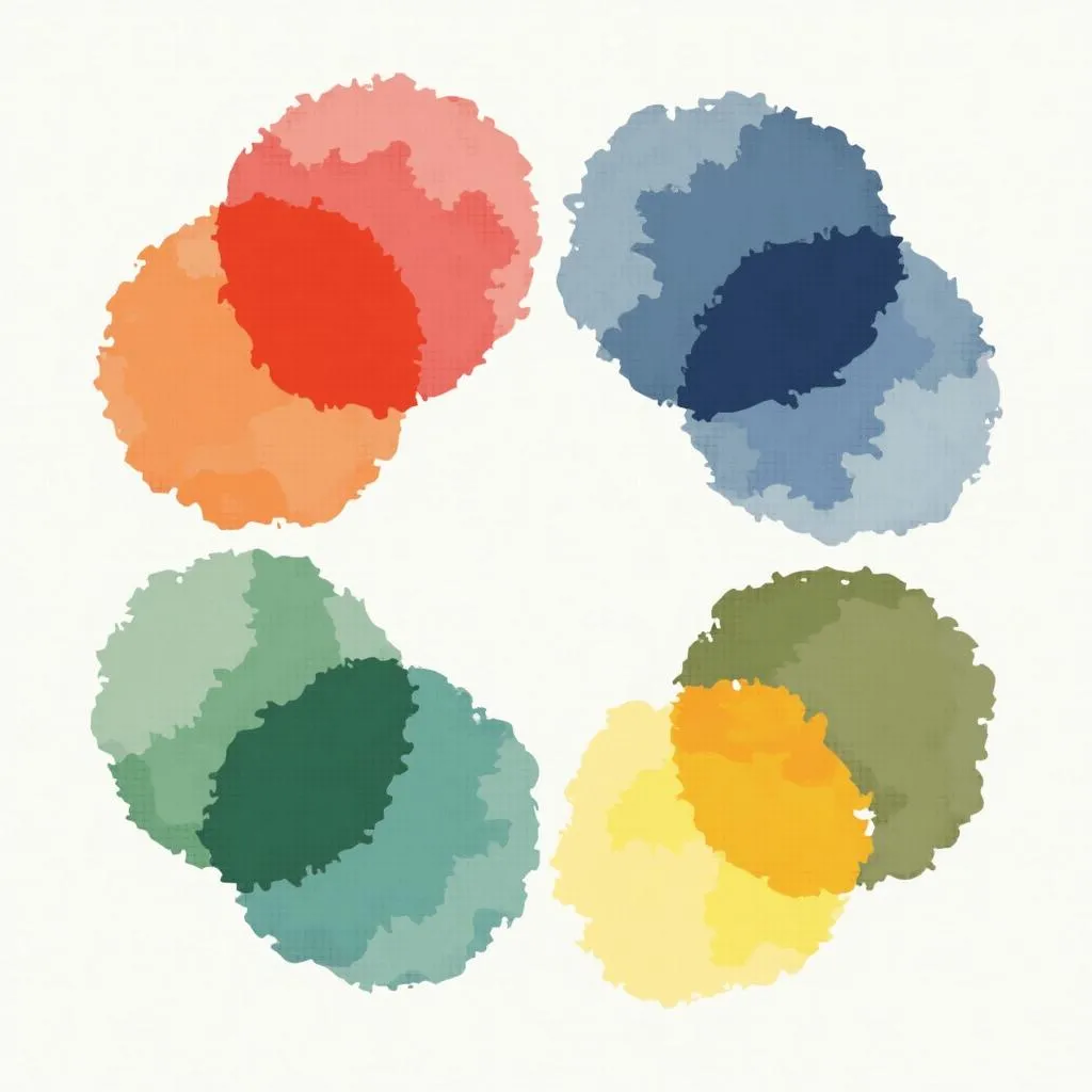
Color harmony refers to aesthetically pleasing color combinations. Understanding different color schemes, like complementary, analogous, or triadic, can help you create balanced and visually appealing color palettes.
 Color Harmony Schemes: Complementary, Analogous, Triadic
“Color balance is not about creating a space devoid of personality. It’s about ensuring every color choice contributes to the overall vision,” says renowned interior designer, Anya Sharma. “A well-balanced room should feel like a symphony of colors, each playing its part in perfect harmony.”
Color Balance in Everyday Life
Color balance isn’t just for professional designers; it’s something we intuitively engage with every day. From choosing an outfit to arranging flowers, we make decisions about color combinations based on our sense of balance and aesthetics.
Need help finding the perfect color combinations for your next project? Check out our articles on what color does pink and orange make, what is the color for friendship, and what color tie with grey suit and blue shirt for inspiration and guidance.
Conclusion
Color balance is the foundation of any successful design project, transforming spaces from ordinary to extraordinary. By understanding the principles of color theory and applying them thoughtfully, you can create environments that are visually captivating, emotionally resonant, and truly reflect your unique style.
Remember, achieving color balance is an ongoing exploration. Don’t be afraid to experiment with different hues, shades, and saturations to find what speaks to you. After all, your home should be a canvas that reflects your personality and inspires joy every time you step inside.
FAQs
1. What is the easiest way to achieve color balance?
The 60-30-10 rule is an excellent starting point for beginners. It provides a simple framework for distributing colors and ensures a balanced look.
2. Can I use more than one accent color?
Yes, you can use multiple accent colors, but it’s crucial to use them sparingly and ensure they harmonize with each other and the overall palette.
3. What if I prefer a monochromatic color scheme?
Monochromatic schemes can be incredibly chic. The key is to introduce variations in shades and textures to create depth and visual interest.
4. How do I know if my colors are balanced?
Trust your instincts! If a space feels harmonious, welcoming, and visually appealing, you’ve likely achieved a good balance.
5. What are some common color balance mistakes to avoid?
Using too many colors, neglecting the impact of lighting, and choosing colors in isolation without considering the overall context are some common pitfalls.
Looking for more tips on color selection and design? Explore our articles on what colors work with my skin tone and how to select a color on procreate.
Need personalized advice on creating a color-balanced space? Our team of experts at Color Box Hanoi is here to help. Contact us at 0373298888, email us at SEO.backlink@gmail.com, or visit us at 86 Cầu Giấy, Hà Nội. We offer 24/7 customer support to answer all your color-related queries. Let us help you transform your vision into reality!

