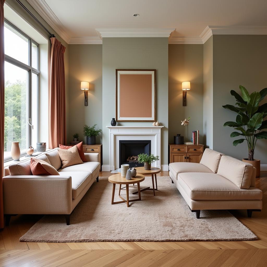
Intermediate colors, sometimes referred to as tertiary colors, are the bridge between primary and secondary colors on the color wheel. They are created by mixing a primary color with its neighboring secondary color. Understanding intermediate colors is fundamental to any creative endeavor involving color, from painting and interior design to graphic design and fashion. Mastering these hues allows you to create dynamic color palettes, achieve balance, and evoke a range of emotions in your work.
Understanding the Color Wheel and its Importance for Intermediate Colors
The color wheel is a visual representation of color relationships, a crucial tool for understanding how colors interact and harmonize. Primary colors—red, yellow, and blue—form the foundation. These colors cannot be created by mixing other colors. Secondary colors—orange, green, and violet—are produced by mixing two primary colors. For instance, mixing red and yellow yields orange. Intermediate colors fill the gaps between these primary and secondary colors, adding depth and complexity to the spectrum.
What Colors are Intermediate Colors?
There are six intermediate colors, each formed by mixing a primary color with its adjacent secondary color. These are:
- Red-violet: A rich, regal hue created by mixing red and violet.
- Red-orange: A vibrant and energetic color formed by mixing red and orange.
- Yellow-orange: A warm and inviting color resulting from the combination of yellow and orange.
- Yellow-green: A fresh and invigorating color created by mixing yellow and green.
- Blue-green: A serene and calming color formed by mixing blue and green.
- Blue-violet: A cool and mysterious color resulting from the combination of blue and violet.
what colors are intermediate colors
How to Mix Intermediate Colors
Achieving the perfect intermediate color requires precision and understanding of color theory. Here’s a guide to help you:
- Start with pure pigments: Use high-quality primary and secondary colors to ensure vibrant and accurate results.
- Gradual incorporation: Slowly add the secondary color to the primary color, mixing thoroughly after each addition. This allows you to control the intensity and achieve the desired hue.
- Test on a palette: Before applying the color to your final surface, test it on a palette or scrap piece of material to ensure it matches your vision.
- Light and environment: Remember that lighting can affect how colors appear. Observe your mixed color under different lighting conditions to ensure consistent results.
How are Intermediate Colors Used in Design?
Intermediate colors play a vital role in creating harmonious and visually appealing designs. They can be used to:
- Create depth and dimension: Intermediate colors add subtle variations and prevent color schemes from feeling flat or monotonous.
- Balance color palettes: They act as bridges between primary and secondary colors, creating a smoother transition and a more balanced overall aesthetic.
- Evoke specific moods: Warm intermediate colors like red-orange can create a sense of excitement and energy, while cool intermediate colors like blue-green can evoke tranquility and calmness.
 Using Intermediate Colors in Interior Design
What are the Colors of the Belts in Karate?
While seemingly unrelated, the colored belts in karate utilize a system that draws parallels to the concept of progressing through levels of color understanding. Though not strictly adhering to the precise definitions of primary, secondary, and intermediate colors, the belt system demonstrates a progression and deepening of knowledge, much like the journey from primary colors to the nuanced world of intermediate hues.
what are the colors of the belts in karate
How Many Colors in the Munsell Color Chart?
The Munsell Color Chart provides a much more extensive system for classifying colors than the basic color wheel. It allows for a highly specific identification of colors, far beyond the primary, secondary, and intermediate categories. Understanding the vastness of the Munsell system emphasizes the complexity of color and the infinite possibilities within the spectrum.
how many colors in the munsell color chart
What is Intermediate Color? A Quick Recap
In summary, intermediate colors are the hues created by mixing a primary color with its adjacent secondary color on the color wheel. These colors offer a wealth of possibilities for creative expression, allowing you to achieve balance, depth, and evoke specific moods in your designs.
In conclusion, understanding and utilizing intermediate colors is essential for anyone working with color. Whether you’re a painter, designer, or simply someone who appreciates the beauty of color, mastering these hues opens up a world of creative possibilities. By understanding the relationship between primary, secondary, and intermediate colors, you can elevate your work and create truly captivating and harmonious visual experiences.
FAQ
- What are the six intermediate colors? Red-violet, red-orange, yellow-orange, yellow-green, blue-green, and blue-violet.
- How do you make intermediate colors? By mixing a primary color with its neighboring secondary color.
- Why are intermediate colors important? They bridge the gap between primary and secondary colors, adding depth and complexity to color palettes.
- What is the difference between intermediate and tertiary colors? The terms are often used interchangeably.
- How can I use intermediate colors in my home? You can use them in wall paint, furniture, decor, and textiles to create a balanced and visually appealing space.
- Can you give an example of using intermediate colors in a painting? Using blue-green for the sky and yellow-green for foliage creates a natural and harmonious landscape.
- How do intermediate colors affect mood? Warm intermediate colors can evoke energy and excitement, while cool intermediate colors create a calming and peaceful atmosphere.
When you need assistance, please contact Phone Number: 0373298888, Email: [email protected] Or visit us at: 86 Cau Giay, Hanoi. We have a 24/7 customer service team.