Chartreuse, a vibrant hue that sits comfortably between green and yellow, can add a burst of energy and sophistication to any space. But finding the right colors to pair with chartreuse can be tricky. This color, named after a French liqueur, is known for its boldness and can easily overpower other shades if not handled carefully.
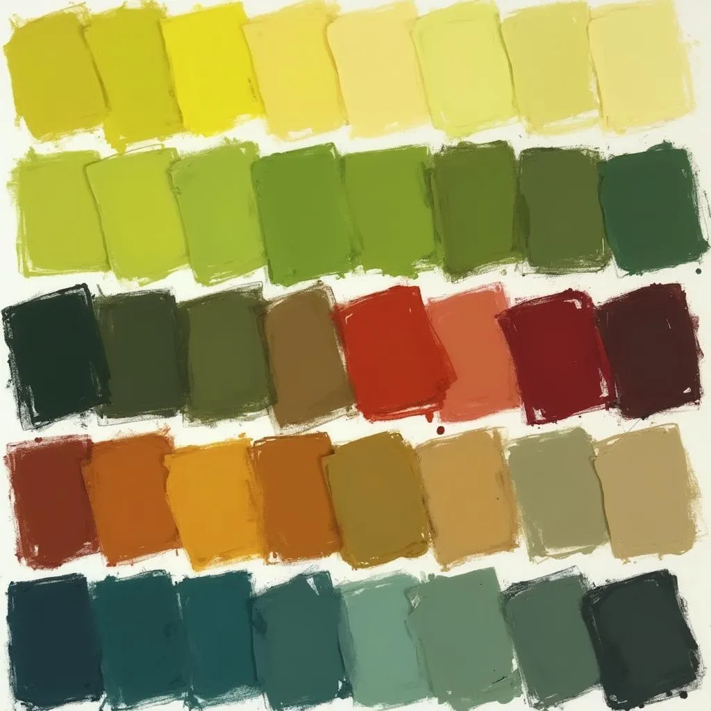 Chartreuse Color Palette
Understanding Chartreuse: More Than Just a Green
Chartreuse is often described as a yellow-green, but it’s much more nuanced than that. It can range from a bright, almost neon yellow-green to a more subdued, earthy tone. The specific shade of chartreuse you choose will influence your color pairings.
For example, a bright, almost lime chartreuse can be paired with other vibrant hues like hot pink or turquoise for a high-energy, tropical feel. While a more muted, olive-leaning chartreuse might look best with earthy tones like brown, terracotta, or deep reds.
Complementary Colors for Chartreuse: Opposites Attract
One of the most effective ways to create a dynamic color scheme is by using complementary colors. These colors sit opposite each other on the color wheel and create a strong contrast when paired together.
The complementary color to chartreuse is red-violet, a rich and luxurious hue. However, using these two colors in equal measure can be overwhelming. Instead, try using red-violet as an accent color, perhaps in throw pillows, artwork, or a statement rug.
Analogous Colors for Chartreuse: Harmony and Flow
For a more harmonious and calming look, consider using analogous colors. These are colors that sit next to each other on the color wheel, like green and yellow for chartreuse. Using analogous colors creates a sense of unity and flow in your design.
You could pair chartreuse with shades of yellow, such as lemon yellow or goldenrod, to create a bright and sunny space. Or, you could use greens, like emerald or forest green, for a more grounded and natural feel.
Monochromatic Magic: Exploring Shades of Chartreuse
Another option is to create a monochromatic color scheme using different shades of chartreuse. This can create a sophisticated and elegant look, especially when you incorporate textures and patterns to add visual interest.
For example, you could use a lighter shade of chartreuse on the walls and pair it with darker shades in furniture and accessories. Or, you could use a chartreuse patterned wallpaper as a focal point and pair it with solid chartreuse pieces in different shades.
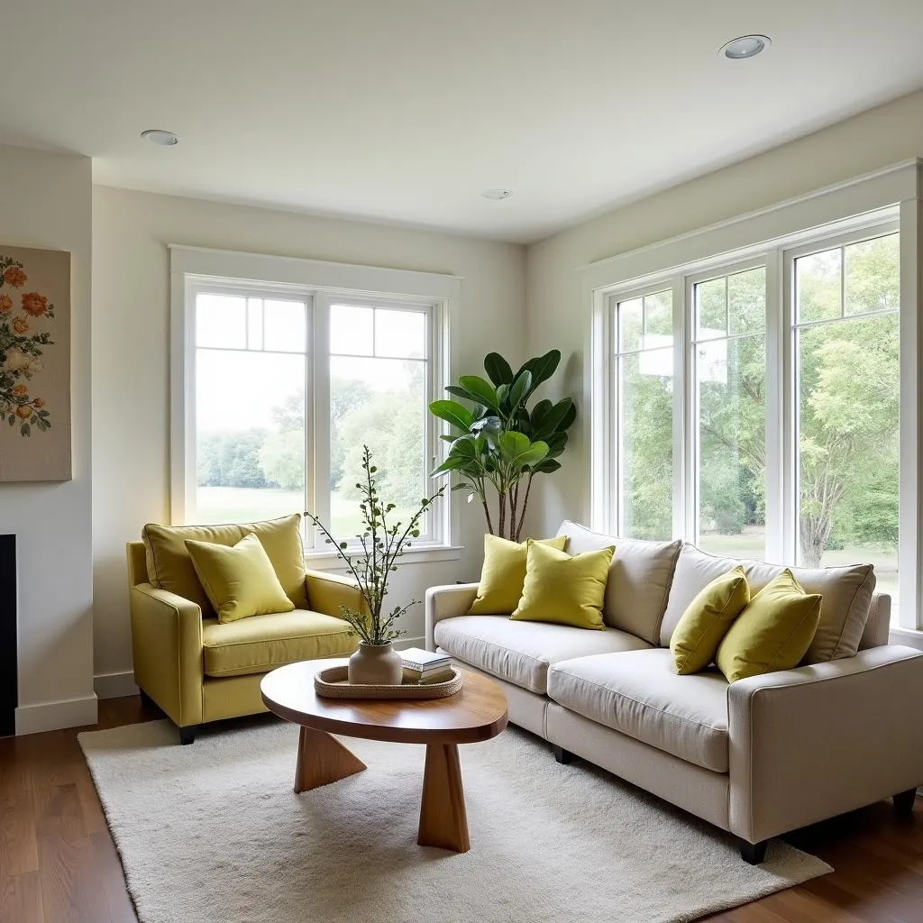 Living Room with Chartreuse Accents
Chartreuse in Different Rooms: Bringing Vibrancy to Your Home
Chartreuse can be used effectively in any room of the house, but it’s important to consider the mood you want to create.
- Living Room: Chartreuse can add a touch of drama and sophistication to a living room. Pair it with navy blue, gray, or black for a chic and modern look.
- Bedroom: For a calming and restful bedroom, use chartreuse sparingly in accents, such as throw pillows or a lampshade. Pair it with soft neutrals like cream or beige.
- Kitchen: Chartreuse can bring energy and life to a kitchen. Use it in backsplashes, cabinets, or even appliances. Pair it with white, black, or stainless steel for a clean and modern look.
- Bathroom: Chartreuse can create a spa-like atmosphere in a bathroom. Pair it with white, gray, or even black for a sophisticated and relaxing space.
Tips for Using Chartreuse:
- Start Small: If you’re hesitant to use chartreuse, start by incorporating it in small doses, such as in accessories or accent pieces.
- Balance Boldness: Chartreuse is a bold color, so it’s important to balance it with other colors. Use it in moderation and pair it with neutrals or complementary colors.
- Consider Lighting: Natural light can make chartreuse appear brighter, while artificial light can make it appear more muted. Experiment with different lighting options to see how they affect the color.
Chartreuse and Other Colors: A Winning Combination
Here are some specific color combinations that work well with chartreuse:
- Chartreuse and Navy Blue: This classic combination is both sophisticated and timeless. The richness of navy blue grounds the vibrancy of chartreuse, creating a balanced and elegant look. This combination works well in living rooms, bedrooms, and even bathrooms.
- Chartreuse and Gray: This modern and sleek pairing is perfect for contemporary spaces. The coolness of gray helps to tone down the brightness of chartreuse, while still allowing it to shine. This combination works well in kitchens, bathrooms, and home offices.
- Chartreuse and Black: For a bold and dramatic look, pair chartreuse with black. This combination is perfect for creating a statement in any room. Use black sparingly, however, as it can easily overpower chartreuse.
- Chartreuse and White: This fresh and airy combination is perfect for creating a bright and cheerful space. White helps to reflect light, making chartreuse appear even brighter. This combination works well in kitchens, bathrooms, and bedrooms.
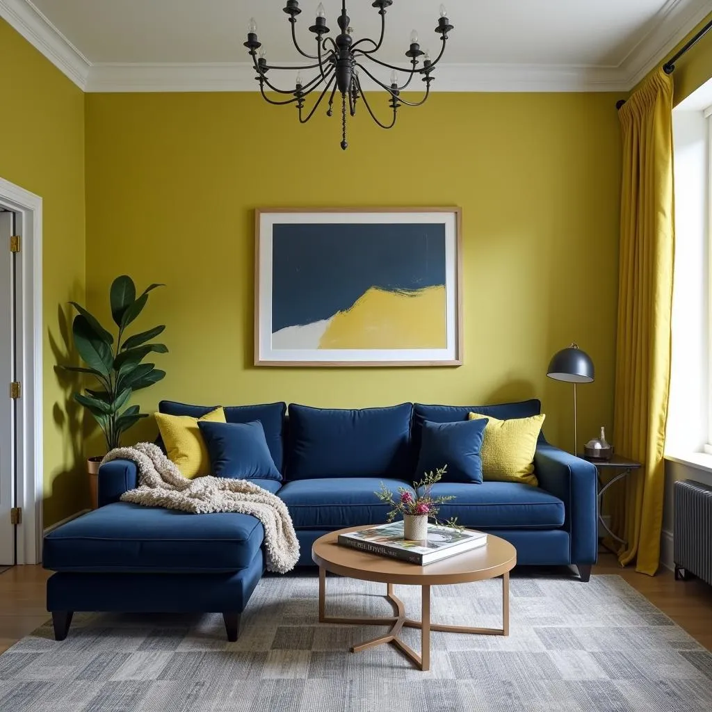 Chartreuse and Navy Blue Interior Design
Conclusion: Embrace the Vibrancy of Chartreuse
Chartreuse is a versatile color that can add a touch of personality and style to any space. By understanding how to pair it with other colors, you can create a harmonious and visually stunning design. Whether you use it as an accent color or the main attraction, chartreuse is sure to bring a touch of vibrancy and life to your home.
FAQs:
1. What is the best way to incorporate chartreuse into a small space?
Use chartreuse sparingly in small spaces, such as in accent pieces or a single wall. You can also use chartreuse in patterns or prints to add visual interest without overwhelming the space.
2. Can chartreuse be used in a traditional design scheme?
Yes, chartreuse can be used in traditional design schemes, but it’s important to use it in moderation. Pair it with traditional colors like navy blue, burgundy, or hunter green.
3. What are some good alternatives to chartreuse?
If you’re looking for a similar color but want something a little different, try lime green, citron, or even a pale yellow.
Need Help with Your Color Choices?
Choosing the right colors for your home can be a daunting task. But don’t worry, we’re here to help! Contact us today for a free consultation with one of our expert color consultants. We can help you create a color scheme that reflects your personal style and enhances your space.
Call us at: 0373298888
Email us at: [email protected]
Visit our showroom: 86 Cầu Giấy, Hà Nội
We have a team of customer service representatives available 24/7 to answer your questions and help you find the perfect colors for your home. You might also be interested in reading about what color is grayish purple or what colors to use bass fishing. We have a wide range of resources available on our website to help you with all of your color needs.