Grey, often seen as a neutral and understated hue, holds a fascinating secret: its opposite on the color wheel is far from boring! Understanding this relationship can unlock a world of possibilities in design and aesthetics, helping you create spaces that are both harmonious and visually striking.
Decoding the Color Wheel: Where Grey Meets its Match
To find the true opposite of grey, we need to venture into the realm of the color wheel. This essential tool for artists and designers illustrates the relationships between different colors, showcasing how they interact and complement each other.
Complementary colors sit directly across from each other on the wheel. They represent the highest contrast possible within the color spectrum. When placed side by side, these color pairings create a vibrant, eye-catching effect, making each color appear more intense.
So, what color holds the key to unlocking grey’s full potential? While grey itself is not a pure color on the wheel, we can consider its opposite to be its complementary color.
The Answer Might Surprise You: It’s Not Black and White!
Contrary to what some might think, the opposite of grey isn’t simply black or white. While these neutrals can create striking contrasts with grey, they don’t offer the same dynamic interplay as a true complementary color.
Instead, the answer lies in the specific shade of grey you’re working with. Grey is essentially a mixture of black and white, and depending on the ratio, it can lean towards warmer or cooler tones.
Warm greys, with hints of yellow or red, find their complement in cool blues and greens. Think of a steel grey paired with a deep teal or a charcoal grey juxtaposed with a vibrant turquoise.
Cool greys, tinged with blue or purple, are beautifully offset by warm yellows and oranges. Picture a dove grey contrasted with a rich mustard yellow or a light grey accented with a burnt orange.
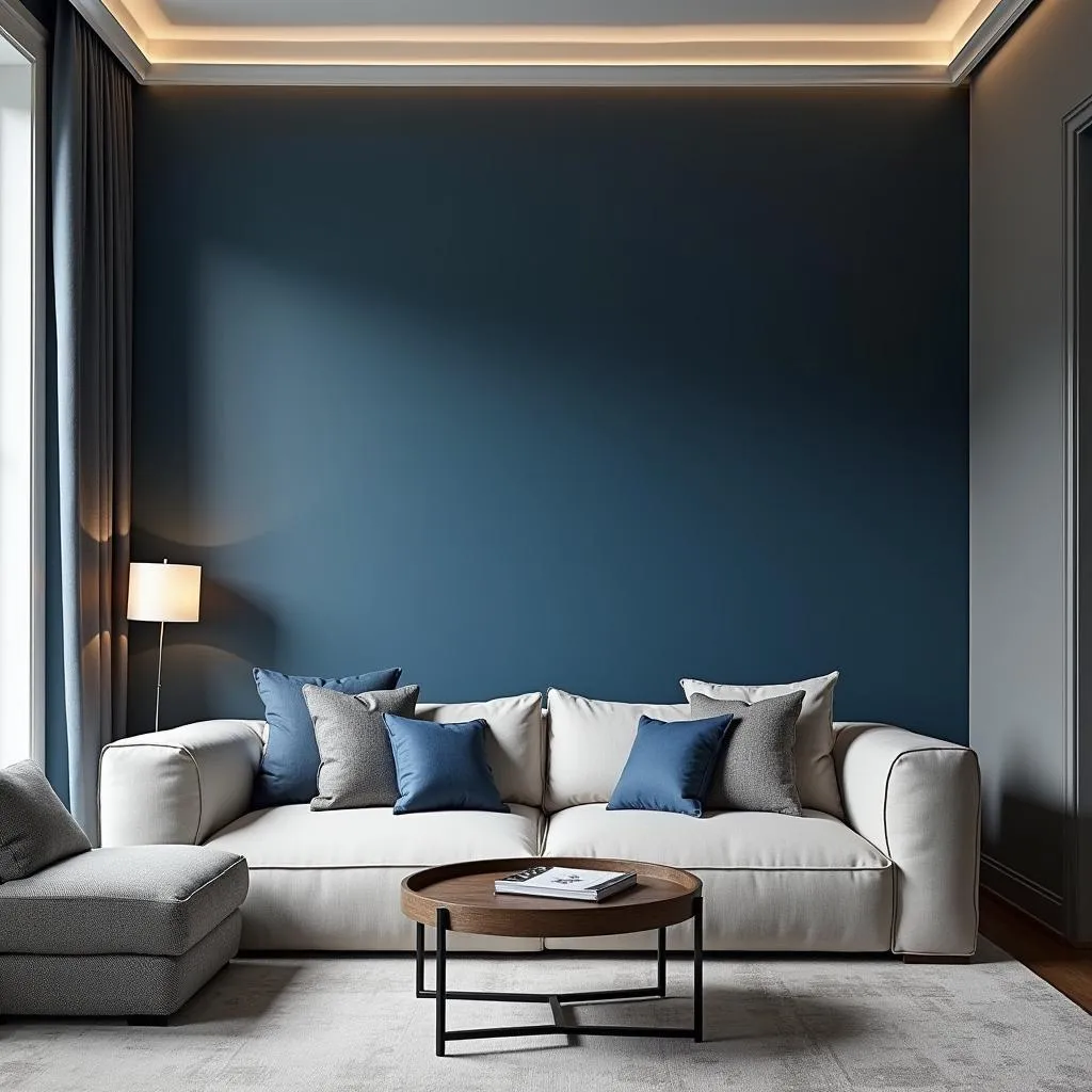 Grey and Blue Living Room
Why Knowing Grey’s Opposite Matters
Understanding this color relationship empowers you to make informed design choices that elevate your spaces. Here’s why it’s crucial:
-
Creating Visual Impact: Using grey and its complementary color together instantly adds a wow factor. The contrast draws the eye and creates a focal point, making your design more dynamic and memorable.
-
Balancing Warm and Cool: The interplay between warm and cool tones creates a sense of balance and harmony. If your space leans too heavily on cool greys, incorporating pops of warm colors can add a welcoming and inviting feel.
-
Highlighting Architectural Details: Use the power of contrast to emphasize interesting architectural features. Paint a recessed wall in a complementary color to make it pop against a grey background, or use grey as a neutral backdrop to highlight colorful moldings or trim.
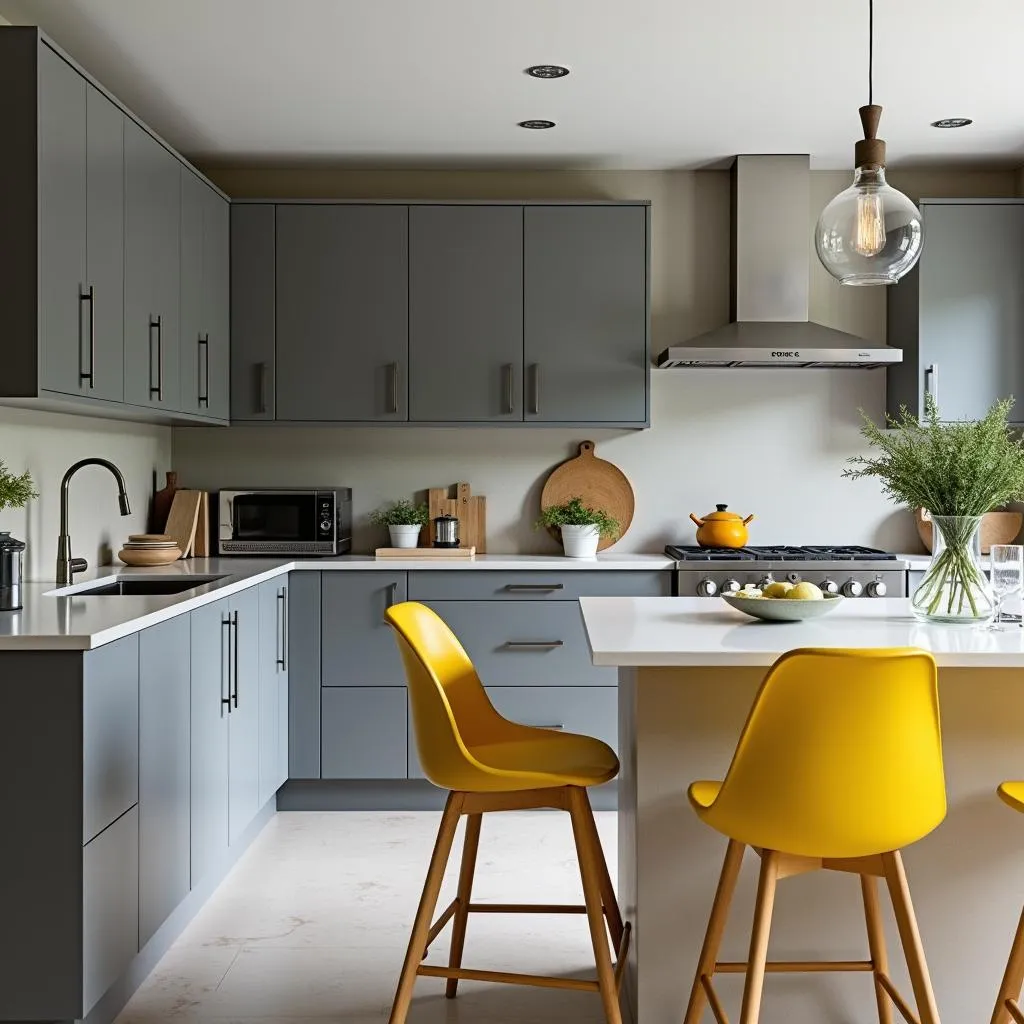 Modern Kitchen with Grey Cabinets and Yellow Accents
From Home Décor to Fashion: Putting Complementary Colors to Work
The principles of complementary colors extend beyond interior design, finding applications in fashion, art, and graphic design. Here are a few examples:
-
Fashion Forward: Pair a sleek grey dress with a statement necklace in a complementary blue or green for a sophisticated and eye-catching look.
-
Artful Expressions: In painting or photography, using grey and its complement can create a sense of depth and dimension.
-
Branding Brilliance: Companies can leverage this color combination to create memorable logos and marketing materials. A grey background with a logo in its complementary color is both professional and attention-grabbing.
 Man in Grey Suit and Blue Tie
Unlocking Your Design Potential with Color Confidence
Knowing the answer to “What color is opposite of grey?” equips you with a powerful tool for creating captivating and harmonious spaces. By embracing the interplay of complementary colors, you can transform your home, wardrobe, or creative projects into stunning expressions of your unique style. Remember, it’s not just about choosing colors—it’s about understanding their relationships and harnessing their power to create something truly extraordinary.
FAQs
1. Can I use more than one complementary color with grey?
Absolutely! While one complementary color can make a statement, incorporating multiple shades within that color family can create a more layered and sophisticated look. For example, pair a medium grey with both a light teal and a deep navy for added depth.
2. What if I prefer a more subtle contrast?
If high contrast isn’t your style, consider using a toned-down version of grey’s complementary color. For instance, instead of a bright orange, opt for a softer peach or a muted terracotta to create a more calming atmosphere.
3. Does this rule apply to all shades of grey?
Yes, but remember to adjust the complementary color based on the warmth or coolness of your chosen grey. Warmer greys pair best with cooler complements, while cooler greys shine with warmer counterparts.
Ready to Explore the World of Color?
Need help finding the perfect color combinations for your next project? Contact us today! Our team of color experts at Color Box Hà Nội is here to guide you through every step, from selecting the right shades to creating a cohesive and inspiring design.
Call us at: 0373298888
Email us at: [email protected]
Visit us at: 86 Cầu Giấy, Hà Nội.
We offer 24/7 customer support to answer all your color-related questions!