Hot pink is a vibrant and energetic color that can add a playful and bold touch to any design or space. But have you ever wondered how this eye-catching hue comes to life? We’ll delve into the world of color theory to uncover the magic behind hot pink and explore the colors that blend harmoniously with it.
Deconstructing Hot Pink: A Fusion of Red and Violet
Hot pink, also known as fuchsia or magenta, is a vibrant shade of pink that leans towards purple. Unlike pure pink, which sits neatly between red and white on the color wheel, hot pink ventures into the realm of violet. This captivating hue is achieved by mixing a vibrant red with a touch of blue, creating a color that is both warm and cool, energetic and sophisticated.
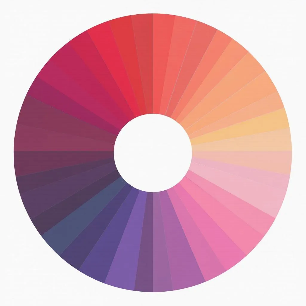 Color Wheel with Hot Pink
Creating Harmony: Colors that Complement Hot Pink
Understanding the color wheel is key to creating visually pleasing combinations. Here are some color pairings that work exceptionally well with hot pink:
1. Green: The Natural Complement
Green, being the direct opposite of red on the color wheel, creates a striking contrast with hot pink. This complementary pairing is commonly found in nature, think of vibrant fuchsia flowers against lush green foliage, and translates beautifully into design.
2. Blue: A Cool Contrast
Blue, particularly in its cooler shades like turquoise or teal, offers a refreshing contrast to hot pink’s warmth. This pairing evokes a sense of energy and playfulness, making it perfect for spaces designed for creativity and expression.
3. Yellow: A Burst of Sunshine
For a bold and cheerful combination, pair hot pink with yellow. This pairing is reminiscent of summer blooms and radiates positivity. Choose a softer shade of yellow, like butter yellow, to avoid overwhelming the hot pink.
4. Black and White: Timeless Classics
Black and white provide a neutral backdrop that allows hot pink to take center stage. Black adds a touch of sophistication and drama, while white enhances its vibrancy.
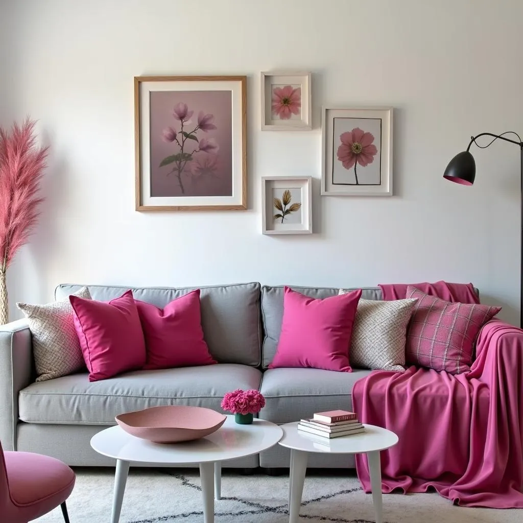 Interior Design with Hot Pink Accents
Playing with Shades and Tones
While the above pairings offer a starting point, don’t be afraid to experiment with different shades and tones within each color family. For instance, a dusty rose pairs beautifully with a deep forest green, while a neon pink can handle the boldness of a bright, sunny yellow.
Hot Pink in Action: From Fashion to Interiors
Hot pink’s versatility extends beyond color theory, finding its place in various aspects of design and everyday life.
Fashion:
Hot pink is a statement color in the fashion world. From vibrant dresses to bold accessories, it adds a touch of personality and flair. What colors go with dark green pants if you want to incorporate this vibrant hue into your wardrobe.
Interiors:
Hot pink can be introduced into interiors through accent walls, furniture, or decorative items. In a minimalist space, a single hot pink armchair can become a focal point, while in a more eclectic setting, it can blend seamlessly with other vibrant hues.
Graphic Design:
Hot pink is a popular choice for logos, website designs, and marketing materials. Its ability to grab attention and evoke energy makes it ideal for brands targeting a youthful and dynamic audience.
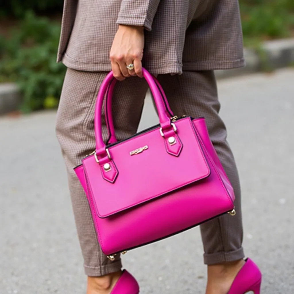 Hot Pink Accessories in Fashion
Conclusion
Hot pink, a dynamic blend of red and violet, offers a spectrum of possibilities when it comes to color combinations. Whether you prefer a contrasting pairing with green or a harmonious blend with blue, understanding the principles of color theory can help you create visually stunning designs. So, embrace the vibrancy of hot pink and let your creativity flow!
FAQs about What Colors Make Hot Pink
1. Is hot pink a primary or secondary color?
Hot pink is not a primary or secondary color. It’s a tertiary color created by mixing a primary color (red) with a secondary color (violet).
2. Can I create hot pink by mixing other colors besides red and blue?
While red and blue are the most common base colors, you can achieve variations of hot pink by experimenting with magenta, pink, and purple hues.
3. What is the difference between hot pink and fuchsia?
The terms hot pink and fuchsia are often used interchangeably. However, some consider fuchsia to be a slightly more purplish shade compared to hot pink.
4. Is hot pink a warm or cool color?
Hot pink is unique in that it possesses both warm and cool properties. Its red undertones bring warmth, while its violet influences lean towards coolness.
5. What are some other colors that go with hot pink besides the ones mentioned?
Beyond the classics, consider pairing hot pink with:
- Gray: For a modern and sophisticated look.
- Gold: To add a touch of luxury and glamour.
- Brown: For an earthy and grounded contrast.
Need help finding the perfect color combinations for your next project? Contact us at 0373298888, email us at [email protected], or visit our showroom at 86 Cầu Giấy, Hà Nội. Our team of color experts is here to help you create a space that reflects your unique style.
Explore more color inspiration on our blog: