“What color is evermore?” you might ask, seeking a tangible shade to grasp this enduring concept. Evermore, unlike a specific color on the spectrum, embodies a feeling, an essence of timelessness and enduring beauty. It’s the whisper of ancient forests, the echo of a forgotten melody, the comforting embrace of a well-worn book. It’s a concept that transcends physicality and invites us to explore the emotional resonance of color.
Evermore: Beyond a Single Shade
Imagine standing on a windswept cliff, gazing at a sunset that paints the sky with hues of lavender, rose, and deep indigo. That feeling of awe, of witnessing something vast and eternal—that’s the essence of evermore. It’s not about capturing a single color, but rather, understanding how colors evoke a sense of timelessness and evoke emotions that resonate deep within us.
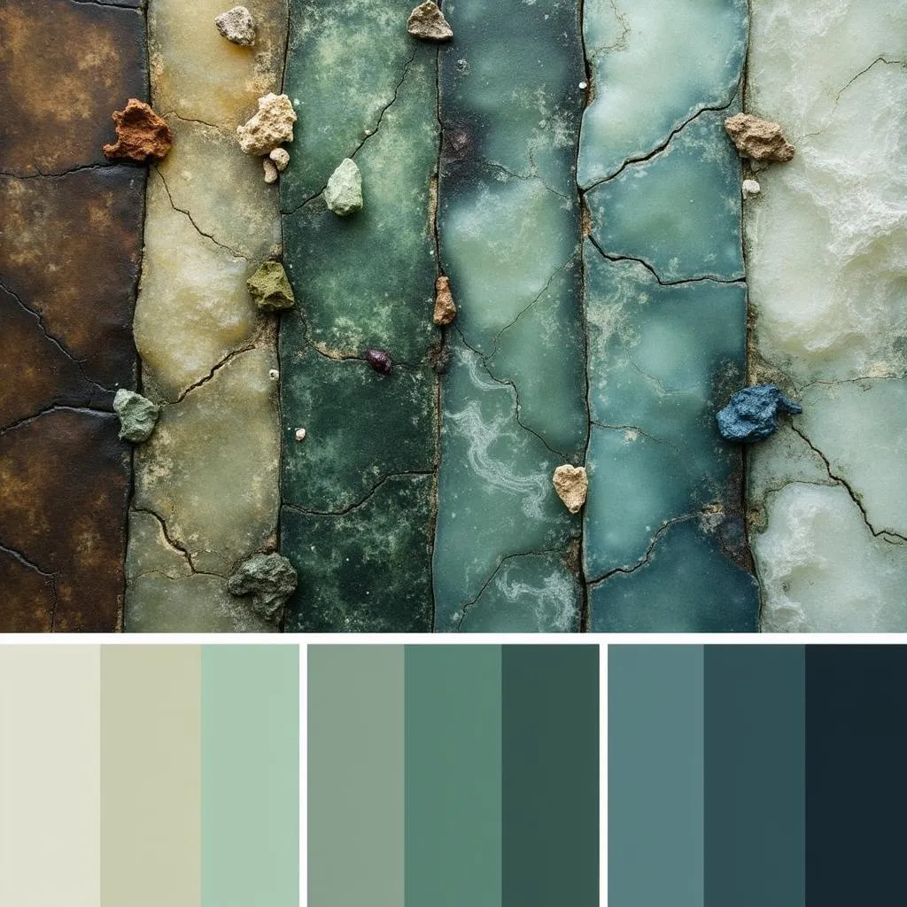
Timeless Color Palettes Inspired by Evermore
Think of the faded grandeur of a vintage photograph, the soft patina on an antique clock, or the gentle variations in a hand-stitched quilt. These objects, imbued with the passage of time, often feature muted, earthy tones that whisper stories of the past.
- Earthy Neutrals: Warm browns, deep greens, and soft grays create a sense of grounding and connection to the earth. These colors, often found in nature, evoke a sense of permanence and stability.
- Muted Jewels: Imagine the faded opulence of a sapphire velvet curtain or the subtle sheen of a moss-covered emerald. These jewel tones, softened by time, add a touch of elegance and sophistication without feeling overwhelming.
- Stormy Skies and Whispering Sands: The ever-changing hues of a stormy sky, from steely grays to deep blues, can create a sense of drama and intrigue. Pair these with sandy beige and soft tans to evoke the timeless beauty of the coastline.
 Timeless Color Palette: Earthy tones, muted jewel tones, and stormy hues
Creating an “Evermore” Ambiance in Your Home
Infusing your home with the spirit of evermore is about more than just choosing the right paint colors. It’s about creating a space that feels lived-in, loved, and connected to something larger than itself.
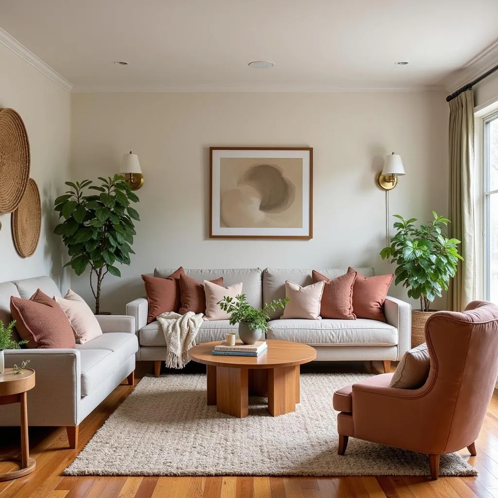
- Embrace Imperfections: The beauty of evermore lies in its imperfections. Don’t be afraid to incorporate vintage furniture with a bit of wear and tear or display handcrafted items with slight variations. These imperfections tell a story and add character to your space.
- Layer Textures: Combine smooth surfaces with rough-hewn elements to create visual interest and depth. Think linen curtains against exposed brick walls or a plush velvet throw on a weathered leather armchair.
- Incorporate Natural Elements: Bring the outdoors in with natural materials like wood, stone, and plants. These elements ground the space and create a sense of connection to the natural world.
 Living Room Decorated with an Evermore Color Scheme
“When designing a space with an ‘evermore’ feel, it’s essential to consider the story you want to tell,” says renowned interior designer, Emily Carter. “Use color and texture to create a layered, nuanced environment that reflects the passage of time and evokes a sense of enduring beauty.”
Evermore: A Journey, Not a Destination
The beauty of “evermore” is that it’s an ongoing exploration. As you curate your space and experiment with color, you’ll discover your own personal interpretation of this timeless concept.
Remember, creating a home is an evolution. Allow yourself to experiment, to embrace the stories embedded in objects and colors, and most importantly, to enjoy the journey of crafting a space that truly reflects your unique spirit.
FAQ
1. What is the best way to incorporate “evermore” colors into a modern home?
Even in a modern setting, “evermore” colors can add warmth and depth. Try using them as accent walls, incorporating vintage or antique furniture pieces, or layering in textiles with rich textures and muted hues.
2. Can I use bright colors in an “evermore” inspired design?
While the focus is on muted tones, pops of brighter colors can add personality and vibrancy. Use them sparingly, perhaps in artwork, throw pillows, or decorative accents.
3. What are some other design styles that complement the “evermore” aesthetic?
Styles like rustic, vintage, bohemian, and eclectic often share elements with the “evermore” aesthetic. Don’t be afraid to blend and borrow from different styles to create a look that feels uniquely you.
Need help finding your perfect “evermore” palette?
Contact Color Box Hanoi today! Our team of color experts and design enthusiasts is ready to guide you on your journey to create a space that embodies timeless beauty and reflects your personal style.
Call us at 0373298888, email us at [email protected], or visit our showroom at 86 Cầu Giấy, Hà Nội. We offer 24/7 customer support to answer all your color and design inquiries.
