Turquoise, a color named after the beloved gemstone, evokes a sense of tranquility, serenity, and coolness. But did you know that turquoise isn’t just one single shade? This captivating color spans a beautiful spectrum, encompassing a range of hues from blue-green to green-blue. Let’s delve into the fascinating world of turquoise and explore the captivating colors it encompasses.
Unveiling the Variations of Turquoise
While we often use “turquoise” as a blanket term, this mesmerizing color exists in various shades, each with its own unique character. Here are some of the most notable variations:
-
Light Turquoise: This delicate hue, often described as pale or baby turquoise, leans towards a lighter, airier feel. It’s reminiscent of calm waters on a bright summer day.
-
Dark Turquoise: On the opposite end of the spectrum lies dark turquoise, a deep, rich, and almost mysterious shade. It exudes sophistication and evokes the depth of the ocean.
-
Green Turquoise: As the name suggests, this variation leans more towards green, capturing the essence of lush tropical foliage. It’s vibrant, energetic, and bursting with life.
-
Blue Turquoise: Staying true to its name, blue turquoise embraces the coolness of blue, reminding us of serene skies and crystal-clear waters. It’s calming, peaceful, and incredibly versatile.
 Different shades of turquoise color
The Science Behind the Shades: What Makes Turquoise So Versatile?
The diverse range of turquoise hues stems from the interplay of blue and green pigments. By adjusting the ratio of these pigments, we can create an array of shades, each with its unique character and appeal.
For instance, increasing the proportion of blue results in cooler, more calming shades like blue turquoise. Conversely, amping up the green creates warmer, more energetic hues like green turquoise.
This inherent versatility makes turquoise a beloved choice across various design disciplines, from fashion and interior design to graphic design and branding.
From Gemstone to Pigment: The Historical Journey of Turquoise
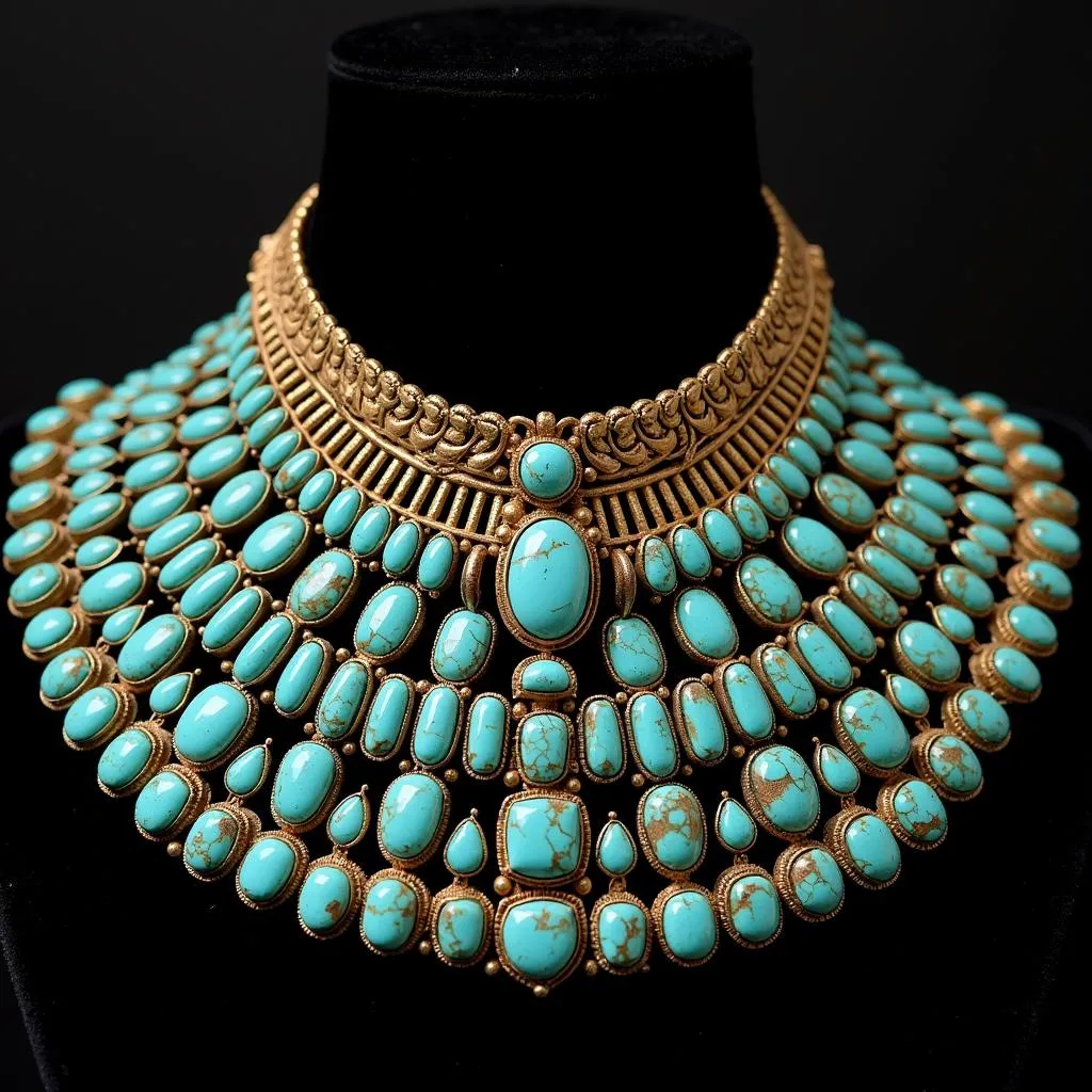
The use of turquoise dates back centuries, originating from the eponymous gemstone prized for its captivating color. Ancient civilizations, including the Egyptians and Persians, adorned themselves with turquoise jewelry, believing it held protective and healing powers.
Over time, the allure of turquoise transcended jewelry, inspiring artists and craftsmen to replicate its captivating hue in pigments and dyes. This marked the beginning of turquoise’s journey as a color, eventually finding its way into our everyday lives.
 Ancient Egyptian necklace with turquoise stones
Expert Insight: The Enduring Allure of Turquoise
“Turquoise possesses a unique ability to infuse any space with a sense of tranquility and sophistication,” says renowned interior designer, Emily Carter. “Whether used as a dominant color or an accent, its calming yet vibrant nature adds depth and character to any design scheme.”
Beyond the Basics: Exploring Related Colors
While turquoise holds a special place in the color spectrum, several related hues share its captivating charm:
-
Aqua: Often used interchangeably with turquoise, aqua typically leans towards a lighter, brighter shade with a more pronounced blue undertone.
-
Teal: A deeper, richer cousin of turquoise, teal boasts a more prominent green presence, resulting in a sophisticated and grounding hue.
-
Mint: This refreshingly cool color combines the calmness of blue with the invigorating touch of green, creating a light, airy, and universally appealing shade.
Conclusion: Embracing the Spectrum of Turquoise
From the delicate hues of light turquoise to the rich depths of dark turquoise, this captivating color offers a shade for every taste and style. Whether you’re drawn to its calming blue tones or its vibrant green energy, turquoise promises to add a touch of elegance and sophistication to your world.
FAQs
- What colors go well with turquoise?
Turquoise pairs beautifully with a wide range of colors, including coral, yellow, pink, gold, brown, and white. - Is turquoise a warm or cool color?
Turquoise can be perceived as both warm and cool, depending on its undertones. Blue turquoise leans towards cool, while green turquoise has warmer tendencies. - Can I use turquoise in my home decor?
Absolutely! Turquoise is a versatile color that can be incorporated into any room of the house. Use it on walls, furniture, textiles, or accessories to add a touch of tranquility and sophistication.
You might also like:
Need help choosing the perfect shade of turquoise for your next project? Contact us at Phone Number: 0373298888, Email: [email protected], or visit us at 86 Cầu Giấy, Hà Nội. Our team is available 24/7 to assist you.

