Color Harmony: The Art and Science of Combining Colors
Color harmony is the art and science of combining colors to create a visually pleasing and balanced effect. It’s about understanding how different colors relate to each other and using that knowledge to create spaces that are both beautiful and functional. Whether you’re painting a room, choosing an outfit, or designing a website, understanding color harmony can help you create a cohesive and impactful look.
The Color Wheel: The Foundation of Harmony
At the heart of color harmony lies the color wheel, a visual representation of color relationships. It’s typically divided into 12 hues, representing primary, secondary, and tertiary colors. This tool helps us understand how colors interact, providing a framework for creating harmonious palettes.
Color Harmony Rules: Creating Visual Symphony
Over centuries, artists and designers have identified several key color harmony rules or schemes. These provide a roadmap for selecting colors that work well together, ensuring a pleasing visual balance.
1. Complementary Colors: The Power of Opposites
Complementary colors sit opposite each other on the color wheel, like blue and orange or red and green. They create a strong contrast, adding vibrancy and energy to a space. When used together, they tend to intensify each other, creating a bold statement.
2. Analogous Colors: Harmony in Proximity
Analogous colors are neighbors on the color wheel, sharing a common hue. For example, blue, blue-green, and green create a sense of calm and tranquility. This scheme is often found in nature, creating a harmonious and relaxing ambiance.
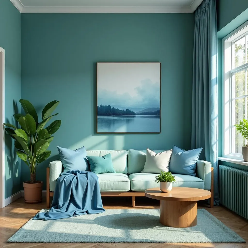 Analogous Color Scheme Example
3. Triadic Colors: A Balanced Trio
Triadic colors are three colors equally spaced on the color wheel, forming a triangle. This scheme offers a vibrant yet balanced look. For example, red, blue, and yellow create a playful and energetic feel.
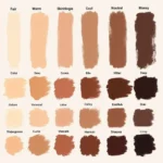
4. Monochromatic Colors: The Elegance of Simplicity
Monochromatic color schemes use variations of a single hue, incorporating different shades, tints, and tones. This creates a sophisticated and calming effect. For instance, a room decorated in various shades of blue can feel serene and elegant.
Beyond the Rules: Personalizing Your Palette
While these rules provide a strong foundation, color harmony is ultimately subjective. Personal preferences, cultural influences, and the specific mood you want to evoke all play a role in choosing the perfect color combinations for your space.
Color Harmony in Action: From Fashion to Interior Design
The principles of color harmony extend far beyond the realm of painting. They influence our choices in fashion, graphic design, and even food presentation.
- Fashion: Have you ever wondered why certain color combinations in clothing seem to work so well together? It’s often because they follow the principles of color harmony.
- Interior Design: Creating a harmonious and inviting home environment often involves selecting a color palette that reflects the desired mood and style of each room.
- Branding and Marketing: Companies carefully select brand colors that evoke specific emotions and associations, influencing consumer perception.
 Brand Color Psychology
Tips for Choosing a Color Harmony
- Start with a Color Inspiration: Draw inspiration from nature, artwork, textiles, or even your favorite travel destinations.
- Consider the Mood: Determine the feeling you want to create in your space—calm, energetic, sophisticated, or playful. Each mood can be enhanced by specific color combinations.
- Test Your Colors: Before committing to a full-scale project, experiment with paint swatches or fabric samples to see how the colors look together in different lighting conditions.
Conclusion
Color harmony is a powerful tool that can transform any space. By understanding the basic principles and experimenting with different combinations, you can create environments that are visually appealing, emotionally resonant, and a true reflection of your personal style. Whether you’re a seasoned designer or just starting to explore the world of color, understanding color harmony can elevate your creative endeavors.
what color hardware for dark brown cabinets can completely change the look and feel of your kitchen.
FAQs
1. What is the most important rule in color harmony?
While all rules are helpful guidelines, the most important factor is creating a visually pleasing and balanced effect that aligns with your personal preferences and the intended mood of the space.
2. Can I use more than three colors in a color scheme?
Absolutely! While traditional schemes focus on two or three main colors, you can incorporate additional shades, tints, and tones to add depth and complexity.
3. How can I use color harmony to make a small room look bigger?
Lighter colors tend to make spaces feel more open and airy, while cooler tones can recede visually.
4. What are some common mistakes to avoid in color harmony?
Using too many strong colors without a clear focal point, neglecting the impact of lighting on color perception, and not testing colors in the actual space are some common pitfalls.
5. Where can I find more inspiration for color palettes?
Nature, art, textiles, magazines, and online platforms like Pinterest and Instagram offer a wealth of color inspiration.
Need Help with Your Next Design Project?
Contact us at Phone Number: 0373298888, Email: [email protected] Or visit us at: 86 Cầu Giấy, Hà Nội. We have a 24/7 customer support team.