The world of color is vast and vibrant, offering endless possibilities to transform your living spaces. Whether you’re drawn to bold and dramatic hues or prefer a more subtle and sophisticated palette, embracing “a lot of colors” can breathe life and personality into your home.
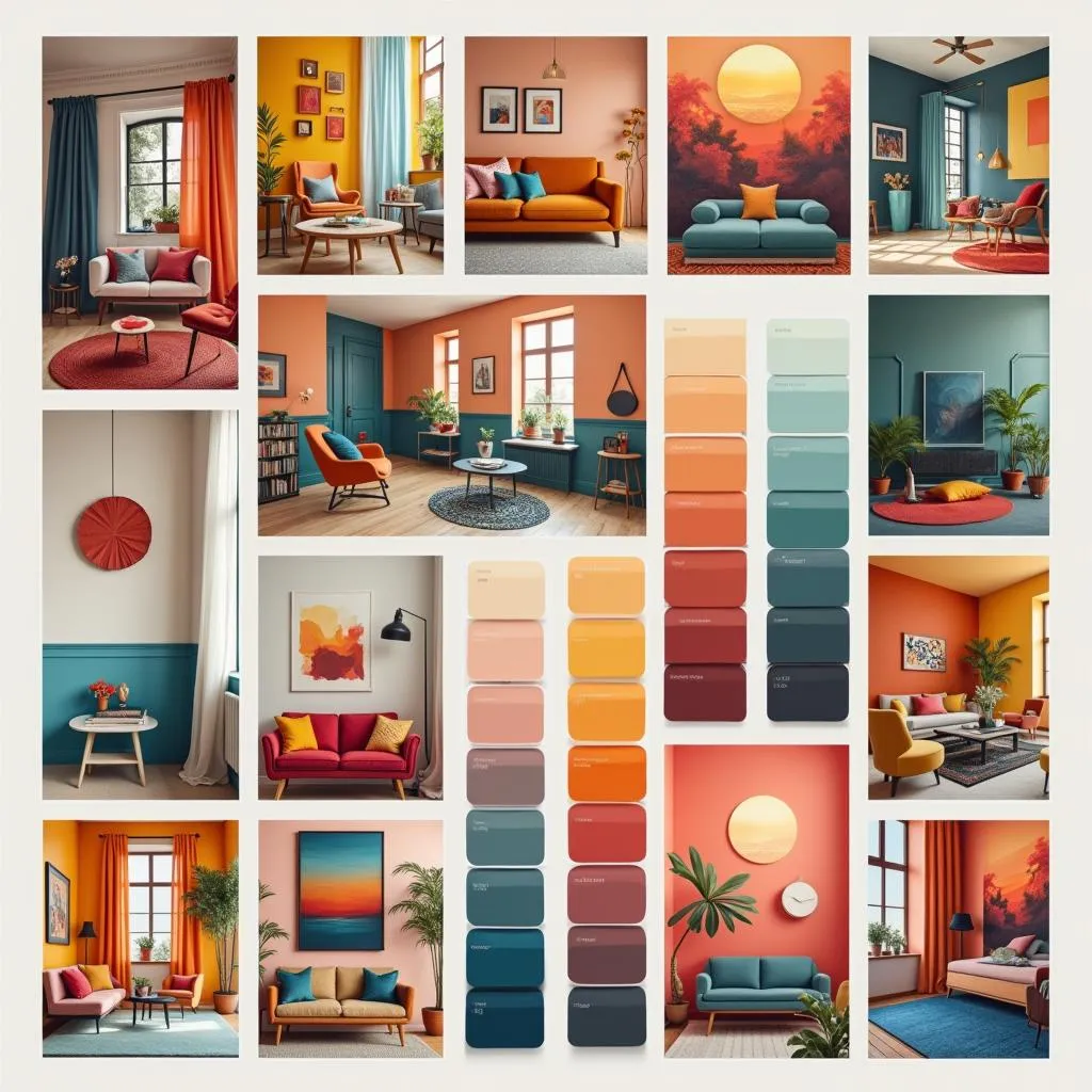 Color Palette Inspiration
Understanding the Impact of Colors
Colors have a profound impact on our mood, emotions, and overall well-being. They can influence our perceptions of space, light, and temperature. Understanding the psychology of color is key to creating harmonious and impactful interiors. For example, warm colors like reds, oranges, and yellows evoke feelings of energy, enthusiasm, and warmth. They are perfect for social spaces like living rooms and dining areas. Cool colors like blues, greens, and purples, on the other hand, have a calming and relaxing effect, making them ideal for bedrooms and bathrooms.
Creating Balance with a Lot of Colors
Using a lot of colors effectively is all about balance and harmony. It’s about creating a cohesive look that reflects your personal style without overwhelming the senses.
The 60-30-10 Rule
A classic design principle, the 60-30-10 rule, can be your guiding light when working with a lot of colors. It suggests:
- 60% Dominant Color: Choose one dominant color for the walls, large furniture pieces, or rugs.
- 30% Secondary Color: Introduce a secondary color in a slightly smaller proportion through curtains, upholstery, or accent walls. This color can complement or contrast the dominant shade.
- 10% Accent Color: This is where you can get playful with pops of bolder hues through accessories, artwork, and decorative elements.
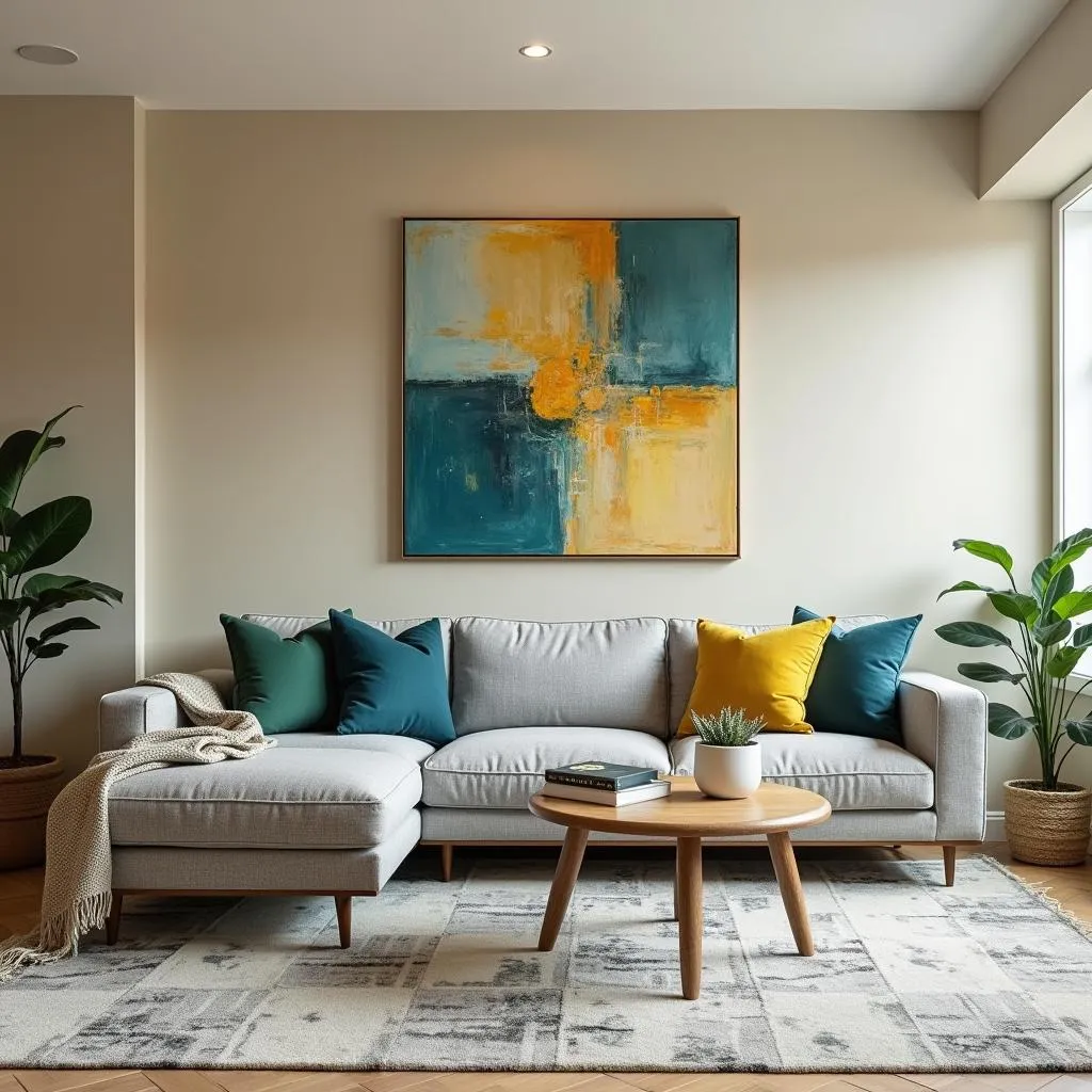 Living Room with Colorful Accents
Playing with Color Combinations
- Complementary Colors: Located opposite each other on the color wheel, these pairings create a dynamic and energetic contrast. Think blue and orange, red and green, or yellow and purple.
- Analogous Colors: These colors sit next to each other on the color wheel, offering a sense of harmony and flow. Consider combinations like blue and green, yellow and orange, or red and violet.
- Monochromatic Scheme: For a sleek and sophisticated look, opt for different shades and tints of a single color. This creates depth and dimension while maintaining a sense of unity.
Expert Insights:
“Don’t be afraid to experiment with color! There are no hard and fast rules. Trust your instincts and have fun with it. The most important thing is to create a space that makes you feel happy and inspired.” – Emily Carter, Interior Design Consultant
Incorporating Patterns and Textures
When working with a lot of colors, patterns, and textures become your allies in adding layers and visual interest. Consider:
- Geometric Patterns: Bold geometric prints in complementary colors can add a modern and graphic touch.
- Floral Patterns: Introduce a touch of nature and whimsy with floral patterns in various scales and color combinations.
- Textural Elements: Don’t forget about texture! Incorporate different textures through textiles, rugs, wall coverings, and decorative accents. This adds depth and dimension, preventing the space from feeling flat.
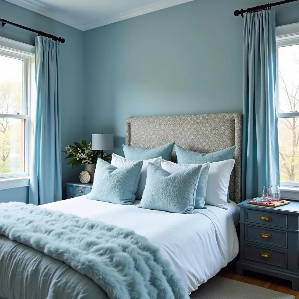 Bedroom with Patterned Accent Wall
Conclusion
Embracing a lot of colors in your home allows you to express your unique personality and create spaces that are as vibrant and dynamic as you are. By understanding the interplay of color, pattern, and texture, you can transform your living spaces into havens of style and inspiration. Remember, the key is to have fun, trust your instincts, and create a home that truly reflects who you are.