Cómo colorear, or how to color in English, is more than just filling in spaces. It’s an art form, a therapeutic activity, and a fantastic way to express yourself. Whether you’re a seasoned artist or just starting out, understanding the nuances of color can transform your creations from simple drawings to vibrant masterpieces. At Color Box Hanoi, we’re passionate about helping you unlock the power of color and create spaces that truly inspire. We believe that everyone can be an artist, and with the right guidance and tools, you can transform any space into a reflection of your unique personality and aesthetic.
Exploring the World of Color
Color is everywhere, influencing our moods, perceptions, and even our memories. From the calming blues of the ocean to the vibrant greens of a lush forest, color has the power to evoke a wide range of emotions. Understanding how to harness this power is key to creating captivating artwork and designs. Think about the last time you saw a breathtaking sunset. The blend of oranges, pinks, and purples likely filled you with a sense of awe and wonder. That’s the magic of color!
Basic Color Theory
One of the foundational concepts in coloring is understanding the color wheel. This circular diagram visually represents the relationships between different colors, helping you understand how they interact with each other. Primary colors (red, yellow, and blue) form the basis of all other colors. Secondary colors (orange, green, and violet) are created by mixing two primary colors. Tertiary colors are created by mixing a primary and a secondary color. Knowing these relationships allows you to create harmonious color palettes and experiment with different color combinations.
What are some practical applications of color theory? Imagine you want to create a calming atmosphere in your bedroom. By choosing cool colors like blues and greens, you can instantly create a sense of tranquility. Conversely, if you’re looking to energize a space, warm colors like reds and oranges can do the trick.
 Color Wheel Basics
Choosing the Right Coloring Tools
From crayons and colored pencils to markers and paints, there’s a vast array of coloring tools available. Each medium offers unique characteristics and effects. For example, colored pencils allow for precise detailing and subtle shading, while markers offer bold, vibrant colors. Watercolors, on the other hand, create a dreamy, ethereal effect. Experimenting with different tools will help you discover which ones best suit your style and the effect you’re trying to achieve. Choosing the right paper is also important. Thicker paper is better for wet media like markers and paints, preventing bleed-through.
What type of paper should I use for colored pencils? A smooth-surfaced paper is ideal for colored pencils, allowing for smooth, even strokes and vibrant color payoff.
Techniques for Cómo Colorear
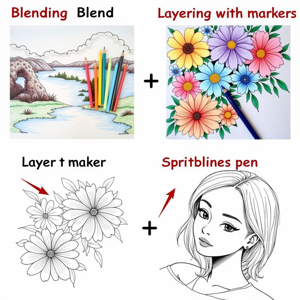
Mastering different coloring techniques can elevate your artwork to the next level. Blending, layering, and stippling are just a few examples. Blending allows you to create smooth transitions between colors, while layering adds depth and dimension. Stippling involves using small dots to create texture and shading. Practice these techniques to discover new ways to express your creativity. Don’t be afraid to experiment!
 Examples of Coloring Techniques
Advanced Coloring Concepts
Once you’ve mastered the basics, you can delve into more advanced coloring concepts. Color psychology, color harmony, and color composition are just a few examples. Understanding these concepts will help you create artwork that is not only visually appealing but also emotionally impactful.
Color Psychology
Color psychology explores the impact of color on human emotions and behavior. For example, red is often associated with passion and energy, while blue is associated with calmness and tranquility. Knowing how different colors affect us can help you choose the right colors for your artwork and designs.
“Understanding color psychology is essential for creating artwork that resonates with viewers on an emotional level,” says renowned color expert, Dr. Anya Sharma.
Color Harmony
Color harmony refers to the pleasing arrangement of colors. There are several color schemes that create visual harmony, such as complementary colors, analogous colors, and triadic colors. Complementary colors are opposite each other on the color wheel, creating a vibrant contrast. Analogous colors are next to each other on the color wheel, creating a harmonious and calming effect. Triadic colors are evenly spaced on the color wheel, creating a balanced and visually interesting composition.
“Creating a harmonious color palette is key to achieving a visually pleasing and balanced composition,” adds Dr. Sharma. Think about how you can apply these principles to cómo colorear un pavo or how to color a snowman.
Conclusion
Cómo colorear is a journey of exploration and self-expression. By understanding the principles of color theory, experimenting with different techniques, and choosing the right tools, you can create artwork that is both beautiful and meaningful. At Color Box Hanoi, we’re dedicated to providing you with the resources and inspiration you need to unleash your inner artist and transform your world with color.
FAQ
- What are primary colors?
- How do I mix colors?
- What is the color wheel?
- What are some different coloring techniques?
- How do I choose the right coloring tools?
- What is color psychology?
- How do I create a harmonious color palette?
Need assistance with your coloring endeavors? Don’t hesitate to contact us! Call us at 0373298888, email us at [email protected], or visit us at 86 Cau Giay, Hanoi. We have a 24/7 customer service team ready to assist you. We can also help you with specific coloring projects, such as learning cómo colorear un pavo or how to color a snowman.

