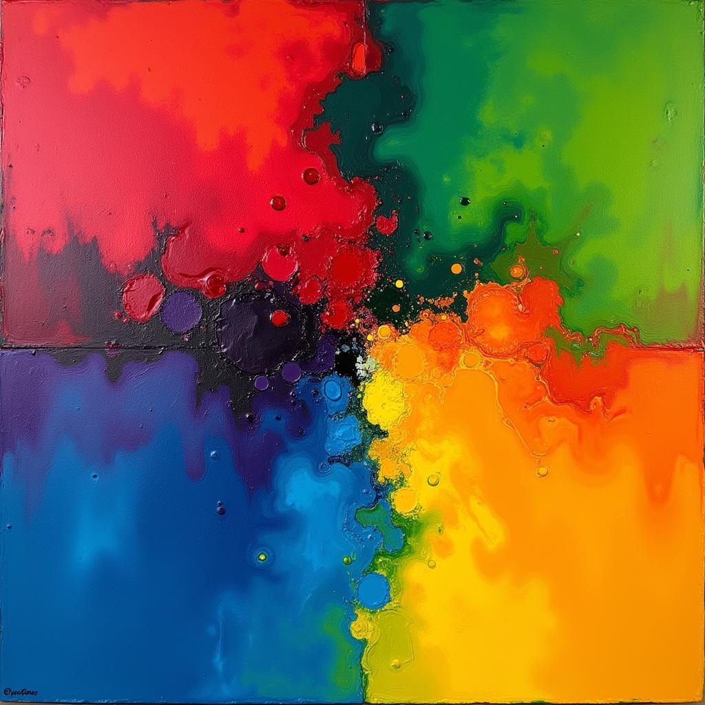
Color plays a vital role in art, evoking emotions, creating depth, and guiding the viewer’s eye. Understanding how artists use color harmonies is key to appreciating the power of art and even creating your own masterpieces. From ancient cave paintings to modern digital art, color harmonies have been a fundamental tool for artists to communicate and express themselves.
Harnessing the power of color theory allows artists to craft visually appealing and emotionally resonant artwork. What is color theory in art, you might ask? It’s the backbone of understanding how colors interact and create harmony. Soon after discovering what color is raw umber, artists often delve into the principles of color harmonies to refine their palette and enhance their compositions. This involves understanding the relationships between colors on the color wheel, how to make a color wheel, and how these relationships influence our perception of art. Learning why color is important in art unlocks a world of creative possibilities.
The Basics of Color Harmonies
Color harmony refers to the pleasing arrangement of colors in a composition. These arrangements are based on the relationships between colors on the color wheel. Several basic color harmonies exist, each with its own unique visual impact and emotional connotation.
Exploring Monochromatic Harmony
Monochromatic harmonies utilize a single color with variations in shade, tint, and tone. This creates a sense of unity and sophistication. Think of a painting featuring various shades of blue, ranging from deep navy to light sky blue. This singular color focus emphasizes subtle nuances and creates a cohesive visual experience.
Complementary Colors: A Dynamic Duo
Complementary colors sit opposite each other on the color wheel, like red and green or blue and orange. These pairings create a vibrant and energetic contrast, often used to draw attention to specific elements within an artwork. Their inherent contrast can also evoke a sense of drama or conflict.
Analogous Harmony: Colors in Conversation
Analogous colors sit next to each other on the color wheel, such as yellow, yellow-green, and green. These harmonies often found in nature evoke feelings of calm and tranquility. Their gradual transition creates a sense of flow and harmony.
 Analogous Color Harmony in Landscape Painting
Triadic Harmony: A Balanced Approach
Triadic harmonies involve three colors evenly spaced on the color wheel, forming an equilateral triangle. This creates a balanced and visually stimulating effect. An example would be a painting using red, yellow, and blue. This triad offers a dynamic yet harmonious color scheme, captivating the viewer’s attention.
Beyond the Basics: Advanced Color Harmonies
While the basic color harmonies provide a solid foundation, artists often explore more complex color relationships to achieve unique effects. These advanced harmonies offer endless possibilities for creative expression.
Split-Complementary Harmony: A Subtler Contrast
The split-complementary harmony involves a base color and the two colors adjacent to its complement. This provides a similar contrast to complementary colors but with a more nuanced and less intense effect. It allows for a wider range of color variations and more subtle visual interactions.
Tetradic Harmony: A Complex Interplay
Tetradic, or double complementary, harmony uses two pairs of complementary colors. This creates a rich and complex interplay of colors that requires careful balancing to avoid overwhelming the viewer. It allows for a wider range of color variations and more subtle visual interactions.
Square Harmony: Four Points of Interest
The square harmony consists of four colors evenly spaced on the color wheel, forming a square. This provides a dynamic and balanced palette with plenty of opportunity for visual interest.
 Tetradic Color Harmony in Abstract Art
How Artists Choose Color Harmonies
The choice of color harmony depends on the artist’s intention and the emotional impact they want to create. A landscape artist might use analogous colors to capture the serene beauty of nature, while an abstract artist might use complementary colors to create a sense of energy and dynamism. Do you wonder what color relates to jazz music? Exploring color associations and harmonies can enrich the creative process.
“Color is a power which directly influences the soul.” – Wassily Kandinsky
Kandinsky’s quote highlights the profound impact color has on our emotional and spiritual experience, showcasing how color choices can transform an artwork.
Conclusion
Understanding how do artists use color harmonies is essential for appreciating the depth and complexity of art. From the basic triad to more complex combinations, color harmonies are powerful tools that artists use to communicate their vision and evoke emotions. By exploring these principles, you can gain a deeper understanding of the power of color in art and even begin to experiment with these harmonies in your own creative endeavors.
FAQ
- What is the simplest color harmony? Monochromatic harmony.
- Which color harmony creates the most contrast? Complementary harmony.
- How can I learn more about color harmonies? Explore color theory resources and experiment with different color combinations.
- What tools can help me choose color harmonies? Color wheels and online color palette generators.
- Why are color harmonies important in art? They create visual interest, evoke emotions, and convey meaning.
- How do I use a color wheel? A color wheel visually represents the relationships between colors, aiding in harmony selection.
- Which harmony is best for beginners? Starting with monochromatic or analogous harmonies can build a strong foundation.
For further reading, we recommend exploring articles on our website such as what is color theory in art, why color is important in art, and how to make a color wheel.
Need help with your next color project? Contact us! Phone: 0373298888, Email: [email protected], or visit us at 86 Cau Giay, Hanoi. We have a 24/7 customer service team ready to assist you.

