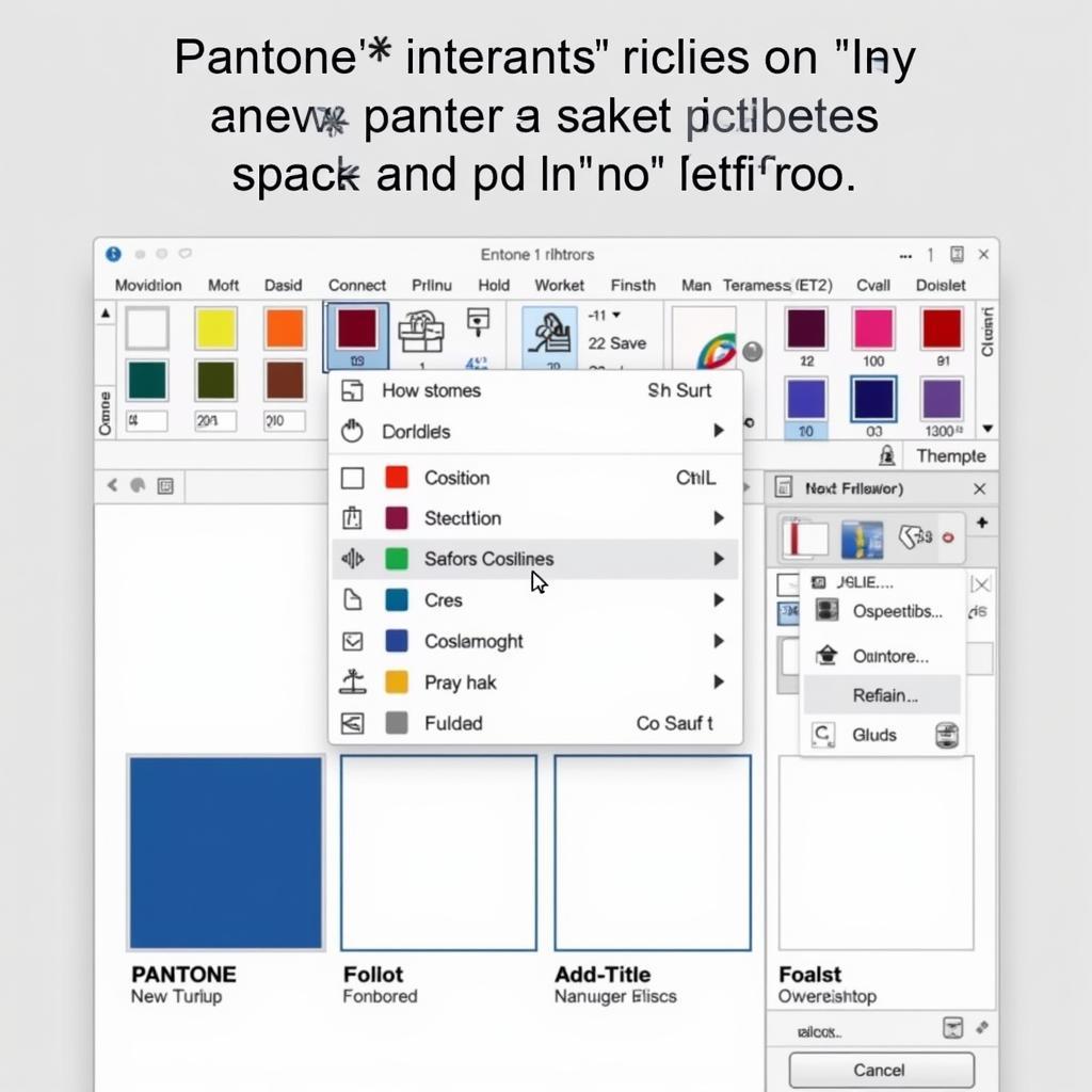
Adding Pantone colors in InDesign is crucial for maintaining color accuracy, especially for print projects. This ensures your designs appear exactly as intended, avoiding color discrepancies between your screen and the final printed product. Whether you’re a seasoned designer or just starting out, mastering this process will elevate your work.
Using Pantone colors gives you precise control over the final output, essential for branding and marketing materials where color consistency is paramount. It’s a simple yet powerful technique that can greatly enhance the professional quality of your designs. Learn how to add Pantone color in InDesign and ensure your vision comes to life in vibrant, accurate color. Want to change the background in InDesign? Check out this guide: how to change the background color in indesign.
Why Use Pantone Colors?
Pantone colors are standardized, ensuring the same color across different printers and substrates. Unlike CMYK, which can vary based on the printing process, Pantone offers a predictable and reliable result. This is especially important when dealing with specific brand colors.
Benefits of Pantone in Print Design
- Consistency: Guarantees your brand colors appear consistently across all printed materials.
- Accuracy: Provides precise color matching, avoiding unexpected color shifts.
- Vibrancy: Often produces more vibrant and saturated colors than CMYK.
- Professionalism: Shows clients and collaborators you’re serious about color quality.
Adding Pantone Colors: A Step-by-Step Guide
Adding a Pantone color in InDesign is a straightforward process. Follow these steps to ensure accurate color representation in your designs.
- Open the Swatches Panel: Go to
Window > Color > Swatches. - New Color Swatch: Click the
New Swatchbutton in the Swatches panel. - Color Type: In the
New Color Swatchdialog box, chooseSpotfrom theColor Typedropdown menu. - Color Mode: Select the desired Pantone library from the
Color Modedropdown menu. You’ll find various Pantone libraries like Pantone Solid Coated, Pantone Solid Uncoated, etc. Choose the library that matches your printing specifications. - Choose Your Color: Browse through the available Pantone colors and select the one you need. You can search by Pantone number or browse visually.
- Name Your Swatch: Give your swatch a descriptive name, such as “Pantone 294 C”.
- Click OK: Click
OKto add the new Pantone swatch to your Swatches panel.
 Adding Pantone Color in InDesign Swatches Panel
Applying Pantone Colors to Your Design Elements
Once you’ve added the Pantone swatch, applying it to your design elements is easy. Simply select the object you want to color and click on the Pantone swatch in the Swatches panel. You can apply Pantone colors to text, shapes, lines, and other design elements.
Tips for Using Pantone Colors
- Consult Your Printer: Always confirm with your printer which Pantone libraries they support and recommend.
- Proof Your Work: Request a physical proof to verify the color accuracy before final printing.
- Consider the Substrate: Different paper stocks can affect how Pantone colors appear.
Using Pantone Connect
Pantone Connect is a valuable resource for managing and sharing Pantone colors. It provides access to the latest Pantone libraries and allows you to create and share color palettes with your team.
 Using Pantone Connect for InDesign Color Management
“Using Pantone Connect streamlines our workflow and ensures everyone is working with the correct brand colors,” says Anna Johnson, Senior Graphic Designer at Design Co.
How to get Pantone colors in InDesign quickly?
Looking to quickly access Pantone colors in InDesign? The Swatches panel is your go-to tool. Simply navigate to the correct Pantone library and select your desired color. For more details on accessing Pantone libraries, check out this helpful guide: how to get pantone colors in indesign.
“Knowing the shortcuts for adding Pantone colors saves me valuable time and makes my design process more efficient,” shares David Lee, freelance graphic designer.
By following these steps and tips, you can effectively utilize Pantone colors in InDesign to create stunning and color-accurate designs. Remember to always consult your printer to ensure the best possible results.
Conclusion
Adding Pantone colors in InDesign is an essential skill for any designer working with print. It ensures color accuracy and consistency, elevating your designs to a professional level. By understanding the process and utilizing tools like Pantone Connect, you can confidently bring your creative vision to life with vibrant, accurate colors.
FAQ
- What is a Pantone color? A Pantone color is a standardized color system used in the printing industry to ensure color accuracy.
- Why should I use Pantone colors instead of CMYK? Pantone colors provide more consistent and accurate color reproduction, especially for brand colors.
- How do I find the right Pantone library? Consult your printer for recommendations based on your printing specifications.
- Can I use Pantone colors for digital designs? While Pantone is primarily for print, you can use Pantone Connect to convert colors for digital use.
- What if my printer doesn’t support a specific Pantone color? They can often suggest a close alternative or offer other printing solutions.
- How do I update my Pantone libraries in InDesign? Use Pantone Connect to sync the latest libraries.
- Where can I learn more about Pantone? The Pantone website offers extensive resources and information.
Need support? Contact us at Phone: 0373298888, Email: [email protected] or visit us at 86 Cau Giay, Hanoi. We have a 24/7 customer service team.

