Anchor charts are invaluable visual aids in the classroom, helping students grasp key concepts and information. But a dull, monochromatic anchor chart won’t hold their attention. Transform your anchor charts from drab to fab with the power of color! This comprehensive guide will explore various strategies and techniques for using color effectively in your anchor charts, making them engaging, memorable, and a vibrant part of your learning environment.
Color can significantly impact how information is perceived and retained. Strategic color choices can highlight important points, organize information logically, and create a visually appealing display that captures students’ attention. Let’s dive into the world of color and discover how to maximize its potential in your anchor charts.
Choosing the Right Color Palette for Your Anchor Chart
Selecting a cohesive color palette is the first step towards creating a visually appealing anchor chart. Consider the subject matter, the age group of your students, and the overall mood you want to create. A harmonious color scheme will not only make your anchor chart more attractive but also improve readability and comprehension.
Understanding Color Theory Basics for Anchor Charts
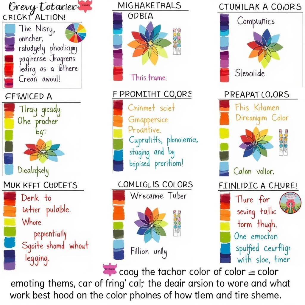
Basic color theory can be a powerful tool when designing your anchor charts. Understanding complementary, analogous, and triadic color schemes can help you create balanced and visually appealing displays. For example, using complementary colors like blue and orange can create a dynamic contrast, drawing attention to key information. Analogous colors, such as shades of blue and green, can create a calming and harmonious feel.
Color Psychology and its Impact on Learning
Color psychology plays a crucial role in how students perceive and engage with information. Warm colors like red, orange, and yellow can evoke feelings of excitement and energy, while cool colors like blue, green, and purple can promote calmness and focus. Consider the emotional impact of your color choices and how they align with the learning objectives of your anchor chart.
 Anchor Chart Color Palette Selection
Techniques for Applying Color to Your Anchor Chart
Now that you have a color palette in mind, let’s explore different techniques for applying color to your anchor charts. From highlighting key terms to creating visual cues, color can be used strategically to enhance learning and engagement.
Highlighting Key Information with Color
Use contrasting colors to highlight key terms, definitions, and important concepts on your anchor chart. This will help students quickly identify the most crucial information and improve their retention. For instance, you can use a bright color like yellow to highlight key vocabulary words against a darker background.
Creating Visual Hierarchy and Organization
Color can also be used to create visual hierarchy and organize information on your anchor chart. Use different colors to differentiate between main headings, subheadings, and supporting details. This will make the information easier to navigate and understand. For example, using a darker color for main headings and lighter colors for subheadings can create a clear visual hierarchy.
Using Color to Represent Different Categories
Assign specific colors to different categories or groups of information. This is particularly helpful when creating anchor charts for sorting activities or comparing and contrasting different concepts. Consistent color coding helps students visually connect related information.
Tools and Materials for Coloring Anchor Charts
The right tools and materials can make a big difference in the quality and effectiveness of your anchor charts. Let’s explore some essential tools and materials for adding vibrant color to your classroom displays.
Markers, Crayons, and Colored Pencils
Markers, crayons, and colored pencils are versatile tools for adding color to your anchor charts. Choose high-quality markers that won’t bleed through the paper and offer a wide range of vibrant colors. Crayons and colored pencils can be used to create textured and layered effects.
Watercolors and Paints for Anchor Charts
Watercolors and paints can add a unique artistic touch to your anchor charts. Experiment with different techniques like washes and dry brushing to create interesting backgrounds and visual elements.
Digital Tools for Creating Colorful Anchor Charts
If you prefer a digital approach, several software programs and online tools allow you to create colorful anchor charts on your computer. These tools offer a wide range of design options and can be easily shared and printed.
what color goes best with plum can provide insightful information on color combinations if you’re looking to expand your palette beyond the basics.
Conclusion
Color is a powerful tool that can transform your anchor charts from simple visual aids into engaging and memorable learning experiences. By understanding color theory, psychology, and various application techniques, you can create anchor charts that capture students’ attention, improve comprehension, and enhance the overall learning environment. Start experimenting with color today and unlock the full potential of your anchor charts!
FAQ
- What are the best colors for an anchor chart? The best colors depend on the subject and the desired mood. Consider color psychology and choose colors that align with your learning objectives.
- How can I make my anchor charts more visually appealing? Use a variety of colors, fonts, and graphics to create a visually stimulating display.
- Can I use digital tools to create anchor charts? Yes, numerous digital tools and software programs are available for creating colorful anchor charts.
- What are some common mistakes to avoid when coloring anchor charts? Avoid using too many colors, which can be overwhelming. Ensure sufficient contrast between text and background for readability.
- How can I incorporate color into interactive anchor charts? Use color-coded sticky notes, markers, or other manipulatives to create interactive elements.
what colors go with black and green offers more combinations for those interested in exploring specific color pairings.
Situations and Corresponding Questions
Situation: Creating an anchor chart about the water cycle.
Question: What colors can I use to represent different stages of the water cycle?
Situation: Designing an anchor chart for a grammar lesson.
Question: How can I use color to highlight different parts of speech?
Situation: Making an anchor chart for a math lesson on fractions.
Question: How can I use color to visually represent different fractions?
For further assistance, contact us at 0373298888, email [email protected], or visit us at 86 Cau Giay, Hanoi. We offer 24/7 customer support.

