Cream, a versatile and timeless color, adds a touch of warmth and elegance to any space. Whether you’re painting walls, mixing paints for an art project, or even experimenting with digital design, knowing how to create the perfect cream color is a valuable skill. This guide will explore various methods to achieve that perfect creamy hue, from understanding the basics of color mixing to achieving specific shades and undertones.
Creating cream involves understanding how different colors interact. It’s more than just adding white to yellow; it’s about finding the right balance and adding subtle hints of other colors to achieve the desired warmth and depth. For example, a touch of brown can create a richer, more antique cream, while a hint of blue can create a cooler, more contemporary feel. Let’s dive into the world of color mixing and discover the secrets to creating the perfect cream. Want to learn how to coordinate colors? Check out what color shirt with green pants.
Mixing Cream with Paints
Achieving the perfect cream with physical paints requires a bit of experimentation. Here’s a step-by-step guide to help you achieve your desired shade:
- Start with White: Begin with a pure white base. This will be the foundation of your cream color.
- Introduce Yellow: Gradually add small amounts of yellow to the white. Yellow is the key to creating the creamy base.
- Adjust with Brown or Red: To add warmth and depth, introduce a tiny amount of brown or a touch of red. This step is crucial for creating a cream that isn’t too pale or stark.
- Test and Adjust: Apply the mixture to a test surface and let it dry. The color will often appear slightly different once dried. Adjust the color by adding more white, yellow, brown, or red until you achieve the desired cream shade.
- Record your Recipe: Once you’ve achieved your perfect cream, make sure you write down the proportions of each color used. This will allow you to easily recreate the same color in the future.
Digital Cream Color Creation
Creating cream digitally offers a different approach, allowing for precise control over color values. Here’s how you can create cream digitally:
- Choose your Color Model: Select the color model you’re working with, be it RGB, CMYK, or HEX. Each model has a unique way of representing colors.
- Adjust RGB/CMYK values: For RGB, increase the Red, Green, and Blue values to create a light base, then fine-tune the ratios to achieve your desired cream. For CMYK, reduce the Cyan, Magenta, and Yellow values, and add a small amount of Black to create depth.
- Use HEX Codes: HEX codes offer a precise way to define colors. Experiment with different HEX codes to find the perfect cream.
- Utilize Color Pickers: Most design software includes color pickers that allow you to select cream visually or by adjusting sliders.
Different Shades of Cream
Cream isn’t just one color; it’s a family of hues. Explore these variations:
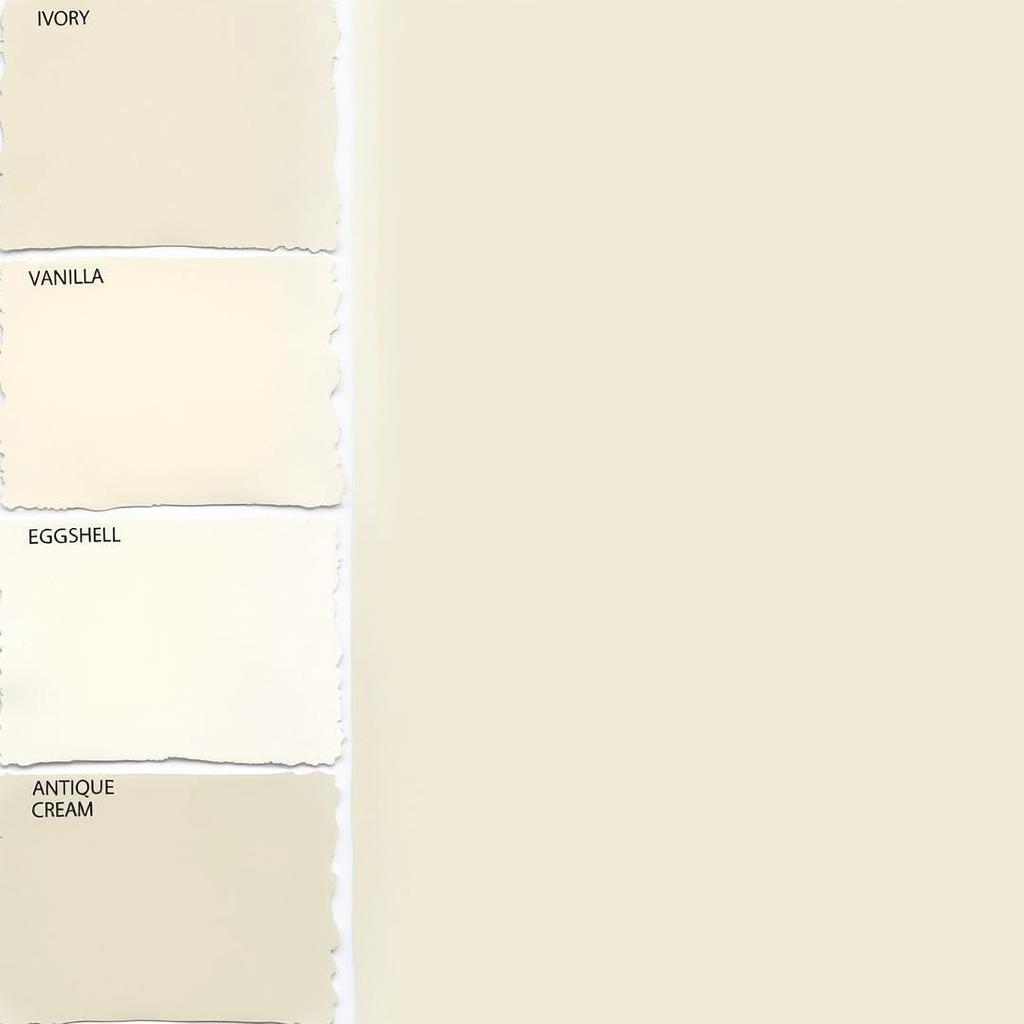
- Ivory: A creamy white with a subtle hint of yellow.
- Vanilla: A warmer cream with a touch of brown or beige.
- Eggshell: A light, slightly off-white cream resembling the color of an eggshell.
- Antique Cream: A cream with more pronounced yellow and brown undertones, reminiscent of aged parchment.
You can also play with different undertones to customize your cream color even further. For instance, adding a touch of pink can create a warmer, blush-toned cream, while a hint of blue can create a cooler, almost grayish cream. These subtle shifts can dramatically alter the feel of the color. If you’re curious about contouring, learn more about what color should contour be.
Tips for Using Cream Color
Cream is an incredibly versatile color, working well in various settings. Here are a few tips to maximize its potential:
- Pairs Well with Neutrals: Cream harmonizes beautifully with other neutral colors like gray, beige, and brown.
- Accentuates Bold Colors: Use cream as a backdrop to make vibrant colors pop.
- Creates a Calming Atmosphere: Cream’s soft, warm tones create a sense of tranquility and comfort.
- Versatile for Different Styles: From modern to traditional, cream complements a range of interior design styles.
 Different Shades of Cream Paint Swatches
“Cream is a fantastic base for any space,” says renowned color consultant, Amelia Hughes. “Its subtle warmth creates a welcoming atmosphere while allowing other colors to shine.”
Conclusion
Creating the perfect cream color is a rewarding process. Whether you’re mixing paints or working digitally, understanding the underlying principles of color mixing will empower you to achieve your desired shade. From subtle variations in undertones to choosing the right complementary colors, the possibilities are endless. Remember to experiment, test, and have fun with it! By mastering the art of creating cream, you can transform any space into a haven of warmth, elegance, and style. For those interested in color and style, you might find helpful tips on what color frames for blue eyes. Looking for a specific color? Find out what color starts with the letter c.
FAQ
-
What colors make cream color? Cream is typically created by mixing white with yellow and small amounts of brown or red.
-
How do you make cream color lighter? Add more white to lighten a cream color.
-
What is the difference between cream and ivory? Ivory is a creamy white with a subtle yellow undertone, while cream can encompass a wider range of hues with varying degrees of yellow, brown, or red.
-
What colors go well with cream? Cream pairs well with most colors, especially neutrals like gray, beige, and brown. It also complements bolder colors, allowing them to stand out.
-
Is cream a warm or cool color? Cream is generally considered a warm color due to its yellow undertones. However, adding a hint of blue can create a cooler, grayish cream.
Common Scenarios
- Scenario 1: You want to paint your living room a warm, inviting cream. Start with a white base and add small amounts of yellow and brown until you achieve the desired warmth.
- Scenario 2: You’re designing a website and need a soft, creamy background. Experiment with RGB or HEX values to create a subtle cream that complements your website’s content.
- Scenario 3: You’re mixing paints for an art project and need a specific shade of antique cream. Start with white and add yellow and brown, focusing on the brown to create a deeper, aged effect.
Further Exploration
Explore more color mixing techniques and learn how to create other skin tones by checking out how to make a skin tone color.
Need help with color selection?
Contact us at Phone Number: 0373298888, Email: [email protected] or visit us at 86 Cầu Giấy, Hà Nội. We have a 24/7 customer service team ready to assist you.

