Choosing the right colors can make or break your digital artwork. Whether you’re a seasoned digital artist or just starting out with Procreate, understanding how to select color in Procreate effectively is crucial for bringing your creative visions to life. This guide will equip you with the knowledge and techniques to confidently navigate Procreate’s color selection tools and unlock a world of possibilities for your digital masterpieces.
Understanding Procreate’s Color System
Procreate offers a robust and intuitive color system designed to empower artists of all levels. Familiarizing yourself with its key components is the first step towards mastering color selection.
The Color Panel: Your Creative Hub
The Color Panel in Procreate is your go-to destination for all things color. It provides various methods for selecting, adjusting, and managing your color palettes, giving you complete control over your color choices.
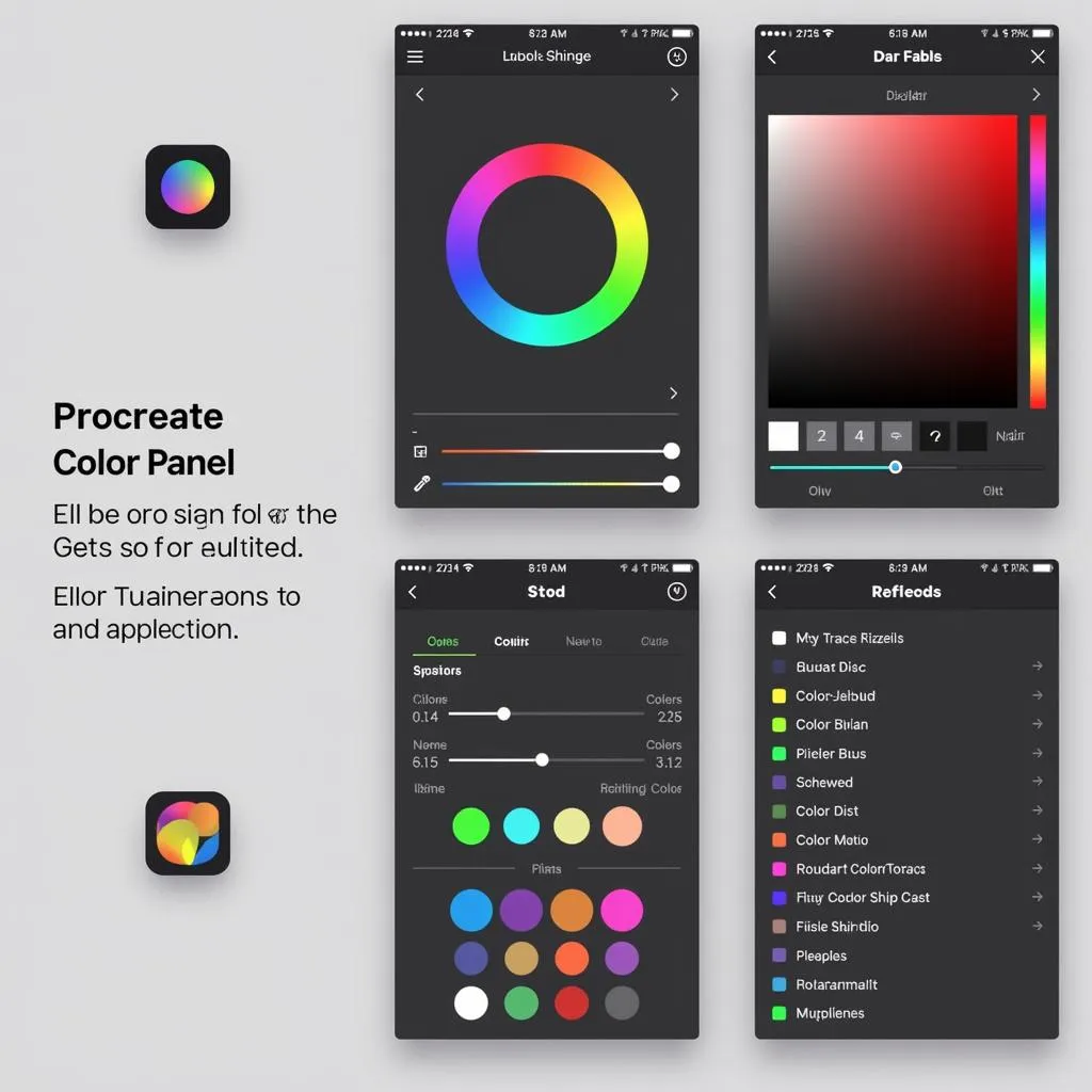 Procreate Color Panel
Color Spaces: RGB and You
Procreate works primarily in the RGB color space, which stands for Red, Green, and Blue. Understanding this color model is essential, as it dictates how colors are mixed and displayed on digital screens.
Color Harmony: The Art of Pleasing Combinations
Color harmony refers to the principles that govern aesthetically pleasing color combinations. Procreate offers tools and features that can help you create harmonious color palettes, ensuring your artwork is visually appealing and engaging.
Methods of Color Selection in Procreate
Procreate offers a variety of ways to select colors, catering to different preferences and workflows. Let’s explore the most common methods:
1. The Color Disc: Intuitive Color Picking
The Color Disc provides a visual representation of the color spectrum, allowing you to intuitively select colors by dragging your finger or stylus across the screen. You can adjust the hue, saturation, and brightness to fine-tune your selection.
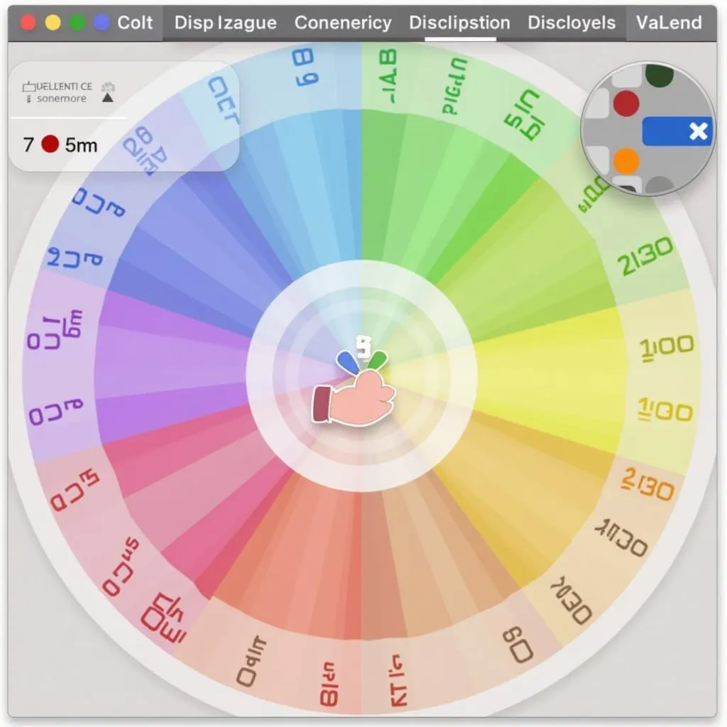 Procreate Color Disc
2. Color Palettes: Organized Creativity
Procreate allows you to create and save custom color palettes, providing quick access to your frequently used colors or color schemes. You can also import pre-made palettes, streamlining your workflow and ensuring color consistency across your projects.
3. The Eyedropper Tool: Precision Color Matching
The Eyedropper Tool allows you to sample colors directly from your canvas or imported images. This is invaluable for matching colors precisely, creating seamless blends, or replicating color schemes from reference materials.
4. Color Values: Numerical Precision
For those who prefer numerical control, you can directly input specific color values using sliders or text fields. This method offers the highest level of precision, especially when working with specific color codes or matching brand colors.
Tips and Tricks for Effective Color Selection
Here are some additional tips and tricks to elevate your color selection skills in Procreate:
- Use color theory to your advantage: Familiarize yourself with basic color theory concepts like complementary colors, analogous colors, and triadic color schemes to create harmonious and visually appealing color palettes.
- Experiment with different blending modes: Procreate’s blending modes can drastically alter how colors interact with each other, opening up a world of creative possibilities. Don’t be afraid to experiment and see what happens!
- Utilize color palettes from real life: Draw inspiration from nature, photography, or other art forms to create unique and captivating color schemes. You can use the Eyedropper Tool to sample colors directly from images.
- Practice makes perfect: The more you practice selecting and combining colors in Procreate, the more confident and intuitive your color choices will become. Don’t be afraid to make mistakes – that’s how you learn and grow!
Conclusion
Mastering color selection in Procreate is an ongoing journey of exploration and discovery. By understanding the tools at your disposal, experimenting with different techniques, and continually seeking inspiration, you can unlock the full potential of color and elevate your digital artistry to new heights. Remember, the only limit is your imagination, so embrace the world of color and let your creativity shine!
FAQ
1. Can I import color palettes from other apps?
Yes, Procreate allows you to import color palettes in various formats, including Adobe Swatch Exchange (.ase) files.
2. How do I create a gradient in Procreate?
You can create gradients by selecting two or more colors in your color palette and using the Gradient Tool, which offers various gradient styles and options.
3. Can I adjust the color of an entire layer in Procreate?
Yes, you can use adjustment layers like “Color Balance” or “Hue/Saturation/Brightness” to modify the colors of an entire layer without permanently altering the original artwork.
4. What is the best way to choose skin tones in Procreate?
Start with a base skin tone and then use a variety of shades and hues to add depth and realism. It’s helpful to study reference images and observe how light interacts with different skin tones.
5. How do I create a metallic or shiny effect with color?
To create metallic or shiny effects, you can use a combination of techniques, such as layering colors with different brightness levels, applying gradients, and using Procreate’s blending modes.
For further assistance with selecting colors in Procreate, feel free to explore our other helpful resources:
- How to color pick on procreate
- How to copy a color in procreate
- How to coloring manga
- What is color balance
- How to select a color on procreate
Need personalized guidance on your next creative project? Don’t hesitate to reach out! Contact us at Phone Number: 0373298888, Email: [email protected] or visit us at 86 Cầu Giấy, Hà Nội. Our dedicated team is available 24/7 to assist you.