Map colors are not just about aesthetics; they play a crucial role in conveying information effectively. Whether you’re a cartographer, a student studying geography, or simply someone who enjoys exploring maps, understanding the significance of map colors can greatly enhance your map-reading skills.
Decoding the Language of Hues
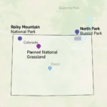
Different colors on a map represent various geographical features and data. For instance, blue often depicts water bodies like oceans, lakes, and rivers. Green typically signifies vegetation like forests and grasslands, while brown shades indicate mountainous areas and elevation changes. Urban areas are frequently represented in gray.
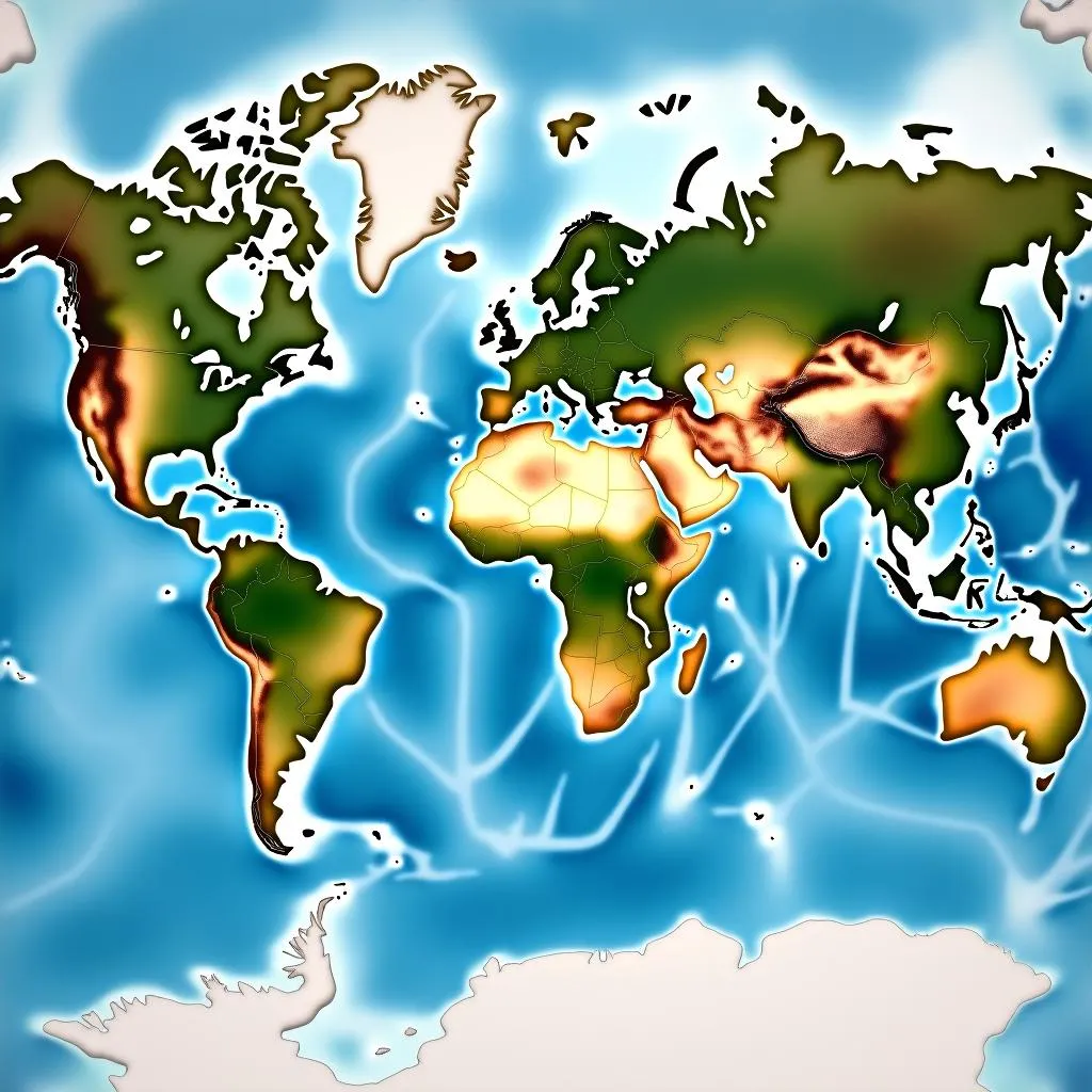 Map Color Representation
The Importance of Contrast and Clarity
One of the primary reasons for using different colors on maps is to create contrast and improve visual clarity. By assigning distinct colors to different features, mapmakers enable users to differentiate between various elements quickly. For example, imagine trying to distinguish between a river and a road on a map if both were represented in the same shade of blue. It would be nearly impossible!
Conveying Data Through Color
Beyond representing physical features, map colors are powerful tools for visualizing data. Choropleth maps, for instance, use varying shades of a single color or multiple colors to illustrate the distribution of data across different geographic regions. For example, a choropleth map might use shades of red to show population density, with darker shades indicating higher density and lighter shades representing lower density.
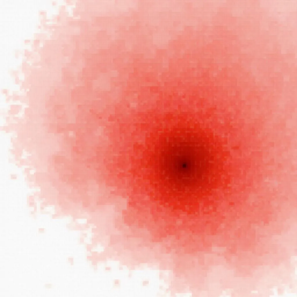 Choropleth Map of Population Density
The Psychology of Color in Cartography
The choice of colors on a map isn’t arbitrary; it often involves careful consideration of color psychology. Different colors evoke different emotions and associations in viewers. For instance, red is often associated with danger or importance, which is why it’s often used for warning signs or to highlight critical areas on maps.
The Evolution of Map Colors
The use of color in cartography has a rich history, evolving alongside technological advancements. Early maps were often black and white, relying on symbols and shading to convey information. The invention of color printing revolutionized mapmaking, allowing for more detailed and visually appealing representations of the world.
Common Questions About Map Colors
Why is the ocean not always blue on maps?
While blue is the most common color for depicting water bodies, some maps may use other colors for stylistic reasons or to highlight specific information. For instance, a map focusing on ocean currents might use different colors to represent the direction and temperature of the water flow.
Do all countries use the same color conventions on maps?
No, color conventions can vary slightly between countries and mapmaking organizations. However, certain conventions, such as using blue for water and green for vegetation, are widely recognized.
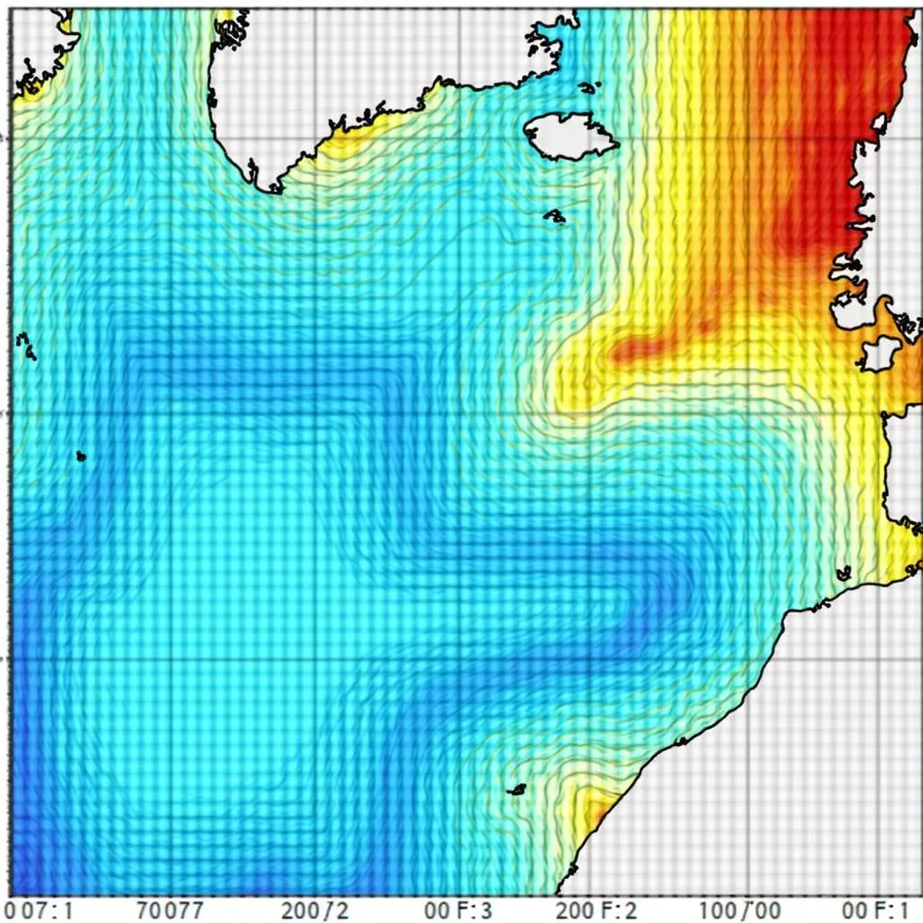 Ocean Current Map
Conclusion
Understanding map colors is essential for anyone who interacts with maps regularly. By deciphering the language of hues, we can unlock a wealth of geographical information and gain a deeper appreciation for the art and science of cartography. The next time you encounter a map, take a moment to appreciate the thoughtful use of color and the story it tells.
Do you need help choosing the perfect color palette for your next project? Contact us at Phone Number: 0373298888, Email: [email protected]. Our team of color experts at Color Box Hà Nội is available 24/7 to assist you! You can also visit our store at 86 Cầu Giấy, Hà Nội, to explore our wide range of paint options and design services.