Cream, a shade radiating warmth and versatility, forms a wonderful base for various design aesthetics. Whether you’re drawn to modern minimalism or classic elegance, understanding what color goes well with cream empowers you to create spaces that are both inviting and visually captivating. This guide will delve into the art of pairing cream with other hues, exploring diverse moods and styles you can effortlessly achieve.
Unlocking the Potential of Cream: A Neutral With Character
Cream, unlike stark white, carries a subtle warmth, making it an ideal backdrop for both bold and muted color palettes. Its inherent versatility allows it to seamlessly transition from a primary wall color to an accent within furniture and decor.
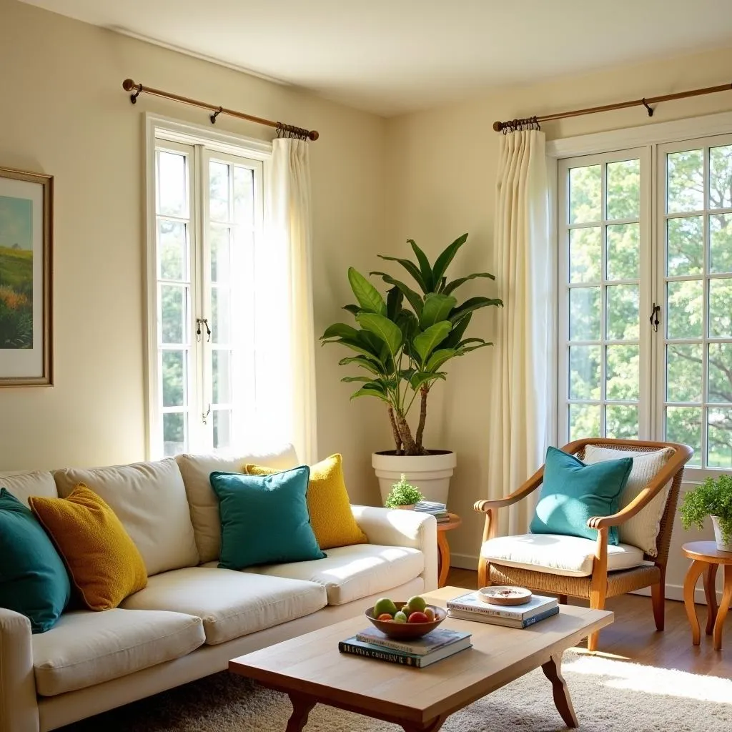 Cream Living Room With Colorful Accents
Creating Harmony: Colors that Complement Cream
Pairing cream effectively relies on understanding its undertones and the desired ambiance. Let’s delve into some captivating combinations:
1. Cream and Blue: A Timeless Duo
This classic pairing evokes a sense of tranquility and balance. The coolness of blue, whether a deep navy or a breezy sky blue, beautifully contrasts cream’s warmth, crafting a harmonious and sophisticated environment.
2. Cream and Green: Bringing the Outdoors In
Infuse your space with a breath of fresh air by pairing cream with various shades of green. Olive green introduces an earthy elegance, while mint green adds a touch of vibrancy and playfulness. This combination works wonders in kitchens, bedrooms, and living areas.
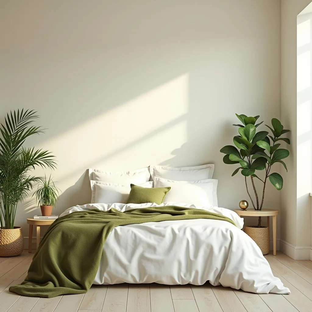 Serene Bedroom with Cream and Green Palette
3. Cream and Pink: A Softly Romantic Ambiance
Cream provides a grounded backdrop for the romantic allure of pink. From blush to dusty rose, these hues introduce a gentle warmth and a touch of femininity. This pairing is ideal for bedrooms, nurseries, and even bathrooms.
4. Cream and Gray: Modern Minimalism at its Best
For those drawn to understated elegance, the combination of cream and gray is a perfect choice. The coolness of gray beautifully offsets the warmth of cream, resulting in a balanced and contemporary aesthetic. Experiment with different shades of gray, from charcoal to dove, to create varying levels of contrast.
Enhancing Your Cream Color Scheme: Tips and Tricks
- Consider Lighting: Natural light enhances the warmth of cream, while artificial lighting can impact its undertones. Test your color combinations under different lighting conditions to ensure the desired effect.
- Play with Textures: Introduce visual interest by incorporating various textures. Think chunky knit blankets, velvet cushions, or woven baskets against your cream backdrop.
- Don’t Shy Away from Patterns: Cream acts as a fantastic canvas for patterns. Introduce patterned cushions, rugs, or artwork to add depth and personality to your space.
Expert Insight
“Cream, often seen as a neutral backdrop, possesses an inherent power to elevate other colors,” shares renowned interior designer, Emily Carter. “Understanding its warmth and pairing it with complementary hues allows you to create spaces that are both visually stunning and emotionally resonant.”
Conclusion
Navigating the world of color combinations can be daunting, but understanding what color goes well with cream unlocks a world of design possibilities. By thoughtfully pairing cream with complementary hues and incorporating textures and patterns, you can transform any space into a reflection of your unique style. Remember, the key lies in choosing colors that resonate with your aesthetic and evoke the desired ambiance.
If you’re looking for guidance on finding the perfect color palette for your next project, our team at Color Box Hanoi is here to assist. Contact us today!