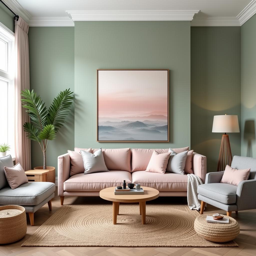
Subdued colors are essential to understand for anyone interested in interior design, fashion, or even just appreciating the world around them. These colors aren’t loud or vibrant; they possess a quiet charm, adding a touch of elegance and sophistication to any setting. They’re the backbone of creating calming atmospheres and subtle, yet impactful, design schemes. So, what exactly defines a subdued color?
Understanding Subdued Colors
A subdued color is essentially a color that has been toned down, often by mixing it with gray, brown, or its complementary color. This process reduces the color’s intensity and saturation, creating a softer, more muted effect. Think of it like turning down the volume on a vibrant hue. While bright colors demand attention, subdued colors whisper elegance and create a sense of calm. They’re the perfect backdrop for showcasing bolder accent colors or creating a harmonious, monochromatic scheme. They can evoke feelings of tranquility, sophistication, and timeless style.
How are Subdued Colors Different from Muted Colors?
While often used interchangeably, “subdued” and “muted” have subtle differences. A muted color is typically desaturated, lacking vibrancy. A subdued color, while also desaturated, can retain a certain richness and depth. It’s less about the absence of vibrancy and more about a controlled, refined expression of color. Think of a deep teal versus a pale, washed-out blue. Both are muted, but the teal retains its richness, making it a subdued color. Similar to how certain what color sheets can create a calming atmosphere, subdued colors achieve a similar effect in a room’s overall design.
Why Choose Subdued Colors?
Subdued colors offer a range of benefits in design. They create a sense of spaciousness, making a room feel larger and more airy. Their calming effect makes them ideal for bedrooms, living rooms, and other spaces where relaxation is key. They also serve as an excellent backdrop for artwork and other decorative elements, allowing these pieces to truly shine. Just as what colors go with wine red can create a rich and inviting space, subdued colors offer a similar sense of depth and sophistication.
Creating Harmony with Subdued Colors
Subdued colors are incredibly versatile and work well together. Creating a monochromatic scheme using various shades of a single subdued color can create a sophisticated and cohesive look. They also pair beautifully with natural materials like wood, stone, and linen, enhancing their organic textures and creating a sense of warmth and comfort. Like choosing the right what color bathing suit should i wear, selecting the right subdued color can drastically affect the overall aesthetic.
 Subdued Colors in Interior Design
Incorporating Subdued Colors into Your Life
From wall paint to fashion choices, subdued colors can elevate any aspect of your life. Consider using them in your wardrobe to create timeless and elegant outfits. Incorporate them into your home decor to foster a sense of tranquility and sophistication. Even small touches, like accessories or accent pieces, can make a significant difference. Understanding the impact of color, like exploring what color is titanium rush metallic, can help you make more informed choices about the colors you surround yourself with.
Expert Insight
Jane Doe, a renowned interior designer, emphasizes, “Subdued colors are the unsung heroes of design. They provide a foundation of elegance and allow other elements to take center stage.”
John Smith, a leading color consultant, adds, “The beauty of subdued colors lies in their versatility. They can be calming, sophisticated, or even playful, depending on how they’re used.”
In conclusion, subdued colors are more than just muted tones. They represent a refined approach to color, offering a sense of calm, sophistication, and timeless style. By understanding their unique qualities and how to incorporate them effectively, you can create spaces and looks that are both visually appealing and emotionally resonant.
FAQ
-
What are some examples of subdued colors? Sage green, dusty rose, charcoal gray, and muted teal are all examples of subdued colors.
-
How can I create a subdued color palette? Mix a vibrant color with gray, brown, or its complementary color to create a subdued version.
-
Are subdued colors only for interiors? No, subdued colors can be used in fashion, graphic design, and any other visual medium.
-
What’s the difference between subdued and pastel colors? Pastel colors are typically lighter and less saturated than subdued colors.
-
Can I use subdued colors with bright colors? Yes, subdued colors make excellent backdrops for brighter accent colors.
-
What is the psychological effect of subdued colors? Subdued colors often evoke feelings of calm, tranquility, and sophistication.
-
Where can I find inspiration for using subdued colors? Interior design magazines, online platforms like Pinterest, and nature itself are great sources of inspiration.
Need more help with color selection? Contact us at Phone: 0373298888, Email: [email protected] or visit us at 86 Cau Giay, Hanoi. We have a 24/7 customer service team ready to assist you.

