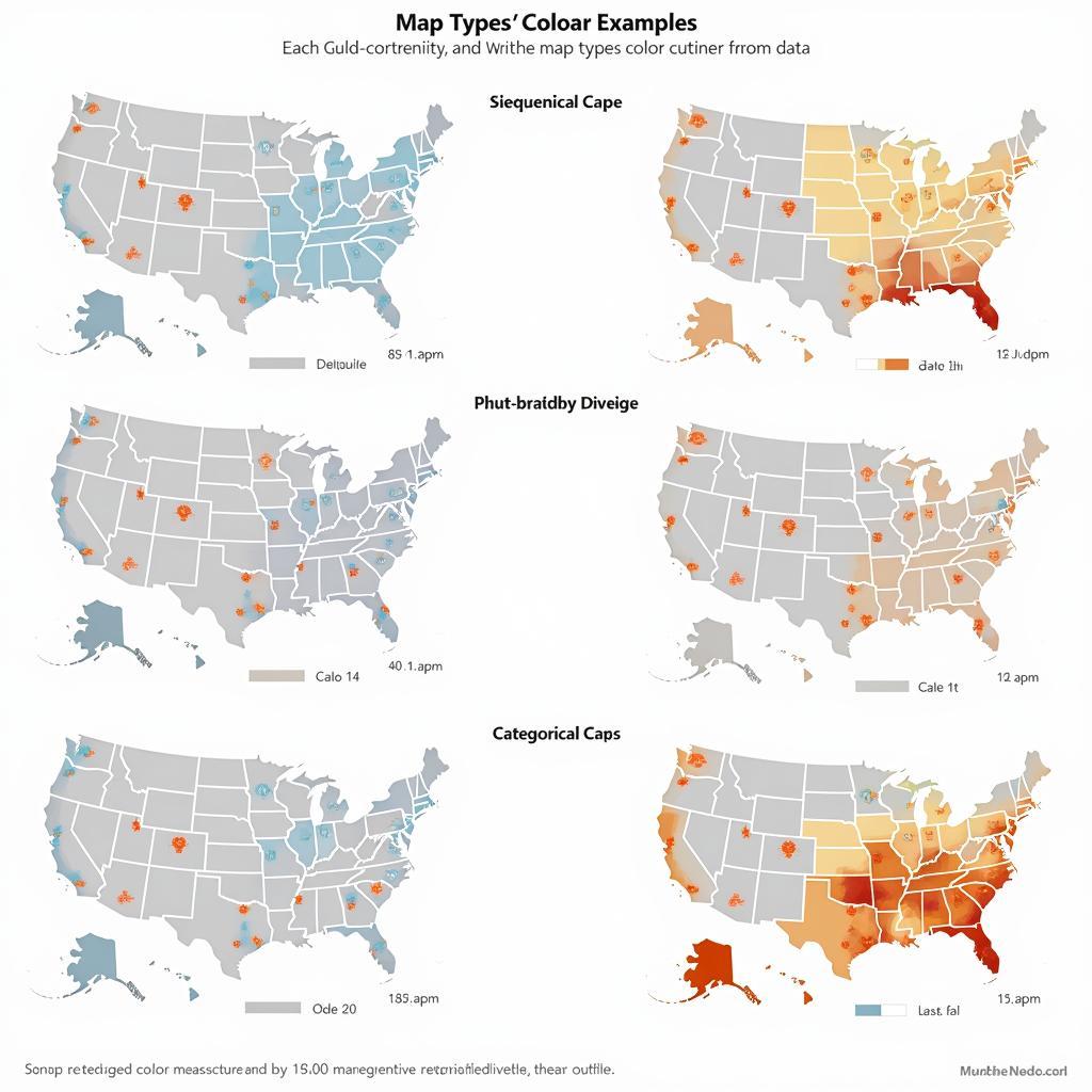
Color coding a map transforms a simple geographical representation into a powerful visual communication tool. It allows us to quickly grasp complex information, identify patterns, and make informed decisions. But what is the best reason to color code a map? While there are many advantages, the most compelling reason is its ability to enhance understanding and facilitate insightful analysis of spatial data. Read on to explore the power of color-coded maps.
Unlocking the Power of Visual Communication Through Map Color Coding
Color-coded maps are more than just pretty pictures; they are essential tools for conveying information effectively. From identifying population density to tracking disease outbreaks, the strategic use of color on a map can reveal hidden relationships and make complex data accessible to a wider audience. This visual clarity empowers decision-making in various fields, from urban planning to public health.
Why Color Code a Map? Unveiling the Key Benefits
Color coding offers a multitude of benefits in cartography. Here are some key advantages:
- Improved Clarity: Color differentiates areas based on specific criteria, making it easy to distinguish regions and their associated values.
- Enhanced Pattern Recognition: Visualizing data through color highlights trends and patterns that might be missed in a monochrome map.
- Simplified Data Interpretation: Color coding translates numerical data into a visual format, making it instantly understandable for a broader audience.
- Increased Engagement: A well-designed color-coded map is visually appealing and encourages interaction with the data.
- Effective Communication: Color coding allows for efficient communication of complex spatial information, enabling faster and more informed decision-making.
Imagine trying to understand the distribution of different tree species in a forest without color coding. A monochrome map would show the location of each tree, but differentiating between species would be challenging. A color-coded map, however, could assign a unique color to each species, instantly revealing their distribution and potential interactions.
how to know the color code of my car
Different Types of Color Coding Techniques
Several color coding methods cater to various data types and objectives. Choosing the right technique is crucial for effectively communicating your message. These include:
- Sequential Color Schemes: Ideal for representing data that progresses from low to high values, such as population density or elevation.
- Diverging Color Schemes: Effective for highlighting variations around a central value, like temperature deviations from the average.
- Categorical Color Schemes: Best for distinguishing distinct categories, such as different land use types or political boundaries.
Choosing the appropriate color scheme is critical for accurate data representation. For instance, using a sequential scheme for categorical data can mislead viewers into perceiving a hierarchical relationship where none exists.
Best Practices for Effective Map Color Coding
Creating a truly effective color-coded map requires careful consideration of several factors:
- Color Blindness Awareness: Choose color palettes that are accessible to individuals with color vision deficiencies.
- Legend Clarity: Provide a clear and concise legend explaining the meaning of each color.
- Data Accuracy: Ensure the underlying data is accurate and reliable to avoid misrepresentations.
- Simplicity and Focus: Avoid cluttering the map with too many colors or unnecessary details.
“A well-designed color-coded map is a work of art that informs and inspires,” says renowned cartographer Dr. Amelia Carter. “It’s not just about choosing pretty colors; it’s about using color strategically to reveal the story hidden within the data.”
What is the best color coding for a map?
The “best” color coding depends entirely on the data you’re presenting and your target audience. Understanding your data’s characteristics and choosing a suitable color scheme is paramount.
How many colors should you use on a color-coded map?
Too many colors can overwhelm the viewer, while too few can obscure important distinctions. Finding the right balance is key. Generally, five to seven colors are sufficient for most maps.
 Different Color Schemes for Maps
Conclusion: Unlocking Insights with Color-Coded Maps
Color coding a map is undeniably the most effective way to enhance understanding and facilitate insightful analysis of spatial data. By transforming raw data into a visually compelling narrative, color-coded maps empower us to grasp complex information, identify hidden patterns, and make informed decisions.
FAQ
- What is the purpose of a color-coded map? To visually represent data and make it easier to understand.
- What are the different types of color schemes used in maps? Sequential, diverging, and categorical.
- How do I choose the right color scheme for my map? Consider the type of data you are representing and your target audience.
- What are some common mistakes to avoid when color coding a map? Using too many colors, not considering color blindness, and having an unclear legend.
- Where can I find resources for creating color-coded maps? Numerous online tools and software programs are available.
- Why is it important to consider color blindness when designing a map? To ensure accessibility for all users.
- How can I ensure the accuracy of my color-coded map? By using reliable data sources and carefully checking your work.
“Color is a powerful tool in the hands of a skilled cartographer,” adds Dr. Carter. “It can illuminate the world in ways we never thought possible.”
Need support with color selection or design? Contact us at 0373298888, email [email protected], or visit our office at 86 Cau Giay, Hanoi. Our 24/7 customer service team is ready to assist you.

