When you think of a warning sign, what color comes to mind? If you thought yellow, you’re not alone. There’s a reason why yellow is the universal color for caution and warning signs.
The Science Behind the Color Yellow
Yellow is the most visible color in daylight. It has the highest wavelength on the visible light spectrum, meaning it’s the first color the human eye perceives. This makes it incredibly effective at grabbing attention, even from a distance.
But it’s not just about visibility. Yellow also triggers a psychological response. Studies have shown that yellow can increase alertness and even anxiety, which is why it’s often associated with caution.
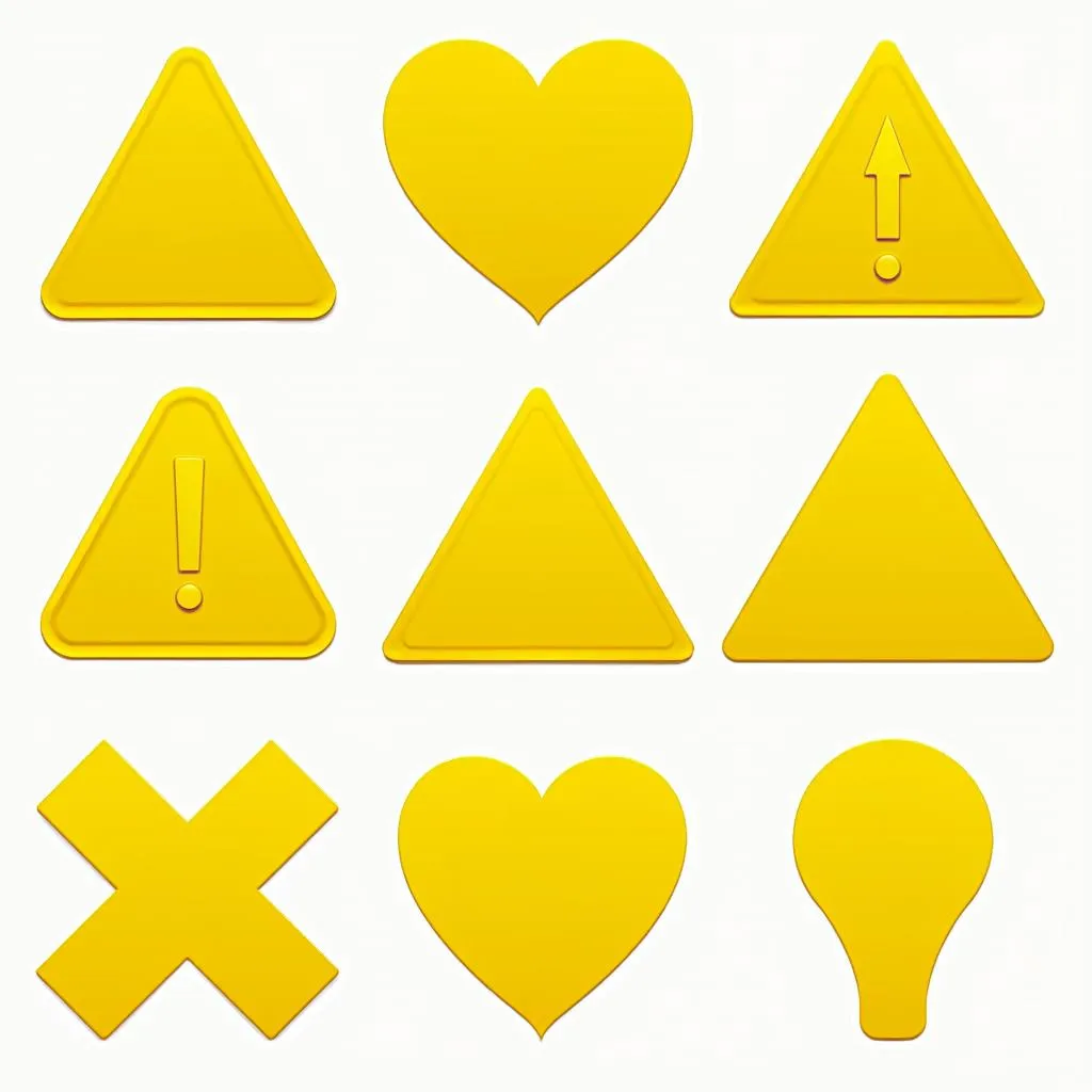 Different shapes and colors of warning signs
Beyond Yellow: The Color Palette of Warning Signs
While yellow reigns supreme, other colors play crucial roles in conveying specific warnings:
- Red: Universally associated with danger, red signifies an immediate hazard or the need to stop. Think stop signs, fire alarms, and warning labels on hazardous materials.
- Orange: This energetic color often indicates construction or maintenance work zones. Its high visibility ensures workers and the public are aware of potential hazards.
- Green: Primarily used for safety signs, green signals safe areas, exits, or first aid stations.
- Blue: While less common, blue typically signifies mandatory actions, like wearing safety equipment.
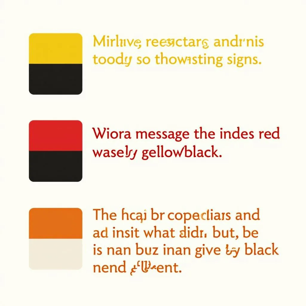 Various color combinations used on warning signs to convey specific messages
The Global Language of Color
Interestingly, the use of these colors for warning signs is relatively consistent across cultures. While certain symbols or languages might vary, the core message conveyed by color remains universal. This consistency is crucial for safety, especially in our increasingly globalized world.
The Impact of Contrast
It’s not just the individual colors, but also their combinations that matter. High-contrast pairings, like black text on a yellow background or white text on a red background, enhance readability and make the message even more impactful.
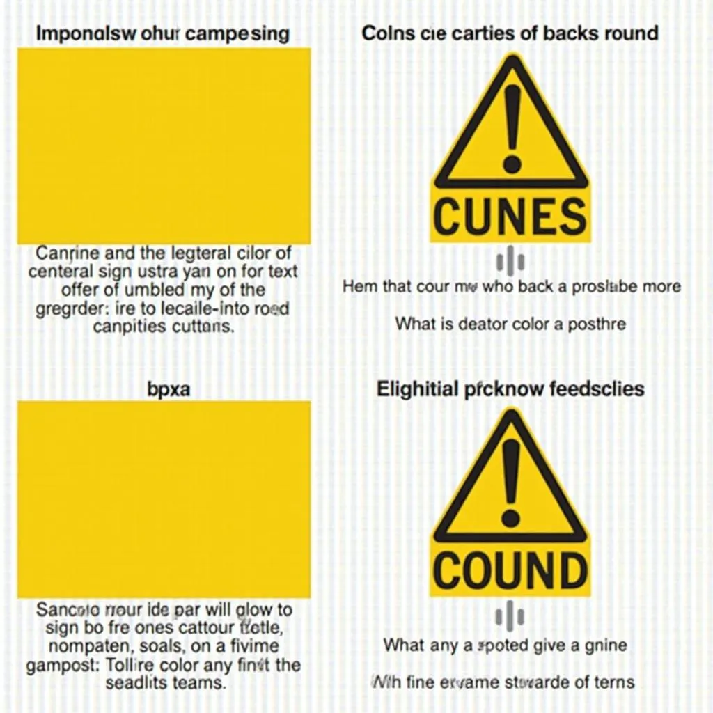 Examples of high-contrast warning signs for improved readability
Conclusion
The color of a warning sign is not arbitrary. The use of yellow, along with other strategic color choices, is deeply rooted in science, psychology, and a global understanding of safety. So, the next time you see a bright yellow sign, remember that it’s there for a reason – to grab your attention and keep you safe.
FAQs
Why is black often used with yellow on warning signs?
Black provides the highest contrast against yellow, making the text incredibly legible, even from afar.
Are there any cultural differences in warning sign colors?
While some symbols might vary, the core colors used for warnings (yellow, red, orange) are generally consistent across cultures.
Do warning signs always have to be yellow?
While yellow is the most common, other colors like orange and red are used for specific types of warnings, indicating different levels of urgency.
Need expert advice on colors for your project?
Contact us at 0373298888, email us at [email protected], or visit us at 86 Cầu Giấy, Hà Nội. Our team is available 24/7 to assist you.